Annual Report Design Examples That Stand Out (+Templates)

See the best annual report design examples for different industries. Learn how to design your annual report to stand out and grab ready-to-use templates.

Annual report design examples

helped business
professionals at:

WorkDay IHeart Meta Nice American Cancer Society Xerox

Short answer

What makes a great annual report design?

The best annual report designs make complex information easy to read. They use smart structure, clear visuals, and interactive elements like tabs, animations, or embedded videos to guide readers through your impact and results.

Best annual report design examples to inspire your efforts

Depending on your industry, you might need to follow a more formal annual report structure - with detailed financials for compliance. But that doesn’t mean your report has to read like a textbook only your auditors will suffer through.

Go too lean, though, and it might seem like you’ve got nothing to show.

By going interactive, you can link out to full financials without crowding the layout, keep long sections tidy with tabs, guide people through the story with scroll-based layouts, or throw in a quick video to bring it all to life.

Below, I've pulled together a gallery of creative annual report designs - some from real companies, others you can grab as templates. Either way, they’ll give you a serious head start (and maybe even a few jealous glances from your peers).

Annual report by Meta (interactive deck)

This is one of my absolute favourites by a Storydoc client - Meta really understood the assignment here.

It’s a dense, insights-packed report (the kind that could easily bore you to tears), but the second you land on that video collage cover slide, you’re pulled right in.

The narrator-style chapter navigation is another win - way more engaging than the usual Table of Contents.

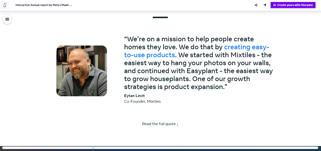
Each section is also full of interactive charts, expandable text boxes, pull quotes, and clever pacing that actually helps you digest the numbers.

For a report this heavy, it’s the best version I’ve seen. Seriously, if you want to know how to present big data in a way that doesn’t make people cry, this is your gold standard.

Annual report of survey results by GrowthZone (interactive deck)

This deck is actually a survey findings report, but honestly, it’s one of the best ways I’ve seen this type of data presented and a great example of modern annual report design.

Right from the start, you’ve got the average reading time on the cover, which sets expectations and lowers the “ugh, do I have time for this?” barrier.

I love how they’ve mixed things up - timelines, running numbers, interactive data charts - it’s a proper choose-your-own-adventure for stats lovers.

At the end, there’s also a short video intro about the company and handy links to their library of resources, so you can dig deeper if you want without cluttering the deck. Smart, engaging, and a perfect format for data-heavy reports.

Annual report by American Cancer Society (interactive deck)

I love how this one instantly feels on-brand - thanks to the organization logo and colors being pulled in automatically. And if you save them, you can use them for every future report too.

This one’s definitely on the meatier side, but it doesn’t feel like a slog thanks to side-by-side layouts that give the content some breathing room.

What really wins me over, though, is how action-focused it is. You’ve got multiple calls to action at the end, each with a button so there’s zero friction if someone wants to get involved.

No awkward “thanks for reading” and dead ends - just smooth, strategic next steps, plus links to socials. Honestly, I wish more reports ended like this.

NGO annual report (interactive deck)

I’m a big fan of how this NGO annual report keeps you focused without overwhelming you.

The grayed-out content trick is brilliant - text fades in as you scroll, so your brain’s not doing gymnastics trying to process everything at once.

The key metrics rise up in real time thanks to running numbers, and you’ve got interactive data visualizations with hover-over descriptions that make even dense stats a breeze to grasp.

Plus, the layout’s clean, airy, and totally responsive, so whether you’re reviewing it on a phone or a giant monitor, it always looks sharp. It’s proof you can be informative and easy on the eyes at the same time.

General annual report (interactive deck)

This annual report design example is perfect if you need to strike that corporate-meets-readable balance.

It leans a little heavier on the financials - great for when the board needs their numbers fix - but still keeps things clean and engaging.

You can pull in your company’s branding in seconds, swap in custom icons, and drop in quotes to break up the text. I love how each chapter gets its own clear section, so you don’t get lost halfway through.

And if you’ve got a lot of visuals, there are plenty of placeholders to show off your team, your work, or whatever else you want to spotlight. It’s a solid choice for more traditional reports that still need to stand out.

Annual sustainability report (interactive deck)

This one nails the modern sustainability report format. The structure’s similar to the corporate one, but with a few clever extras that make it feel more dynamic.

I love the expandable text sections - casual readers get the short version, while detail-hungry stakeholders can dig in.

There’s a narrator slide that literally guides you through their environmental impact, which feels way more human than dumping stats on a page.

The case studies are arranged into tabs, so you’re not scrolling forever to find the one that matters to you. And if someone wants to explore further, you can link out to the full versions.

This is how you make sustainability reporting both informative and actually fun to read.

Foundation annual report

This one’s a great pick if you want your annual report to actually get read. It’s divided into chapters, so it’s easy to follow, but what really sets it apart is how interactive it is.

You can click through different challenges or programs instead of reading a wall of text. And there’s actual data backing this up - giving people something to interact with increases the chances they’ll read your entire deck by 41%.

For a foundation that likely juggles multiple initiatives, this is such a smart way to keep people engaged without overwhelming them.

Community outreach and engagement report (interactive deck)

If you’re looking for a minimalist annual report design, this one nails it.

It’s clean, clear, and built for reports that lean heavier on research - there are dedicated sections to walk through your introduction, methodology, context, and conclusion without making it feel like a thesis.

Everything’s spaced out with plenty of breathing room, so it’s easy to digest even if you’re tackling complex topics.

I also love the embedded calendar at the end - such a smart touch if you want to invite readers to discuss the findings or ask follow-up questions.

Global impact report by Toms (static PDF)

This annual report example is a static PDF, so it’s working with some limitations - but they’ve done a solid job.

I love the opening image of two people holding hands paired with the title “[Y]our impact.” It’s a small detail, but it makes the whole thing feel more human.

The layout breathes - plenty of white space, text broken up with photos, maps, timelines, and impact stats.

My favourite bit is the section on their original giving model and how it evolved over time using a static timeline.

You also get simple diagrams showing how their shoe program works (from manufacturing to distribution), and even learn they’ve given out 95 million pairs. That’s not nothing.

It’s long, but it doesn’t drag. If you’re stuck doing a PDF, this is a masterclass in how to do it right.

Annual report by Feeding America (static PDF)

Feeding America strikes again - and if you’ve read my nonprofit annual report examples roundup, you’ll know it’s not the first time their reports have made my list.

This one’s another proof that PDFs can work - if you know what you’re doing. It’s compact, but everything earns its place.

I love that they kick things off with a real story and a working video (a unicorn in PDF land). The mission is front and centre, but it’s the financials that really blew me away.

Instead of yet another pie chart, revenue and expenses are shown as sliced bell peppers. I mean, come on - that’s just brilliant. Of course, that level of playfulness wouldn’t fly in some industries, but here? It works beautifully.

They also link out to resources, and every page gives you something to care about. A great reminder that length doesn’t equal impact.

Annual report by Compassion International (static PDF)

This annual report is a textbook example of how to make a static PDF feel like a breeze.

Everything’s broken down into bite-sized chapters, from “Who We Are” to condensed financials - and it’s all clean, clear, and well-paced. I like how they mix in maps, charts, key metrics, and QR codes that let you dig deeper if you want.

You’ve got a strong sense of their mission and the scale of their impact. The links and social icons actually work too (praise be), which is more than I can say for half the PDFs I open. Honestly, it’s about as good as it gets without going interactive.

Annual report by Mailchimp

I’ve seen a lot of annual reports and this creative annual report design is nothing like the rest.

Instead of slides or PDFs, you get a little character who guides you through their milestones like you’re playing a game. It’s weird, wonderful, and totally immersive.

The original was hosted on their website, but since it’s no longer live, I tracked down a screen recording.

Granted, the video I found is a bit blurry in places and it’s not something most teams could recreate without a dev wizard, but I had to include it.

It’s the most fun I’ve ever had reading an annual report (and yes, it actually won awards). Honestly, after the year we all had in 2020, this is the exact kind of dopamine hit we needed.

Annual report by Mailchimp

Annual report by Pandora (static PDF)

Okay, so this annual report design example proves that not every annual report has to be playful to work.

It’s over 100 pages long - half of which are dense financials - but thanks to plenty of white space, clean layouts, and their signature blush pink, it’s surprisingly readable.

You’ll find photos, diagrams, and well-paced charts that help break things up, so it’s not just numbers stacked on top of numbers. It’s a great example of how to keep things digestible even when the content gets technical.

If you’ve got a more formal report to deliver (especially in a highly regulated industry), this is a good one to study.

Annual report by Carlsberg (static PDF)

This Carlsberg report clocks in at 149 pages - so yeah, not exactly light reading. It’s definitely built with the investor and auditor crowd in mind.

The timeline design at the beginning winds like a river, which looks nice but takes a second to figure out where to start.

Once you're in, the layout leans denser than the Pandora report - smaller fonts, more columns, and the financials are woven through the narrative rather than grouped at the end.

Still, there are clever touches that humanize the whole thing.

I loved the visual beer lineup when talking about their portfolio (way better than a dull list), and they spotlight the key numbers up top, which gives you a quick taste before you dive into the full brew (I do love a good pun ;))

How to design your annual report to stand out

Even if your annual report is bound by strict rules (auditors aren’t exactly known for loving animations), there’s still a lot you can do to make it easier to read - and nicer to look at.

I promise that you don’t need fancy tools, design degrees, or a full creative team.

With a few smart annual report design tips, you’ll have something that’s miles ahead of what most organizations are putting out.

Use tabs to avoid the endless scroll

Nobody wants to scroll through 60 slides of content in one go.

Tabs let you group related info together - like financials, programs, or goals - so readers can click through to what they care about and ignore what they don’t.

You still get to include all your content, but without turning your report into a lecture.

Annual report tabs example

Embrace scroll-based design

Scroll-based design lets you guide readers through the story slide by slide, like turning the pages of a well-designed book.

You decide the order, the pacing, and where their attention goes next. It’s way more effective than dumping all your content at once and hoping for the best.

Annual report scroll-based design example

Make it mobile-friendly

We’ve all been there - opening a PDF on your phone, only to be met with tiny text, endless side-scrolling, and the dreaded pinch-and-zoom dance. It’s clunky, frustrating, and enough to make anyone give up.

With responsive, interactive design, your report adapts to any screen - so it’s scrollable, tappable, and perfectly readable from the first swipe.


Pull in your branding (and save it for later)

Your annual report shouldn’t look like it was made in a vacuum.

Pull in your brand colors, fonts, and logo in just a few clicks - and if you’re planning to do more reports or decks, you can save your brand kit for next time.


Use expandable text for detail without the clutter

Not every reader wants the full story up front.

Expandable text lets you tuck the nitty-gritty into a “read more” button so casual readers get the highlights, and stakeholders can dig deeper when they feel like it. It keeps your layout clean and your readers happy.

Annual report expandable text example

Break up the page with visuals

Even if your report is heavy on text, don't let it look that way.

Pull quotes, maps, or even subtle background visuals can give the reader’s brain a break. No one wants to read a wall of words - spacing it out makes your message land better.

Annual report pull quote example

Embed media to bring the story to life

If you’ve got a compelling video, testimonial, or program footage, embed it directly in your report. It keeps everything in one place and lets the message land with more emotion and context.

There's no need for external links - just hit play within the deck and experience the impact without breaking focus.

Annual report embedded video example

Use interactive charts to make complex data easy

When your report is full of numbers, people need more than just static bar graphs to stay engaged. Interactive charts help readers understand key takeaways faster.

Add hover-over text for extra clarity or let them click through categories - it makes your data feel human, digestible, and worth remembering.

Annual report data visualization example

Create your annual report from a template

Writing your annual report is hard enough - figuring out how to design it on top of that? Total nightmare.

You waste hours trying to make charts line up, Googling “how to format a report,” and hoping it doesn’t end up looking like something from 2003.

Interactive annual report templates take that stress off your plate. The structure’s in place, the layout flows, and it actually looks like something people want to read.

You just need to drop in your content and you’ll end up with a report that’s clean, engaging, and way better than what most organizations are sending out.

Just grab one.

No templates found
Dominika Krukowska

Hi, I'm Dominika, Content Specialist at Storydoc. As a creative professional with experience in fashion, I'm here to show you how to amplify your brand message through the power of storytelling and eye-catching visuals.

Engaging decks. Made easy

Create your best annual report to date.

Stop losing opportunities to ineffective presentations.
Your new amazing deck is one click away!