

How to Make a Pitch Deck for a Restaurant (+Examples)
Learn how to make a winning restaurant pitch deck, with tips on what to include in your pitch deck and customizable restaurant pitch deck examples.
Set as Preferred Source
A restaurant pitch deck is for anyone trying to raise money to open, grow, or franchise a restaurant.
That could mean pitching to angel investors, venture capitalists, banks, family offices, or even local business partners.
The people reviewing your deck may or may not be from the food industry – so it needs to be clear, compelling, and easy to grasp whether they’ve run a kitchen or not.
The goal of a restaurant pitch deck is to secure investor interest by clearly presenting your concept, team, financials, and funding needs.
It should prove that your restaurant has strong market potential, a smart business model, and a clear plan for growth and return on investment.
Before you start writing your restaurant pitch deck, pull together assets like your sample menu, logo and branding elements, high-quality food photos or mockups, and a breakdown of your concept.
You’ll also need solid financial documents: a startup cost estimate, operating budget, projected P&L, and a clear funding ask with use of funds.
For location, gather research on foot traffic, nearby competition, and rent benchmarks – even if you haven’t signed a lease yet.
And don’t forget bios of your founding team and any press, reviews, or traction you’ve already got.
How to write a restaurant pitch deck to win funding
Let’s get one thing straight: your pitch deck isn’t going to land you a check on the spot. That’s not how it works – especially in the restaurant world, where investors tend to be extra cautious.
Food is subjective, profit margins are thin, and most restaurants take a while to break even. It’s a high-risk game, and they know it.
That’s why the deck needs to do more than show off a great menu.
You need to prove you’ve thought of everything beyond the kitchen, from staffing to marketing to how the business scales.
In this section, I’ll walk you through how to write a restaurant pitch deck step by step – so it reads like a business case, not just a passion project.
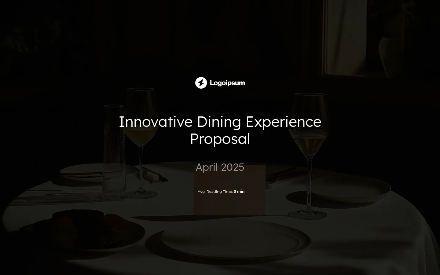
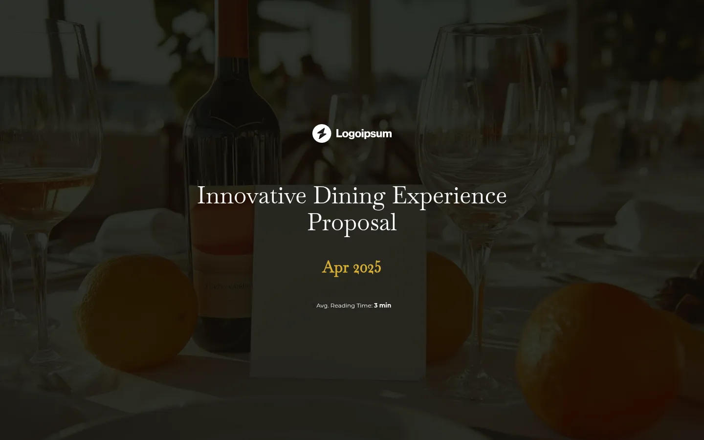
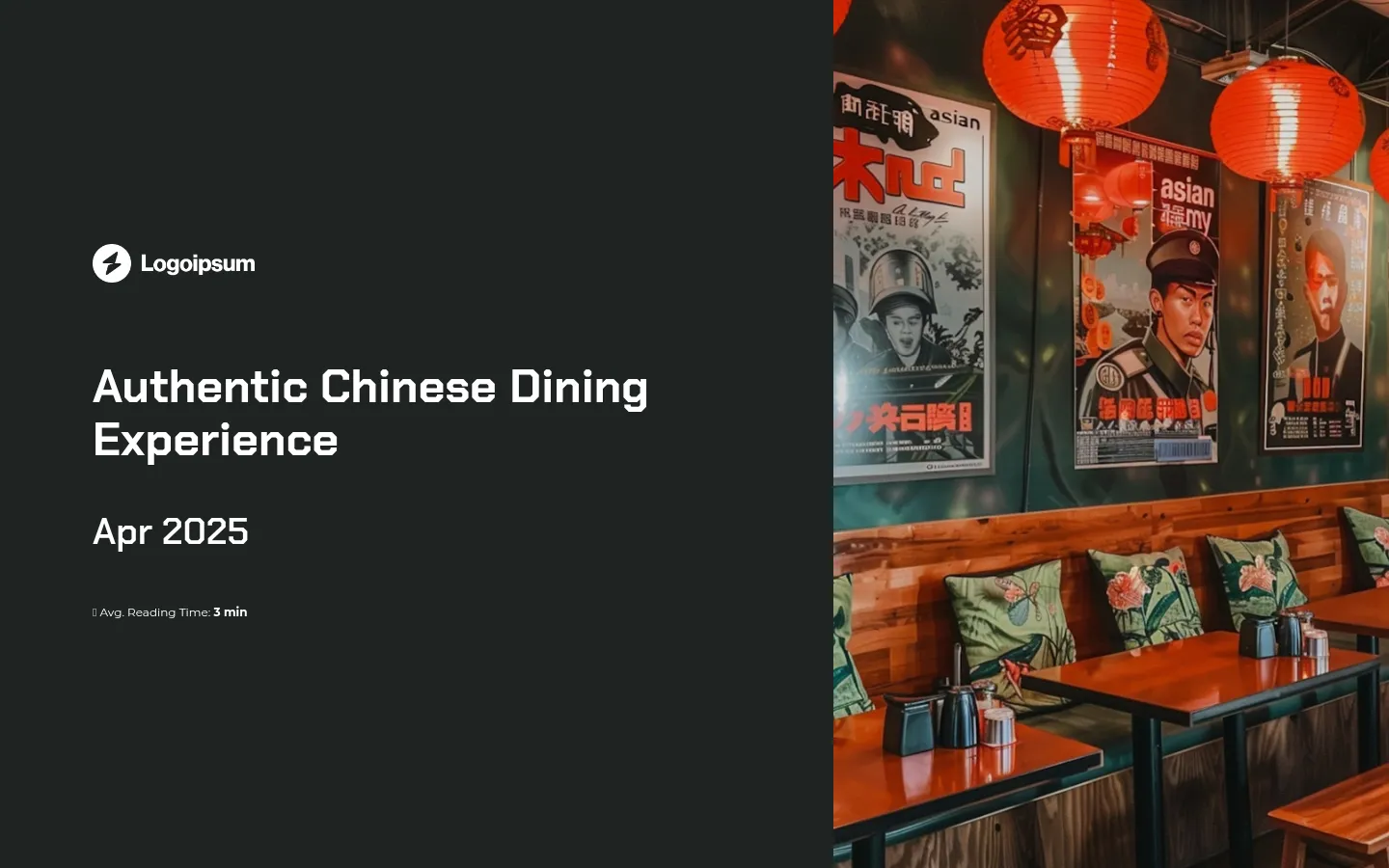
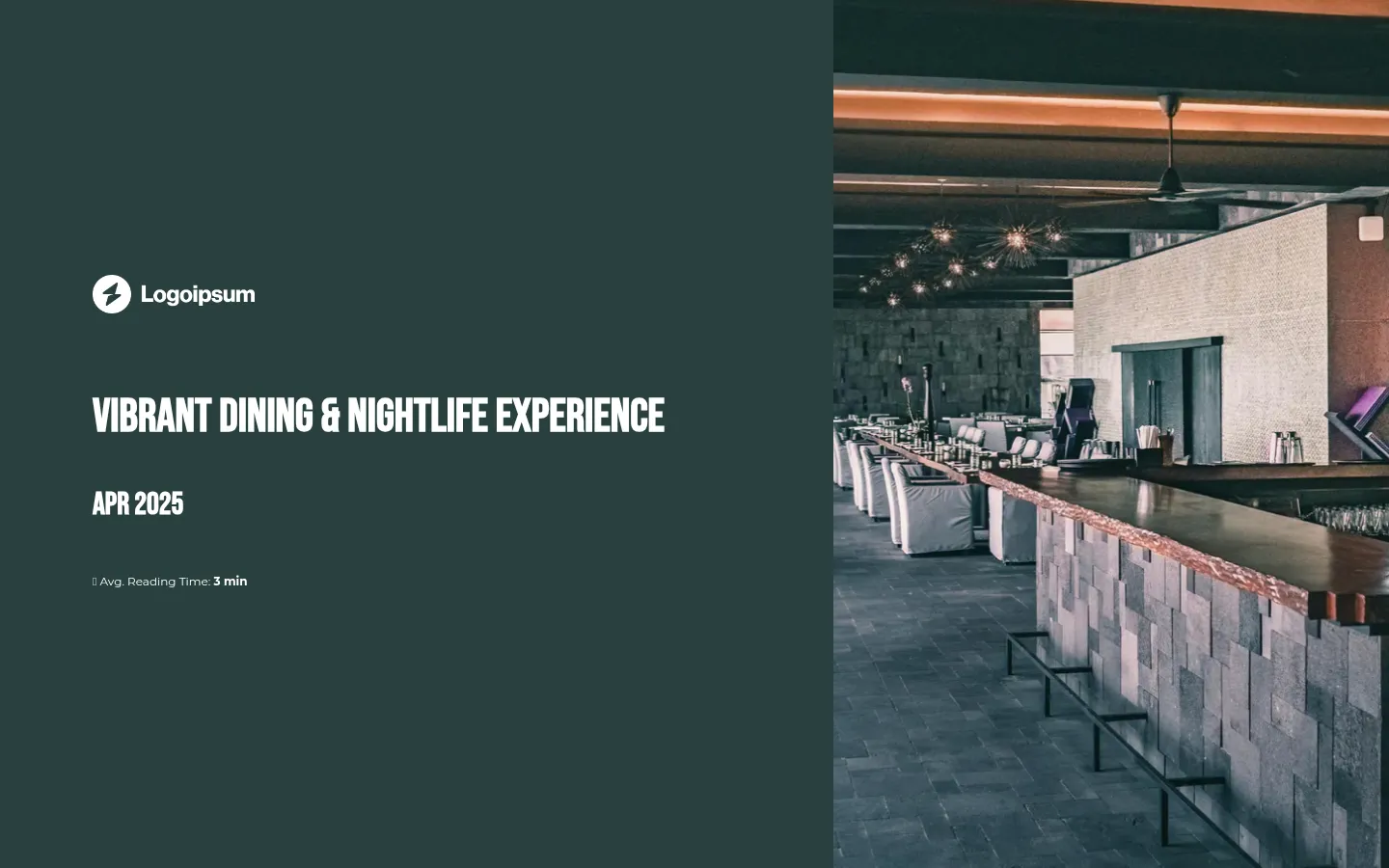
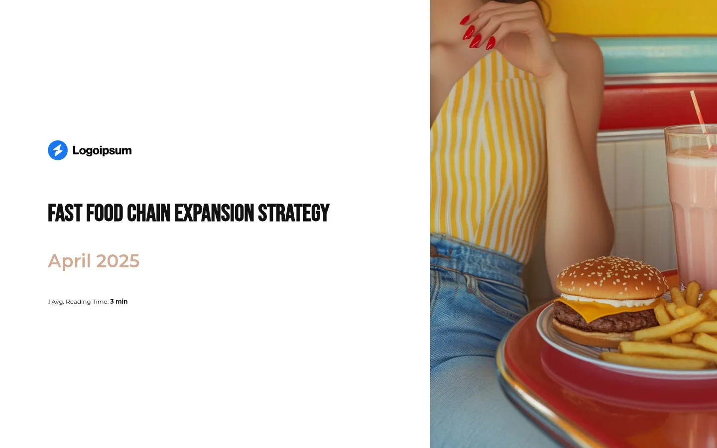
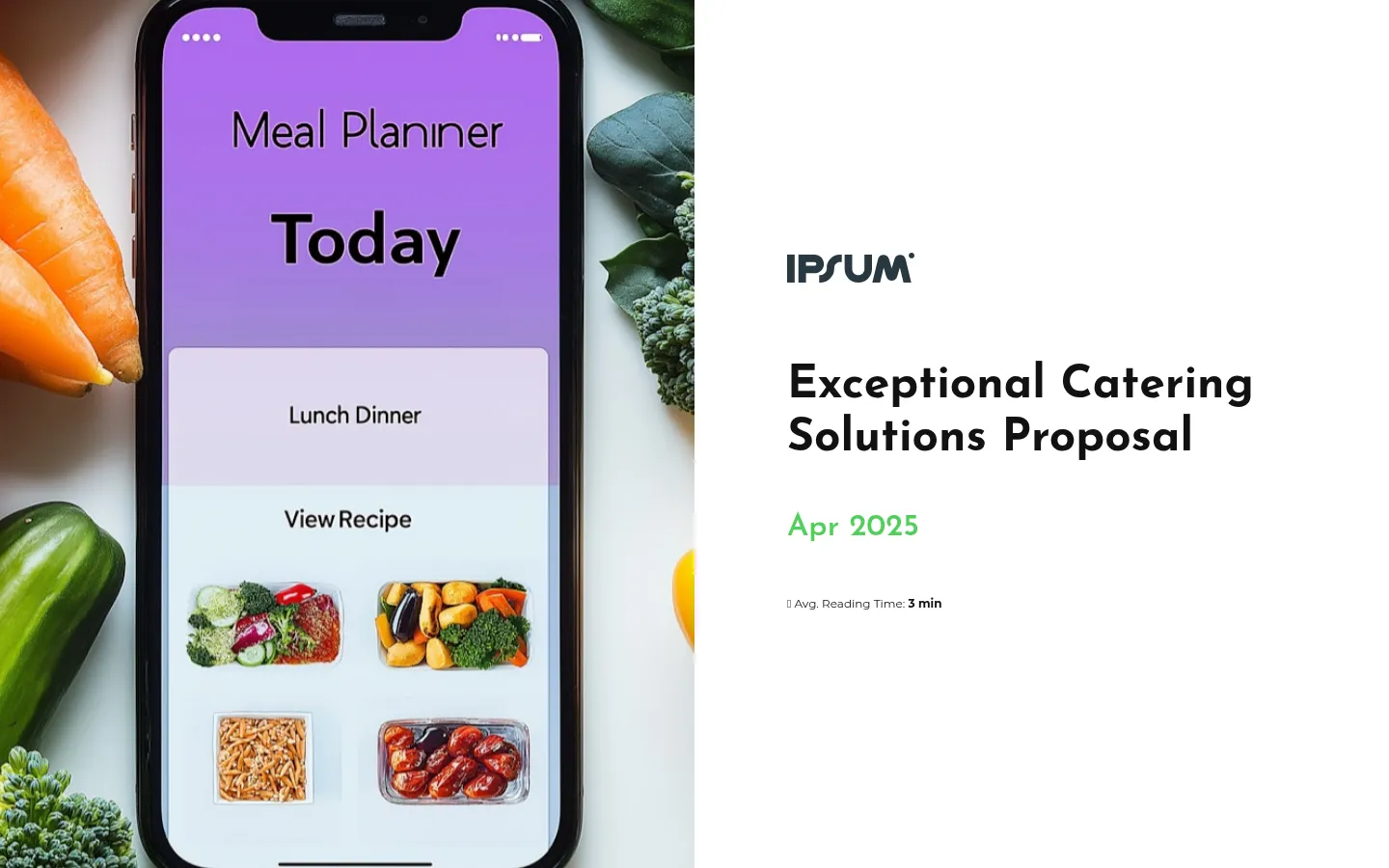
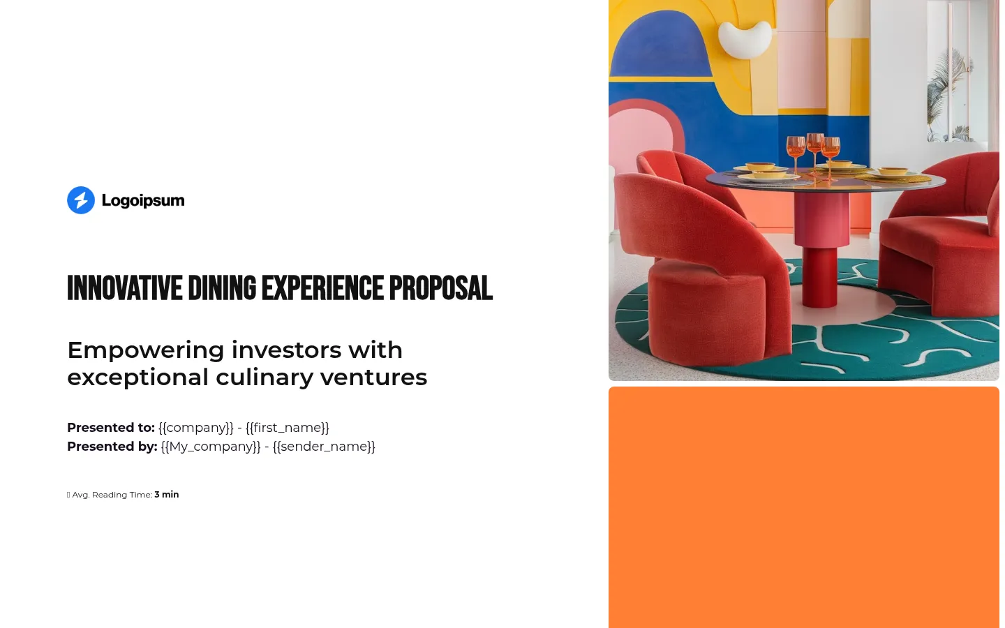
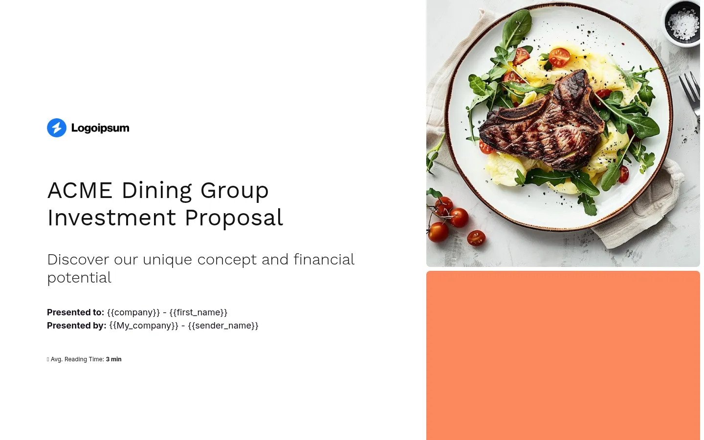
1) Cover slide
This slide might feel like a formality – but when an investor has dozens of decks in their inbox, a clean, clear cover helps yours get taken seriously from the start. It signals that you’re not winging it.
You don’t need fireworks here. Just make sure the essentials are in place, and that it looks like something you’d be proud to put on the front door of your future restaurant.
- Restaurant name and logo – Crisp and professional. Not scribbled in Canva the night before.
- Tagline or concept in a sentence – Think “Modern Balkan small plates with natural wine” or “Fast-casual Indian street food for city lunches.” Keep it short and punchy.
- Date – Useful if you’re sending updated versions or applying for time-sensitive funding rounds.
- Visual cue – Add something that gives a feel for the brand, like a high-quality photo of your food or a mockup of the interior.
- Personalization (optional) – If you know who you’re pitching, add their name or company to the slide. It’s a small touch, but it shows this isn’t the same deck you’re sending to everyone.
2) Executive summary
This is your elevator pitch in slide form. It’s the first real bite of your pitch, and it needs to hit hard. Investors are scanning for opportunity, clarity, and professionalism. If this part doesn’t land, they might not bother reading the rest.
Your job here is to give them a clear overview of what you’re building, why it matters, and what you’re asking for – without rambling or slipping into buzzword soup.
- The concept – What’s the format, cuisine, and style? Is it a fine dining flagship, a scalable fast-casual brand, or a neighbourhood spot with cult potential?
- Location – Where are you opening (or operating)? Why does this spot make sense?
- The founder (if relevant) – If you’re a seasoned operator, trained chef, or have past success in the industry, say so. Experience goes a long way in an industry where most new restaurants fail.
- The opportunity – Show that you’ve done your research. Is there unmet demand in your city? An underserved audience? A food trend you’re tapping into?
- Traction so far – Mention anything that proves this isn’t just an idea. Pop-up success, sold-out tastings, social following, industry praise – whatever shows people already want what you’re offering.
3) Market overview
Even the best concept can fall flat in the wrong market. The market overview slide proves you’ve done your homework – and that there’s actual demand for what you’re offering.
You want to show that there’s room (and hunger) for your restaurant, and that you understand who you’re serving and why they’ll show up. It’s about showing investors you get the lay of the land – and where you fit into it.
- Target customer profile – Who are you serving? Commuters grabbing lunch? Families on weekends? Young professionals looking for small plates and natural wine?
- Local demand – Use real data where possible: foot traffic, nearby offices or universities, existing restaurant saturation, average spend per head, etc.
- Market size – Zoom out slightly. How big is the addressable market in your area? How many similar concepts are thriving nearby? Remember, no one wants to invest in the 5th sushi spot on the same block.
- Trends – Is your concept riding a wave (e.g. plant-based dining, craft cocktails, fast-casual reinventions)? Show how you’re tapping into it.
- Why now – Highlight what makes this moment ideal to launch: a gap in the market, emerging dining trends, consumer behavior shifts, or a local real estate opportunity. Help investors see why waiting would mean missing the wave.
4) The concept
This section explains exactly what kind of restaurant you’re building – and proves that you’ve thought through how it will work day to day.
It should be obvious to anyone reading this slide how the restaurant functions, why the concept fits the location and target audience, how it’s different, and what will make people come back.
But here’s the thing: originality is only part of the story.
The concept has to be clear, viable, and built to handle the chaos that comes with real-world operations. (The Bear didn’t lie – permits, staffing, and consistency will break you if your concept isn’t airtight.)
Think of this as the “why us” slide – but grounded in reality. Not a fantasy where you open and the New York Times shows up, but a concept that makes operational and financial sense from day one.
- Service format – Define the model: full-service, counter-service, tasting menu, grab-and-go, etc. This influences layout, staffing, turnover, and pricing strategy.
- Cuisine and sourcing – Be specific. Mention your culinary influence, signature items, or how you source ingredients. Whether you’re importing from Italy or working with a local farm co-op, details like this tell people you’re serious.
- Guest experience – Describe the environment and flow of service. Investors should immediately understand whether this is a two-hour seated dinner or a fast lunch spot with high table turnover.
- Competitive edge – Explain what makes your concept viable in your market. That could mean better price-to-quality ratio, faster service, a dish nobody else is doing, or a model that works for delivery without wrecking food quality.
- Operational logic – Show that the business has been designed to work under real-world constraints. For example, a tight menu that reduces waste and simplifies prep, or a service format that runs with minimal staff during off-peak hours.
5) Founders or team
Restaurants don’t succeed just because the food’s good – they succeed because the team running them knows what they’re doing.
This slide is your chance to prove you’ve got the right people in the kitchen, behind the scenes, and on the books.
If you’re opening with a partner, bringing on a head chef, or working with a GM who’s run successful restaurants before – show that off.
A well-rounded, experienced team makes investors feel like they’re betting on a safe pair of hands, not a risky passion project.
- Names, roles, and headshots – Keep it simple, but professional. No blurry selfies from service.
- Relevant experience – Have they worked in a high-volume kitchen? Opened other spots? Turned around a struggling bar? This is where you mention it.
- Notable achievements – Awards, successful past ventures, features in the press, big-name mentors or restaurant groups – anything that builds credibility.
- Why this team works – If you’ve worked together before or bring complementary strengths (e.g. one partner handles front of house, the other ops), say so.
6) Menu
This isn’t the time to dump your entire recipe file – but investors do need to understand what’s on offer, how it’s priced, and how it fits into the broader concept.
Your menu reflects everything else: your costs, your kitchen workflow, your margins, and your guest experience. It also signals whether you know how to balance creativity with profitability.
- Sample menu – Include a stripped-down version of your menu: a few starters, mains, and drinks. Enough to give a feel for the offering without overwhelming.
- Pricing strategy – Show typical price points for each category. Explain your reasoning if needed – like sourcing premium ingredients or offering value-focused combos.
- Menu design logic – Highlight how the menu supports your operations: minimal SKUs, items that use overlapping prep, dishes designed to travel well if delivery matters.
- Best-sellers (if applicable) – If you’ve run a pop-up or tested the menu elsewhere, include what sold best. This shows you’re iterating based on demand – not ego.
- Special items – If there’s a signature dish or something that gets people talking, include it. Especially if it helps justify pricing, press attention, or your brand story.
7) Business model
This slide answers a simple question: how does your restaurant make money – and keep making money after opening week?
It’s not enough to say you’ll serve great food. You need to show you understand how revenue comes in, what eats into it, and what levers you can pull to stay profitable.
Investors want to know you’ve thought about seasonality, capacity, margins, and all the boring (but vital) parts that make a restaurant sustainable.
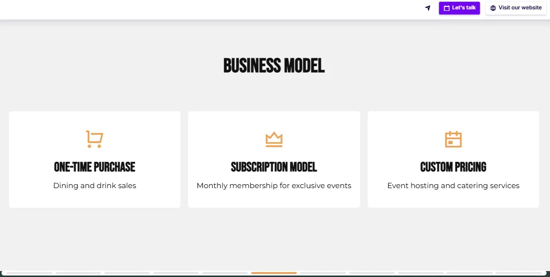
- Revenue streams – Break down where the money comes from: dine-in, takeaway, delivery, private dining, catering, events, merch, alcohol, etc. The more balanced (and thought-through) your mix, the better.
- Average ticket size – Estimate your average spend per customer, based on menu pricing and expected ordering patterns. Bonus points if you explain how you’ll upsell (e.g. drink pairings, add-ons, specials).
- Capacity and turnover – Show how many covers you can do per service, how often you expect to turn tables, and what that means over a week/month.
- Days and hours of operation – A fine-dining place open four nights a week operates very differently than a fast-casual spot open seven days from noon to 10.
- Margins and cost control – Highlight how you’ll manage costs: streamlined prep, low-waste systems, portion control, smart scheduling, etc. If you’ve run the numbers and kept food/labor costs tight, show it.
8) Location
Your concept might be perfect – but if it’s in the wrong spot, it won’t matter.
This slide proves you’ve chosen your location (or target area) for a reason, and that you’ve considered the real-world factors that make or break a restaurant: foot traffic, nearby competition, average spend, and access to your target audience.
And if you don’t have a signed lease yet? That’s fine – as long as you show you’re looking in the right places and know what you’re doing.
- Exact location (if secured) – Share the address or neighborhood, and explain why it makes sense for your format and audience.
- Lease terms (if known) – Outline square footage, rent, and any key details like TI (tenant improvement) allowance, patio rights, or venting already in place.
- Foot traffic and anchor spots – Mention nearby drawcards like offices, universities, theatres, gyms, or transport hubs that will feed your customer base.
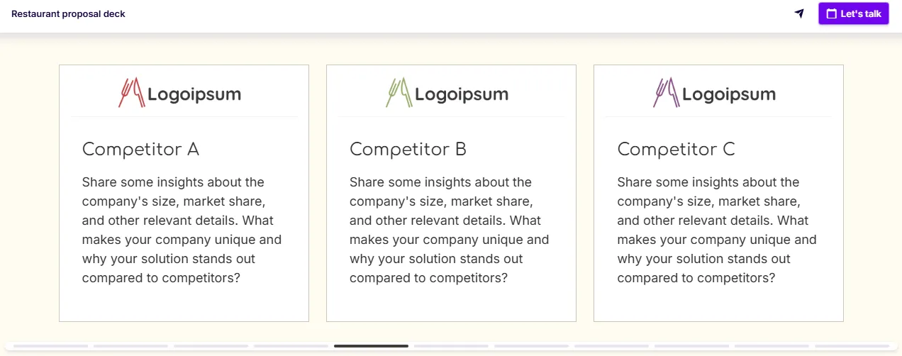
- Competitor context – A quick nod to similar restaurants nearby (if any), and why yours stands out. Don’t ignore competition – show how you stack up.
- If you’re still scouting – Name specific neighborhoods, target square footage, and what you’re looking for (e.g. second-gen space with existing infrastructure, high visibility, access to parking).
9) Traction or proof of concept
Investors are far more likely to back a restaurant that’s been pressure-tested in some form, whether that’s a pop-up, a food truck, a residency, a wildly popular menu item, or a social following that’s already obsessed.
Traction reduces risk. If investors see that people are already showing up, signing up, or cheering you on, they’re a lot more likely to believe you can pull this off.
Even if you haven’t served a single meal yet, you might have more traction than you think.
- Pop-up or soft launch data – Sales numbers, sold-out nights, repeat customers, or waitlist stats. Anything that proves demand.
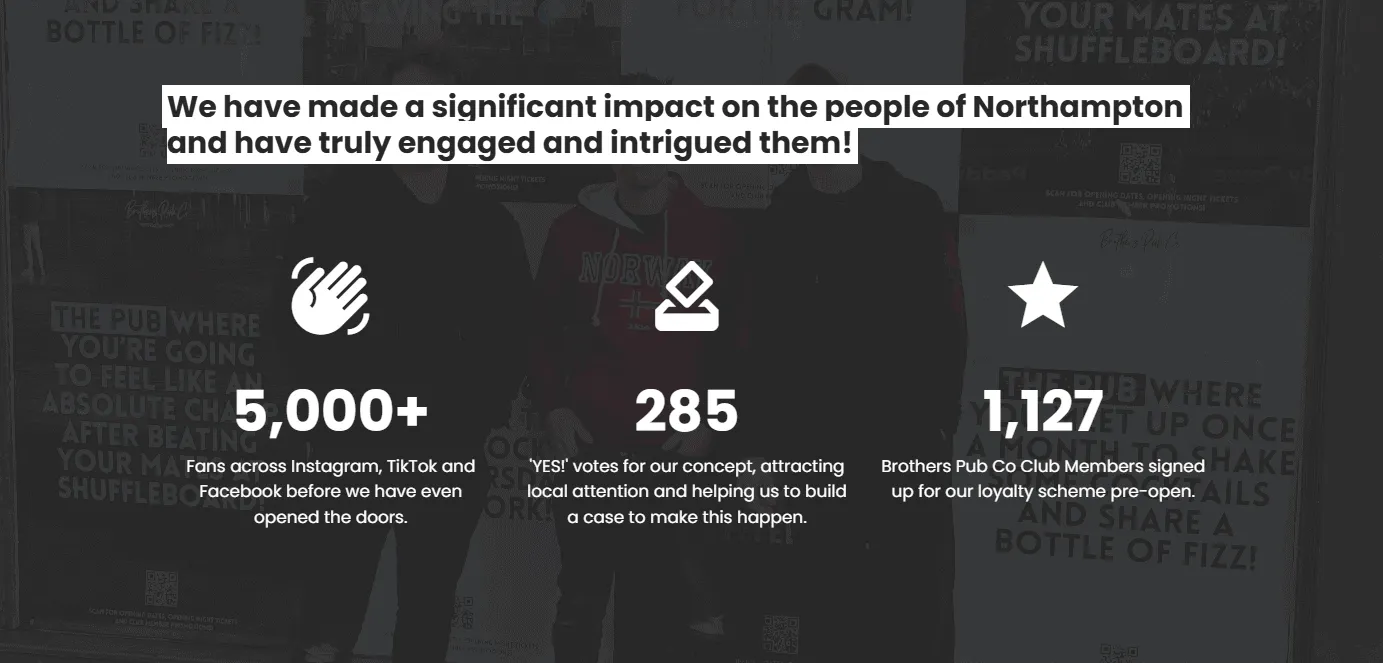
- Press or social attention – Any local press mentions, influencer posts, or social media stats (followers, engagement, newsletter signups). You don’t need 50k followers – you need proof people care.
- Past experience – If you’ve run other restaurants, worked under respected chefs, or helped launch other concepts, bring that credibility here.
- Pre-opening buzz – Document anything happening already: RSVPs to preview dinners, collaborations with local brands, or venue partnerships.
- Customer feedback – Pull quotes from people who’ve tasted your food. Even two lines from someone who drove across town for your pasta says more than a paragraph of self-praise.
10) Marketing plan and Go-to-Market strategy
Opening the doors isn’t enough. You need a plan to get people through them – and keep them coming back.
This slide shows you know how to build buzz, fill seats, and turn first-timers into regulars. And it should go beyond, “We’ll post on Instagram and hope for the best.”
- Pre-opening strategy – Tease your brand before the doors open: soft launches, friends-and-family nights, email signups, early loyalty perks, pop-ups, or collaborations.
- Channels you’ll use – Be clear about how you’ll reach your audience: social media, local press, SEO, influencer tastings, paid ads, loyalty platforms, or good old-fashioned flyers if that fits your vibe.
- Messaging and voice – Explain how your brand will speak to people. Whether it’s warm and nostalgic or bold and cheeky, consistency builds recognition.
- Retention tactics – Share how you’ll keep people coming back – like SMS campaigns, loyalty programs, or limited-time offers that drive repeat visits.
11) Financials
This is where your restaurant pitch deck either earns trust – or raises red flags.
Investors aren’t expecting instant profit. They are expecting to see that you understand your costs, your margins, and how long it’ll take to get out of the red.
If anything on this slide feels made up, vague, or wildly optimistic, you’re done.
Your food might be Michelin-worthy. But if you don’t know your labor cost percentage or monthly burn, it won’t matter.
- Startup costs – Break down what it takes to open: buildout, equipment, licenses, deposits, marketing, inventory, soft launch. Show you know what this actually costs in your city, not in theory.
- Runway and burn rate – How many months of operating expenses do you need before breaking even? Show your estimated fixed and variable costs (rent, labor, food, utilities, etc.) so investors understand the timeline.
- Revenue projections – Use realistic projections based on average spend, covers per day, and expected seat turnover. Tie this to your format – counter-service has different numbers than fine dining.
- Profit margins – Projected food and beverage costs, labor costs, and overall net profit margins over time. (Spoiler: most investors would rather see 10% margins they believe than 20% ones they don’t.)
- Timeline to break even – Be transparent. A 12–18 month runway is typical, and being upfront about how long it’ll take to become self-sustaining shows maturity.
You don’t have to be an accountant – but your numbers need to hold up. Every line here should be backed by research, real-world quotes, or past experience. If you’ve got an advisor, consultant, or CFO helping, say so.
12) Investment and use of funds
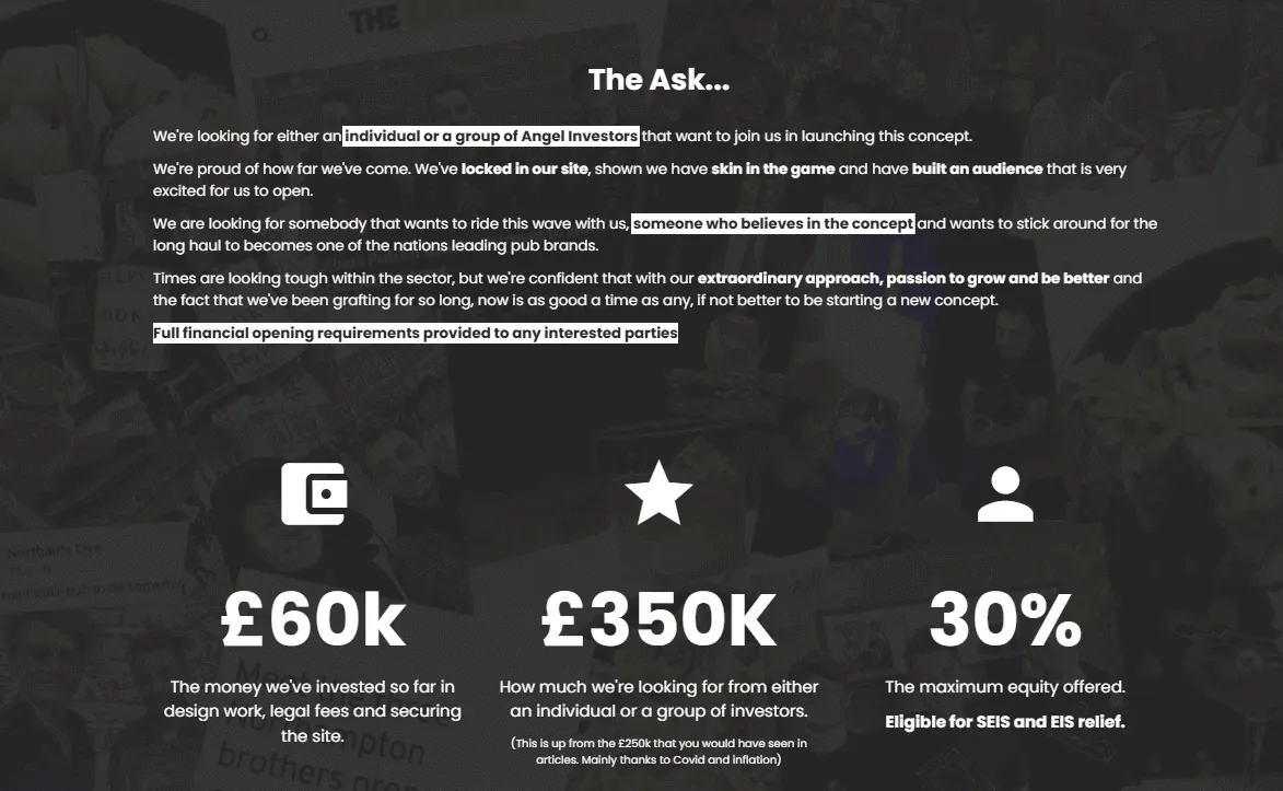
This is where you make the ask. How much capital do you need, and what will it go toward? Don’t just drop a big number – break it down.
Investors need to see that you’re realistic about startup costs and that their money isn’t going to disappear into a walk-in fridge and vibes.
Even if your concept is small and scrappy, this slide should make them feel confident you’ve done your homework and planned every dollar.
- The ask – State clearly how much funding you’re seeking. No hedging, no ranges – just the number.
- Allocation breakdown – Show where the money will go. A simple pie chart or bullet list is enough: e.g. 35% buildout, 25% equipment, 15% marketing, 10% working capital, 10% licenses and fees, 5% contingency.
- Timeframe – Indicate how long this funding will carry you (e.g. 12–18 months post-launch) and when you expect to break even.
- Return structure – If you’re offering equity, revenue share, or repayment terms, explain how it works. No need to go full term sheet – but a high-level structure helps.
- Your involvement – Mention if you’re personally investing or if you’ve already raised a portion. It reassures investors you’ve got something to lose, too.
13) Call to Action
Whatever you do – don’t end on “Thanks for reading.” This is your moment to tell them what you want, and how they can move forward.
You’ve just taken someone through your vision, your numbers, your plan. Don’t let them close the deck wondering, “So… now what?”
Be specific, be confident, and make it easy to take the next step.
- What you want them to do – Book a meeting? Schedule a tasting? Start due diligence? Say it clearly.
- How to take that step – Add a clickable calendar link (like Calendly), contact details, or next steps button. You want zero friction.
- Optional: Reaffirm the vision – A short one-liner to leave a lasting impression. Something like: “We’re not opening a restaurant. We’re building the kind of place people talk about for years.”
- Socials or website (optional) – If you want to drive people to learn more, include links with custom icons that fit your brand.
Restaurant pitch deck examples that sell your concept
Now that you know how to build your pitch deck the right way, it’s time to see what that looks like in action.
Below, I’ve pulled together a few restaurant pitch deck examples that show what’s possible when your vision meets a strong structure.
I’ll walk you through what each one does exceptionally well, what you could tweak to make it hit even harder, and how you can use them as a starting point for your own deck.
Pub and restaurant pitch deck by Brothers Pub Co
This might be my favorite restaurant pitch deck I’ve seen – and trust me, I’ve gone through a lot.
It opens strong: a cover slide with a video to pull you in, a tagline that tells you exactly what you’re about to see, and a smart little note saying it’s just a teaser deck (with the full thing available on request).
But let’s be honest – this “teaser” is already more detailed than most full decks out there.
They’ve backed up every claim with real numbers, mixing broader industry data with their own on-the-ground research from locals, showing there’s actual demand for what they’re building.
They also do what most founders forget – show skin in the game. There’s already one angel investor onboard, and they’re upfront about how much of their own cash is in it too. That alone builds trust.
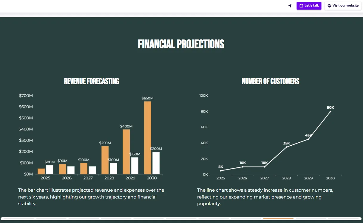
What really impressed me, though, is a fully mapped out 5-year plan and a detailed P&L analysis.
This isn’t a “hope and hustle” story – it’s a pitch from people who know exactly what they’re doing, and they’ve accounted for everything. Investors looking at this would feel like they’re stepping into a well-oiled machine.

Scroll to preview
Restaurant bar pitch deck
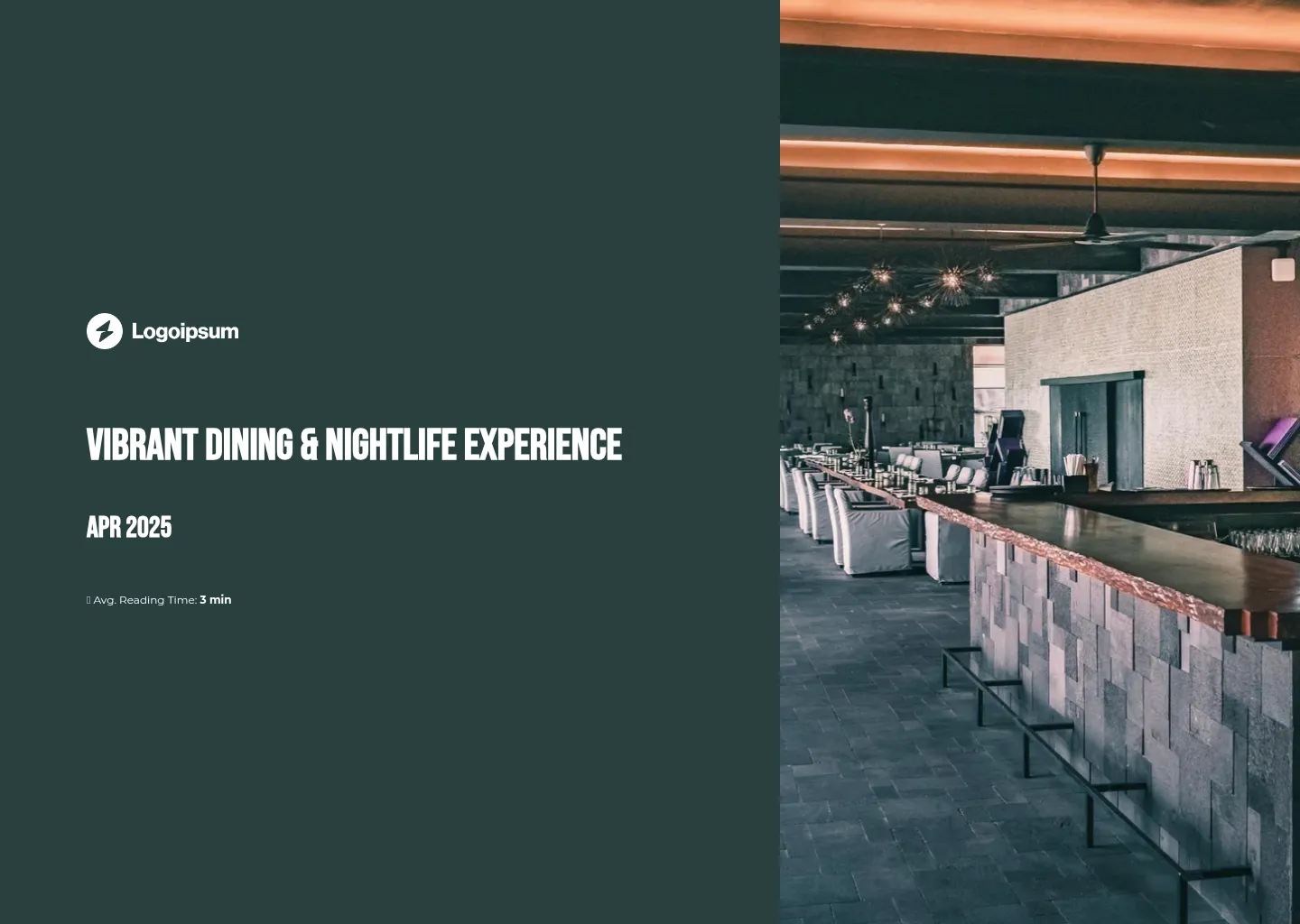
This restaurant pitch deck follows the structure we talked about earlier, and honestly, that alone puts it ahead of most decks out there.
What I really like is how they introduce the concept. It’s done with a narrator-style slide, so as you scroll, new images and short descriptions pop into view.
It’s such a good way to walk someone through your idea without flooding them with text. It lets people take it in at their own pace.
It also nailed the data side of things. The market analysis, target audience, and projected financials – everything’s broken down into interactive charts. Hover over anything and you get a clear explanation – without dense spreadsheets or squinting.
The only thing I’d add is a proper investment and use of funds slide to wrap it all up with a clear ask. It’s not a dealbreaker though, as you can drop one in from the gallery in two clicks.
Scroll to preview
Restaurant proposal deck
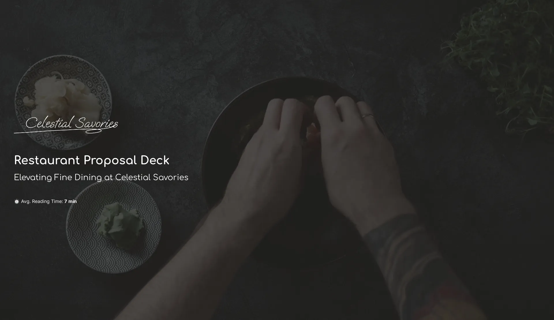
This restaurant proposal deck feels smooth from the start.
The logo on the cover slide gives it that investor-ready feel – and all it takes is your website URL and the editor pulls it in for you. No fiddling with file uploads or resizing.
The executive summary slide is a strong opener too. It tells you everything you need to know without turning into a wall of text. And if you do want more, there’s a little “read more” button that expands the details. Super tidy.
That same approach carries through the rest of the deck. There are placeholders for charts, competitor analysis, and a team slide – but the way it’s structured keeps it feeling light.
It could definitely benefit from an “ask” slide to make the investment part crystal clear – but the financials are already strong.
You get revenue and budget breakdowns at different stages, followed by a clear plan for growth, so the direction is obvious.
And if someone has questions, there’s a built-in calendar so they can book a meeting on the spot.
Scroll to preview
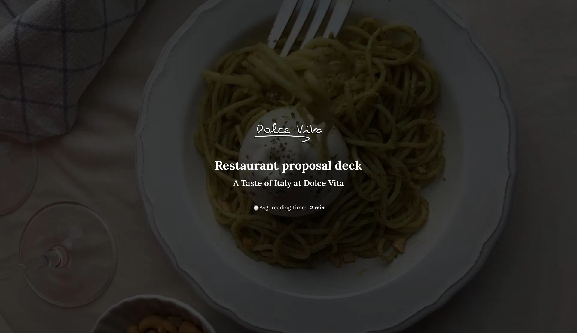
Italian restaurant pitch deck
This one follows a similar structure to the previous deck, but I had to include it here for one reason – the marketing strategy slide.
Instead of cramming everything into one screen, they’ve split it into clickable tabs so people can jump straight to what interests them most. It’s clean, digestible, and actually makes you want to read it.
If you’ve got more detail to share, you can easily drop in links to full docs or add an attachments slide where all the extras can live. And if you’re worried about privacy, you can lock the deck with a password, so only the right eyes get access.
And then there’s the analytics. You can see who opened the deck, who they shared it with, how long they spent on each slide, and if they clicked on any CTAs.
If most people are bouncing halfway through – well, there’s your sign something needs tightening up.
Scroll to preview
Restaurant investment proposal
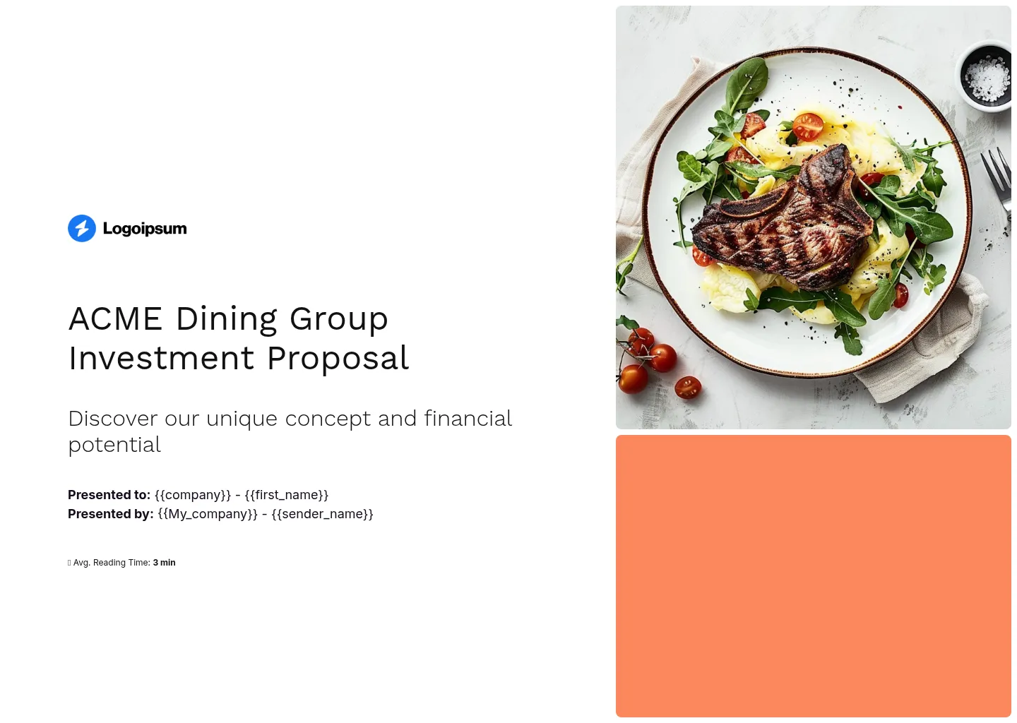
This restaurant investment proposal is a great reminder that the little things can make a big difference – especially when it comes to personalization.
Right on the cover, you’ve got smart tags like {{first_name}} and {{company}}, which means you can create investor-specific versions in minutes.
Not only does it feel more tailored, but it also lets you A/B test different versions using built-in analytics.
It’s such a simple tweak, but it’s genuinely one of the biggest predictors of whether someone will actually read your deck or bin it.
It’s also built to perform everywhere – on desktop, tablet, or mobile – which is ideal for investors reviewing things on the go.
If you need to make changes after sending, no big deal – they’ll always see the latest version, no awkward “here’s the new one” follow-ups.
And if you’re not building this solo, you can work on the deck in real time with your team to avoid version control chaos or someone’s inputs getting lost. .
Scroll to preview
Pesca restaurant pitch deck (static PDF)
Okay, so this one’s a static PDF – and yes, that already knocks a few points off, because it loses all the charm and interactivity a modern deck can offer.
But I’ll be honest: for a PDF, it’s actually… really solid. Possibly as good as it gets in that format.
It opens by walking you through the past, the present, and the future of the brand – setting the stage for what’s been done and what’s possible with an investor’s involvement. It’s a nice way to show momentum while pulling you into the vision.
I was also pleasantly surprised the video link actually works (a rare win for PDFs), and it takes you to a multilingual site – great thinking for an international chain.
And I have to say, I laughed when I saw the expansion map marked by fish icons: full fish, half-eaten fish, and skeletons depending on the location status. Morbid? A little. Memorable? Absolutely.
The financials are sharp, the investor returns are clear (it’s more than just unlimited seafood), and there are testimonials from people who’ve already backed them. Dare I say… it’s done so well I almost forgot I was reading a PDF. Almost.
Scroll to preview
Create your restaurant pitch deck from a template
Getting the balance right in a restaurant pitch deck is hard. You want to show off the food, the vibe, the experience – but investors also want to see numbers, margins, and when they’re getting their money back.
And if you’re a small team doing this for the first time? It’s a lot.
With interactive restaurant pitch deck templates, you don’t need to figure out the perfect structure alone.
Just plug your content into a professionally designed layout, and if you get stuck, our AI assistant can help you fill in the gaps based on your website or documents.
In minutes, you’ve got a deck that’s clear, compelling, and investor-ready.
Just grab one.