How to Write an Impact Report to Drive Action (+Examples)

Learn how to create an impact report that inspires people to act. See winning impact report examples and use our customizable templates to make your own.

Impact report examples

helped business
professionals at:

WorkDay IHeart Meta Nice American Cancer Society Xerox

Short answer

What is an impact report?

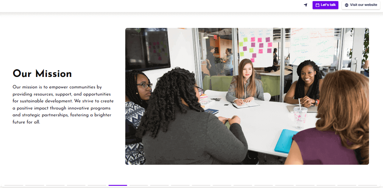
An impact report is a structured document outlining an organization’s achievements over a specific period - often highlighting the social, economic, or environmental effects of their work.

An impact report can be created by nonprofits to report to donors or by companies as part of their CSR or ESG strategy to show accountability and long-term value beyond profit.

Who creates impact reports?

  • Nonprofit organizations - Charities, NGOs, and foundations use impact reports to show donors, grantmakers, and volunteers how their contributions led to real-world change and secure continued support and funding.

  • Corporations - Companies publish impact reports as part of their CSR (Corporate Social Responsibility) or ESG (Environmental, Social, Governance) strategy. These reports highlight initiatives around sustainability, diversity, ethical practices, or social investment.

  • Social enterprises and B Corps - Mission-driven businesses use impact reports to show how they balance profit with purpose - whether it’s reducing environmental harm, supporting local communities, or reinvesting revenue into social good.

  • Educational institutions - Universities or research centres may create impact reports to show the societal benefit of their programs, partnerships, or funded projects - especially when reporting to government bodies or foundations.

  • Government and public-sector bodies - Public institutions may publish impact reports to show transparency and accountability for publicly funded initiatives - like community outreach, healthcare access, or climate programs.

What’s the difference between an impact report and an annual report?

An annual report gives a broad overview of everything your organization did over the past year - programs, financials, leadership updates, and key milestones.

An impact report, on the other hand, zooms in on the outcomes of specific projects, campaigns, or focus areas, often tied to a particular initiative or goal.

What are the benefits of creating an impact report?

  • Build trust with stakeholders - When you clearly show what was achieved - and how - you demonstrate accountability. Funders, partners, and supporters are more likely to back organizations that are transparent about their results.

  • Strengthen future fundraising or investment - A well-made impact report proves your value. It gives donors, grantmakers, or ESG-minded investors confidence that their support leads to real, measurable outcomes.

  • Improve internal alignment - The process of gathering data and writing your report often leads to better clarity across teams - what worked, what didn’t, and what should happen next.

  • Create a lasting asset - Unlike campaign materials that get buried, a good impact report can be reused across decks, proposals, social posts, and more - it becomes proof of your credibility and inspires new people to get involved.

  • Motivate and unite your team - When you’re deep in the day-to-day, it’s easy to lose sight of the bigger impact. Sharing a finished report with your staff and volunteers reminds them why their work matters - and gives them something tangible to be proud of.

What does an impact report look like?

Most impact reports are long-form PDFs or Powerpoints - heavy documents filled with text, charts, and tables that read more like a book than a report.

Others are published as static landing pages on the organization’s website, often with downloadable files attached.

But let’s be honest - those formats don’t always get read. PDFs are hard to skim, difficult to share, and impossible to update once they’re out in the world. And if your impact lives in a file nobody opens, does it really land?

That’s why many organizations are shifting to interactive impact reports. These live, web-based presentations are easier to explore and share - whether via link, email, or social.

You can embed videos, charts, testimonials, attach supporting documents, and even track engagement. It’s a smarter, more dynamic way to bring your impact to life - and actually get people to engage with it.


You can see a great example of an interactive impact report below:

How to write an impact report in 9 easy steps

Writing an impact report shouldn’t feel like navigating a minefield - but let’s be honest, it often does. You’re expected to be transparent, inspiring, data-driven, emotionally compelling, and somehow not boring. Easy, right?

Sometimes you’re working toward strict legal or funding requirements. Other times, it’s looser - but that can be even harder.

With too much freedom, reports tend to drift: either bloated with every number you could dig up, or so polished they start to feel like greenwashing. On the flip side, keep it too lean and it risks falling flat - like your work didn’t really amount to much.

So if you’ve got the results but need help turning them into something people will actually read (and trust), here’s how to structure it - step by step.

What should you include in an impact report?

  1. Cover slide

  2. Executive summary

  3. About us

  4. Goals and focus areas

  5. Key achievements

  6. Impact stories and testimonials

  7. Optional: Future goals

  8. Methodology and data sources

  9. Next steps slide

1) Cover slide

The cover slide isn’t here to impress anyone - it’s here to orient them. At minimum, include your organization’s name, the title (“2024 Impact Report,” for example), and the reporting period it covers. This is the functional front door of your report.

That doesn't mean you should waste the space, though.

If your report is interactive, this is a great moment to pull people in with something visual - a quick video, powerful photo, or moving quote that immediately signals what kind of impact they’re about to see.

Impact report cover slide example

2) Executive summary

This is your impact report in a nutshell - the who, what, why, and how much.

Anyone skimming should walk away knowing what changed, why it mattered, and what you’re working toward next. Keep it high-level, but don’t make it vague.

You’re not summarizing everything - you’re surfacing what’s most important through the lens of your impact framework.

This is where you highlight your key outcomes, core focus areas, and a short note on what enabled that progress (funding, partnerships, new programs, etc.).

Impact report executive summary slide example

3) About us

This section gives readers the context they need to understand your impact - and why it’s coming from you. It’s about what drives your work, how you're positioned to deliver results, and why you chose to focus on these particular challenges.

  • For nonprofits, this is your moment to explain your mission, your model, and the communities you serve.

  • For corporate teams, it's your chance to show how your impact work fits into your broader values and business strategy - and why you’ve chosen to tackle these issues in the first place.

If your impact journey is personal, values-driven, or still evolving, this section might work best as a short message from your founder or CEO.

It humanizes the report, frames your motivation, and shows leadership is involved - not just signed off at the end.

Impact report about us slide example

4) Goals and focus areas

The best impact reports do more than just list goals - they give people a reason to care.

Most readers don’t know your sector or community as well as you do, so it’s your job to spell out the problem first. Not just what you did, but what gap you were trying to close.

But here’s the problem: most organizations assume people already understand the issues they’re working on. So they toss out numbers without any context.

“We aim to train 1,200 people” doesn’t mean much unless I know what the need was to begin with, or how that compares to previous years.

Always frame your goals in terms of the bigger challenge - what’s broken, what’s at risk, and what success looks like in real terms.

How to frame your goals effectively

  • Don’t just state a goal. Set the problem first. Example: Instead of “Our goal was to plant 10,000 trees,” say: “Deforestation wiped out 40,000 hectares of native forest in the past decade, destroying habitats and increasing flood risk for rural communities. Our goal was to restore 10% of that loss by replanting 20,000 native trees across the hardest-hit areas.”

  • Ground it in emotion. A well-told personal story draws people in. It humanizes the issue and builds empathy. Once people care about one person’s experience, it’s easier to expand the lens and say: “...and there are 4,000 others just like her we’re trying to reach.”

  • Make your reader want the outcome. A good goal gives the sense that there’s something at stake - and something to gain if you succeed. This is why storytelling beats raw data every time. This way, instead of just reporting progress, you’re creating a sense of resolution.

The kind of goals you should include

  • Quantitative goals are measurable and comparable. Think: number of people trained, emissions reduced, funding secured. Use these when progress can be clearly tracked - and when stakeholders expect it.

  • Qualitative goals are more nuanced. An example can be improving community trust, increasing inclusion, or shifting public perception. These are often harder to measure, but no less important. Just make sure you explain how you assessed progress - interviews, surveys, recurring feedback loops, etc.

Impact report goals and focus areas slide example

5) Key achievements

This is the core of your impact report. It’s where you show what was actually accomplished, what changed, and why it matters.

But raw numbers won’t do the job alone. Data without context is forgettable. What stakeholders want is meaning - how those numbers translated into real-world outcomes.

A strong impact report also admits where goals weren’t met.

It’s far more credible to say, “We aimed to reach 1,000 families and reached 720” than to pretend everything went to plan.

No organization hits 100% of its targets - and claiming you did makes the whole report less believable.

What matters is whether you can explain why. Was it a funding gap? External disruption? A misjudged timeline? Then, show what you learned and how that’ll inform your approach next time.

How to present your achievements

  • Use visual storytelling - before-and-after sliders, stat reels, or image galleries work well

  • Add short videos or testimonials from those impacted - this builds emotional connection

  • Interactive data visualizations (e.g. filterable charts or hover-based breakdowns) help users engage with the data, not just stare at it

  • Maps can show geographic reach at a glance - especially powerful for health, education, or climate-related programs

How to translate hard numbers into real outcomes

❌ Flat:

“We distributed 15,000 hygiene kits.”


✅ Stronger:

“We distributed 15,000 hygiene kits across flood-affected regions - covering over 80% of displaced households. Follow-up surveys showed a 65% drop in reported infections within two weeks of distribution.”


This version shows scale, relevance, and real impact. It also quietly demonstrates that you followed up - which is another sign of credibility.

Impact report key achievements slide example

TIP: If your work was made possible through the support of donors, volunteers, community partners, or sponsors, this is a good place to acknowledge them.


A short sentence or two can go a long way in recognizing their role and showing that your impact is the result of shared effort - not just internal delivery.


In corporate reports, this might take the form of a brief mention of key collaborators or mission-aligned sponsors who contributed to specific initiatives.

6) Impact stories and testimonials

This is where the data gets personal. You’ve shared the numbers - now show what those numbers actually meant for real people.

A good story puts a face to the problem, shows what your intervention looked like on the ground, and then zooms out to show how many others are in that same situation.

A single quote in isolation rarely carries weight. But when you place that story right next to the data it reflects - “Ana’s story is just one example of the 6,000 families reached by our flood relief program” - you get emotional resonance and scale.

This structure is the classic problem-solution arc, and it works for a reason. Showing resolution is satisfying and gives your data emotional weight without losing credibility.

Impact report impact stories and testimonials slide example

7) Optional: Future goals

Most impact reports focus on what’s already been done - and rightly so. But if you want people to keep caring, you also need to show where you’re going next.

  • For nonprofits, a brief “What’s next?” section can help maintain momentum and show that the work isn’t over. It signals ambition, direction, and a continued need for support. It doesn’t have to be long - just enough to help readers see the bigger arc.

  • In corporate reports, future goals are often expected. Whether you’re publishing under a CSR or ESG framework, this is the section where you show how today’s results fit into a longer-term strategy - “Net zero by 2030,” “plastic-free packaging by 2026,” “50% board diversity by 2028.”

These are public commitments, and they’re used to track year-on-year progress.

Impact report future goals slide example

8) Methodology and data sources

Not every impact report includes a methodology section - and depending on your audience, it might not be necessary.

If your report is relatively simple and your numbers are straightforward - “We held 12 workshops,” “We raised $1.2M” - you may not need a separate section.

But if your results rely on large datasets, third-party verification, or qualitative research, this is where you show how you got your numbers and why they can be trusted.

This is especially important if your report falls under any kind of regulatory compliance - like ESG disclosures, grant reporting, or public funding. In these cases, including methodology isn’t optional.

You’ll often be expected to outline your data sources, collection methods, and limitations with a reasonable level of detail.

What to include in the methodology section of your impact report

  • A short explanation of how key metrics were tracked (surveys, CRM data, financial reports, interviews, third-party tools, etc.)

  • Data collection timeframes, where relevant

  • Any known limitations or caveats (“X data only covers 3 out of 5 program sites”)

  • If applicable, mention of external audits, independent reviews, or framework alignment (e.g. GRI, SDG, B Impact Assessment)

Impact report methodology slide example

9) Next steps slide

Even if your impact report isn’t built for conversion in the traditional sense, it’s still a touchpoint - one of the few where someone has actually taken the time to engage with your work.

Don’t let that moment end with a thank-you and a dead-end contact form.

What happens after someone finishes reading? That’s what the next steps slide should answer.

Whether it’s getting involved, making a donation, booking a meeting, or simply diving deeper into your work, you should always offer something. And make it easy.

Tailor your CTA to your audience - investors may want to schedule a meeting, donors might want to forward the report to others, and potential partners may be looking for a reason to collaborate.

Anticipate their intent and guide them toward the next logical step.

Examples of effective CTAs

  • A link to a full report or downloadable version (especially if this is a one-pager or summary)

  • Additional resources or case studies (consider a separate “Attachments” or “Resources” slide before this)

  • A calendar embed for booking a call to talk about getting involved

  • A donation prompt, volunteer form, or expression-of-interest link

  • Links to follow your work (newsletter signup, social media, etc.)

Impact report next steps slide example

Best impact report examples that inspire action

Now that you’ve seen how to write an impact report step by step, let’s take a look at how it works in practice.

I’ve pulled together a mix of real-world impact report examples. No matter the format, they’re all great examples of how to turn raw data into something that’s genuinely engaging, and not just a box-ticking exercise.

In the second half, you’ll also find a few templated examples - ideal if you’re ready to start building your own.

Whether you’re writing for funders, investors, or community partners, these examples will help you figure out what works - and more importantly, what could work for you.

NOTE: This section focuses on corporate impact report examples, but if you're looking for nonprofit reports, we’ve got you covered too. Check out our nonprofit annual report examples for a full guide tailored to charities, foundations, and NGOs.

KPMG impact report (static PDF)

Alright, so this one’s a full-length, capital R Report - from KPMG Luxembourg, no less. And yes, it’s a static PDF. So before I even opened it, I braced myself for tiny fonts and the inevitable pinch-zoom routine on mobile. Spoiler: both came true.

However, as far as old-school impact reports go, this one’s doing a lot right.

It’s structured like a book, with chapters clearly dividing each focus area - so once you get your bearings, it’s actually quite easy to follow.

It’s text-heavy, no question - but it’s not data-dense. The numbers are simple, clear, and not buried under jargon or confusing charts.

Sure, the static visuals could use a refresh, but at least you don’t need a finance degree to understand what’s going on.

What really won me over, though, was how they handled supporting documents. Each section has a tidy little table of attachments, complete with clickable links (and they actually work - a rare win in PDF-land).

Still, let’s be real: it’s not something you’d casually scroll through on your phone. It begs for an interactive makeover - one that keeps the structure but ditches the friction.

AON impact report (static PDF)

This impact report example kind of feels like the diet version of the KPMG report - still corporate, still buttoned-up, but trimmed down a bit.

It’s cleaner, more to-the-point, but also… kind of less user-friendly in the process. Most of it’s plain text, laid out like a long internal memo rather than a reader-friendly report.

However, it’s still a solid reference if you’re working with a corporate template that has to follow compliance guidelines.

You’ve got your ESG highlights broken out - environmental, social, and governance each get their turn—and that familiar, tried-and-true structure makes it a safe bet for annual filing or stakeholder reports.

But here's the catch: the impact stories are just a giant list of links at the end. No summaries, no visuals, no pull-quotes - just URLs stacked one after another like someone was racing to hit “submit” before the weekend.

This is where an interactive format could really shine. Break those stories into bite-sized highlights, make the visuals pop, and actually give readers a reason to click through.

Right now, it’s functional, but forgettable. Still, if you’re stuck with a rigid reporting structure, it’s not the worst example to follow.

Citi Impact Fund impact report (static PDF)

This impact report example sits right in that corporate-report sweet spot - somewhere between KPMG’s full-volume deep dive and Aon’s stripped-down summary.

Maybe it’s just because I’ve been burned too many times, but I was genuinely surprised when those little bookmark-style tabs at the top of each page actually worked. They’re clickable! In a PDF! Miracles do happen.

Visually, the key metrics section does as much heavy lifting as a static format will allow. You’ve got a geographic map showing reach, key numbers broken down by category, and it all feels digestible without being dull.

They also do a nice job weaving in quotes from partners and presenting their investments like mini case studies - enough detail to understand the impact, but not so much you’re skimming to escape.

If I had one gripe, it’s that there’s no clear call to action at the end. After all that good work, it just… stops. No nudge to explore more, no invitation to connect or learn how to get involved.

A missed opportunity, really - especially when everything else is this thoughtfully put together.

Starbucks global impact report (static PDF)

When it comes to the Starbucks impact report, I like how the executive summary hits you right up front with key achievements.

The structure’s tight too: Partners, Coffee, Community & Environment. It’s a clean three-part division that works really well.

As for the layout itself, for a static PDF, it’s about as good as it gets. You’ve got visuals, data points, pull quotes, and key metrics all playing nicely together.

You’re never wading through walls of text, which is more than I can say for most corporate reports.

However, I’ve got mixed feelings about the appendices. I get that the full data tables and third-party assurance letters need to be there, but that section feels a bit heavy.

To be fair, putting it up front would’ve been even worse… but an interactive format could’ve fixed this. Let readers click into what they care about, hide the rest. Simple.

And then there’s the fact that you have to go to their website to read the letters. Fine in theory, but if the link ever breaks, you're out of luck.

An interactive deck would let them attach downloads or link to supporting materials without making the user do all the work.

Little Soap Company impact report (static PDF)

Okay, I’ve seen a lot of PDFs in my time - and I’m not exaggerating when I say this is one of the most readable, pleasant ones I’ve ever opened. It’s their first-ever impact report, and honestly, it puts plenty of big-name brands to shame.

It opens with a personal letter from the founder, which I always think is a smart move - especially for smaller or purpose-led companies.

It gives context and builds that emotional connection right from the first page. You feel like you’re being spoken to by a real person, not a corporate comms team.

What stands out to me is the structure. You’ve got an executive summary to get you grounded, followed by a classic problem-solution arc - laying out the plastic crisis and showing why their mission matters, what gap they’re filling, and how.

And instead of dumping one grand vision, they go for clear, tangible goals per focus area.

It’s such a refreshing approach - it gives the report rhythm, keeps it focused, and actually makes the impact feel achievable. You can read this in one sitting and care about what they’re doing.

Honestly, it barely even feels like a PDF - it reads more like a beautifully designed ebook. Sadly, there’s no call to action at the end. After building all that momentum, it needs just one final nudge: here’s what you can do next.

Toms impact report (static PDF)

I love how this impact report opens strong with a headline metric: lives impacted. You know right away that this is about more than just products or performance - it’s about real outcomes.

One of my favorite things is how they handle context. When they bring up their B Corp score, they don’t just throw out a number and expect you to be impressed - they actually walk you through what that score means.

They compare it to the baseline to qualify, the highest apparel company score, and the max score possible. It’s a brilliant little lesson in how to make your data meaningful.

There’s also some really nice language in here - like “the power of your purchase.” It's a small phrase, but it builds such a strong emotional connection between the brand and its customers. This is impact storytelling done right.

They do a great job spotlighting their partners, too, which so many brands overlook. Recognizing the people helping you make change happen only builds more credibility.

If I had one complaint, it’s the same as with the Little Soap Company: no next step. No CTA, no way to keep the momentum going. After all that good energy, it just… ends. But hey, if that’s my biggest complaint, you’re doing a lot right.

Vestiaire Collective impact report (static PDF)

As someone who’s actually used Vestiaire Collective to resell my own designer pieces (and spent time working in the fashion industry), I was genuinely excited to see this report.

What I really appreciate is how they back up their mission with hard metrics, like how much water it takes to make a single T-shirt. That kind of context sticks with you.

They’ve nailed the problem-solution arc, too. Not only do they frame the issue, but they’ve taken the time to calculate their own environmental footprint and show how it stacks up against buying new.

It’s one of the better examples I’ve seen of making impact data relevant to everyday decisions.

And I love that it’s not all doom and gloom. They actually make it fun - inviting you to get involved, then following it up with a playful little quiz about what kind of fashion lover you are. It’s light-touch engagement done well.

Their strategy section is also super digestible. You see where they’re heading and how their current initiatives ladder up to that. It’s transparent, it’s accessible, and honestly - it just makes you want to root for them.

All in all, this is how you do a fashion impact report without it feeling preachy or corporate. It’s personal, it’s purpose-led, and it makes you feel like your choices matter.

Impact report one-pager (interactive deck)

If you’ve got a massive corporate impact report and need a way to make it actually digestible, this one-pager format is a lifesaver.

It’s perfect as a condensed version you can send in an email or pitch deck, with a link out to the full report for those brave enough to dive in.

You can pull in your logo automatically just by dropping in your website URL - which sounds small, but it makes setup feel seamless. The same trick applies if you want to showcase your partners or contributors.

The executive summary is sharp: hover over each data point to get a little more context without overwhelming the screen.

The same approach runs through the whole deck - from the market analysis to the financials - giving people just enough info without drowning them in detail.

And thanks to those “read more” sections, you decide how deep to go. That kind of control is exactly what’s missing in traditional PDF reports.

You can also add a CTA button or slide with attachments to link directly to the full report, so this one-pager becomes the gateway

Quarterly impact report (interactive deck)

Don’t let the “quarterly” label fool you - this impact report example is more flexible than it sounds. Whether you're reporting monthly, yearly, or on some made-up fiscal window, this format bends to fit.

You can add or remove slides, mix in extras from the template library, and the layout magically adjusts to whatever you throw at it. No design headaches.

First off, I love the table of contents right up top - it sets expectations straight away. (Minor remark: I wish it were clickable, but it’s easily doable in the editor.) Still, it’s a smart way to frame the journey.

Now, my absolute favorite bit is the yearly summary slide. It walks you through the timeline using a scroll-based layout, with grayed-out content that fades in as you go.

It’s a super clean way to break up text and actually hold people’s attention - which is no small feat for a report.

The future plans section is brilliant too. Everything’s tucked into clickable tabs, so people can explore what’s relevant to them without scrolling through an endless wall of text.

If you want something that feels dynamic, adapts to your content, and plays nice with any reporting cycle, this one’s a solid bet.

General impact report (interactive deck)

It’s essentially the grown-up version of the quarterly impact report - longer, more in-depth, but just as smooth to navigate. The whole thing is structured in chapters, which makes skimming or jumping between sections feel effortless.

It’s got everything you’d expect: a crisp executive summary, dedicated chapters for each focus area, impact stories, future plans - and yes, it even gets honest about the challenges along the way. That level of transparency builds trust fast.

What really seals the deal for me is the embedded multimedia. You can drop in images or even videos that play right inside the deck.

It’s the perfect way to follow the “show, don’t tell” rule - especially when you’ve got emotional stories or powerful visuals to share.

It’s also built for collaboration. You can work on it with your team in real time, which means no more passing around version 17_final_final_3.pptx.

And the built-in analytics are an absolute game-changer. You’ll know exactly how many people read it, where they scrolled, where they dropped off - so you can refine it for next time.

Corporate ESG compliance report (interactive deck)

This impact report has got everything you’d expect from a corporate ESG report - structured, brand-aligned, and fully audit-proof - but it actually looks great on any device.

No weird formatting issues, no tiny text you have to zoom into. That alone makes a huge difference in how much people engage with it.

I also love how editable it is even after sending - because let’s face it, you’ll spot a typo or need to update a number the second you hit send. Here, you can fix it instantly without re-exporting a PDF or emailing a new version.

You can even pull your branding straight from your website, or let the AI assistant give you a hand with writing copy or choosing visuals based on what you’ve already got. It’s perfect if you’re juggling a deadline and don’t want to start from scratch.

There’s also smart access control baked in, so you can lock editing rights down to the people who should be touching it.

And if you’re tailoring your report for different audiences - say, one version for investors, another for internal teams - you can duplicate and adapt versions in a couple of clicks.

Company annual report (interactive deck)

This deck is proof that an annual report doesn’t have to be dull.

Right from the start, the videos on the cover pull you in - they don’t overpower the message, but they do make a difference. (And yes, adding video can boost engagement by up to 32%, so it’s not just a gimmick - it works.)

One thing I really love here is the embedded calendar. If someone wants to get involved, ask questions, or just chat through next steps, they can book a call straight from the deck.

You can even add a second button - like linking to more resources, downloading the full report, or heading to a donation page.

And of course, you can embed the whole thing on your website or send it as a live link - so you’re not stuck uploading yet another static PDF that no one wants to download.

All in all, it’s a modern take on an annual report. Easy to navigate, easy to share, and a whole lot more actionable than the usual 40-page doc that ends up buried in someone’s inbox.

Create your impact report from a template

Juggling data, text, and design on your own takes ages - and even then, there’s no guarantee it’ll actually land. Just look at how many clunky, unreadable reports are out there.

Thanks to interactive impact report templates, you can skip the guesswork.

You don’t need to be a designer or presentation expert - just plug in your content and the layout, structure, and flow are handled for you.

You’ll end up with something that looks and performs better than 90% of reports out there. Or, if you want to go fully hands-off, let the AI assistant create one for you based on your website or existing materials.

Just grab a template and get started.

No templates found
Dominika Krukowska

Hi, I'm Dominika, Content Specialist at Storydoc. As a creative professional with experience in fashion, I'm here to show you how to amplify your brand message through the power of storytelling and eye-catching visuals.

Engaging decks. Made easy

Create your best impact report to date.

Stop losing opportunities to ineffective presentations.
Your new amazing deck is one click away!