
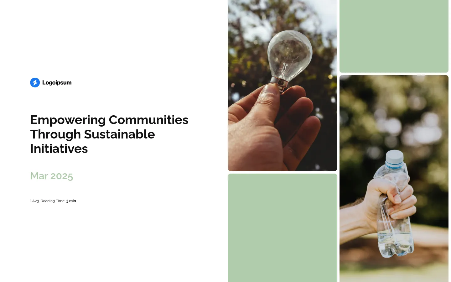
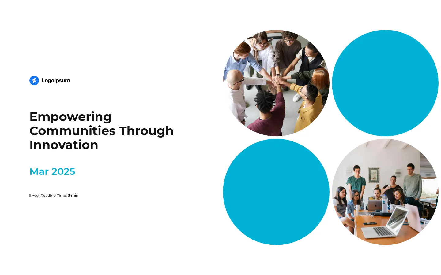
How to Write an NGO Project Proposal (+Examples & Templates)
Learn how to write an NGO project proposal that stands out and gets funded. See winning NGO project proposal examples, instantly usable as templates.
Set as Preferred Source
What does an NGO project proposal look like?
If you’re applying for federal funding, you’ll often have strict forms and no say over the format. But when you do have control, most NGOs still reach for the same old PDF: 20+ pages of dense text, dry tables, and zero personality.
It gets the job done – but let’s be honest, it’s also begging to be skimmed (or worse, ignored completely). Static PDFs don’t let you guide the reader, track engagement, or make it easy for someone to find what they actually care about.
Interactive proposals fix that. You can break things into tabs, add videos, link to reports, and include visuals that explain more with less. Everything’s cleaner, more engaging, and easier to act on.
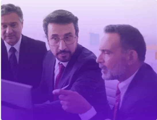
Here’s what an interactive project proposal looks like:
Scroll to preview
How do you write a proposal for an NGO project?
Writing an NGO project proposal is a bit of a balancing act. You’ve got multiple people reviewing it – some who live and breathe your sector, and others who might be skimming it between meetings with zero context.
If your proposal doesn’t hit the mark for both, you risk losing out on funding your cause genuinely depends on.
And let’s be blunt: if they don’t read it, they won’t fund it. So it’s your job to make your proposal easy to follow, easy to care about, and hard to ignore – without watering down what matters.
No pressure, right? But don’t worry – in this section, I’ll walk you through how to get it right, step by step.
1) Cover slide
The cover slide might seem like a throwaway detail – but if your proposal gets added to a massive review stack, or passed around between departments, the cover slide is how people know what they’re looking at.
It should clearly answer: what’s the project, who’s proposing it, who’s it for, and when was it submitted? If you’re responding to a call for proposals, include any reference number they’ve provided so reviewers can track it.
And if this is one of many proposals the donor will review, make sure yours is unmistakably labelled and easy to file.
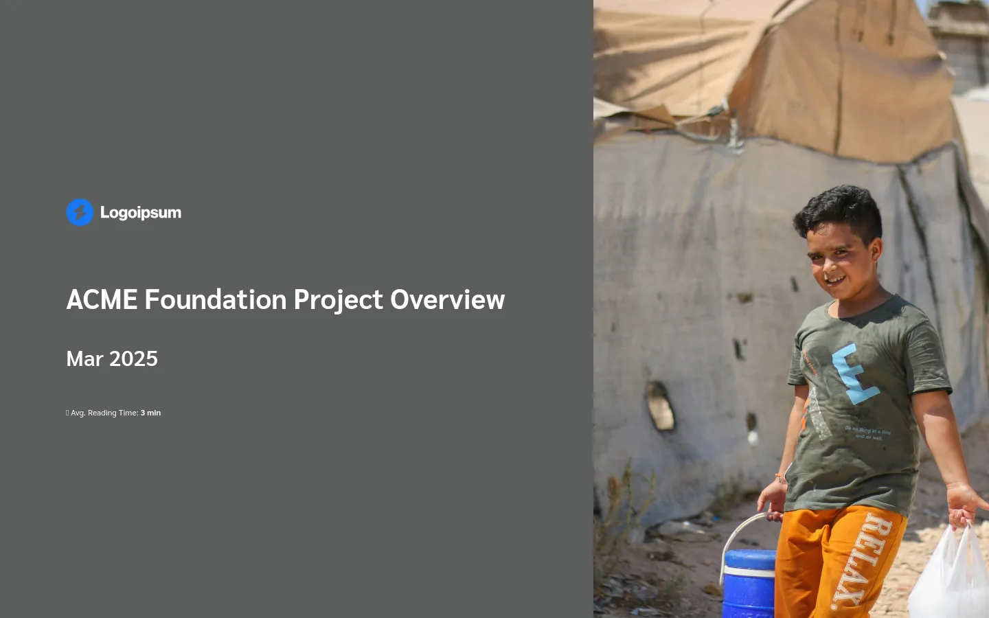
If you’re using an interactive format, you can add subtle animation or a strong visual (e.g. an image of the community or theme of the project) to signal professionalism without distraction.
- Project title – Specific, outcome-focused, and free from buzzwords. Think: “Sustainable Water Access for 5,000 Households in Kivu Province”, not “Hydration for Change”.
- Your organization’s name and logo – So reviewers can immediately see who the proposal is from – especially helpful if they’re reading dozens in a row.
- Date of submission – This matters more than you’d think, especially if there are multiple rounds or tight deadlines.
- Reference number (if applicable) – If the donor included a code or call reference, it goes here. These are often used by reviewers or internal tracking systems – so if you leave it off, you risk getting misplaced or flagged as incomplete.
- Donor or funding body – Helps signal that this proposal was written for them, not recycled from something else.
- Key contact info – Name, role, email. Make it easy for them to reach out without digging through annexes.
2) Executive summary
An executive summary is a page (or just a few tight paragraphs) that sums up the whole proposal – what the problem is, what you’re planning to do about it, who it’s for, how much funding you need, and what kind of results you’re aiming for.
It’s your one shot to hook a busy reviewer and convince them your proposal is worth their time.
Some reviewers might only read this section before skimming the budget and scoring your application – so it needs to work just as well for a first-time reader as it does for someone who knows your work inside out.
- Lead with the need – Set the context in one sentence. What’s happening? Why does it matter now?
- State your goal – Be specific about the change you’re aiming for—not just the activity.
- Explain your approach – What are you doing, how long will it take, and who’s delivering it?
- Highlight the impact – How many people will benefit, and how will their lives be different?
- Mention the budget – Show you’re cost-aware by stating the total ask upfront.
- Write this section last – You’ll be in a much better position to sum things up once you’ve nailed down all the details. It’s easier to capture the full picture after the rest of the proposal is locked in.
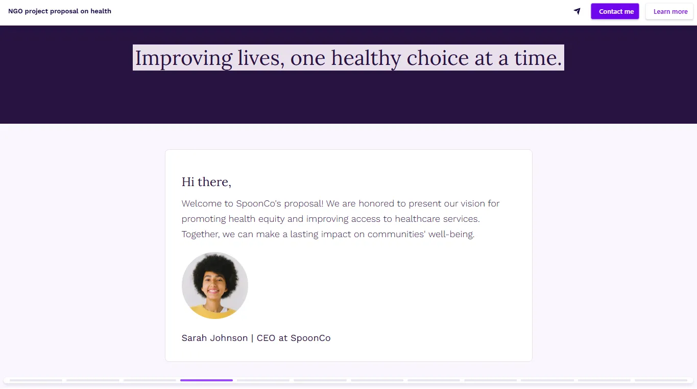
3) Organizational background
This isn’t your “About us” page. It’s your chance to show the donor why you are the right organization to deliver this project.
You should include relevant experience, credibility in the region or sector, and the people, partnerships, and systems that will help you get the job done.
The key is focus. Don’t list every project you’ve ever run. Stick to experience that proves you’ve done similar work – or that you’ve got the team and infrastructure to pull this off responsibly.
If your organisation is small or still building experience, don’t pretend otherwise. Instead, highlight your community connections, your trusted partners, or your rock-solid commitment to doing the work right.
Funders don’t expect perfection – they expect a plan. It’s better to be upfront about a challenge – and show how you’ll handle it – than to oversell and underdeliver. Authenticity builds trust, and trust gets funded.
- Who you are and what you do – A short, clear description of your organization’s mission and focus areas.
- Relevant experience – Projects you’ve completed in the same region, sector, or with a similar scale or goal.
- Your capacity – That includes technical expertise, financial systems, M&E processes, and staff.
- Local credibility – Highlight community partnerships, past collaborations with government, or existing infrastructure.
- Proof of success – Show the results of similar projects – like how many people you reached, what changed for them, and what’s still working today.
4) Problem statement (or needs assessment)
This is where your proposal earns its right to exist.
If a reviewer doesn’t clearly understand what’s wrong – and why it matters right now – they’re not going to fund the solution. This section needs to present the problem in a way that’s impossible to ignore.
That means a well-researched, evidence-backed description of what’s happening, who’s affected, and why it’s urgent. The goal is to make the issue feel real and pressing, even to someone who’s never set foot in the region.
Use data, research findings, and short, clear examples to show the scale of the problem and the human cost of doing nothing. And don’t forget to go one step deeper – what are the root causes, and why hasn’t this been solved already?
- Start with hard numbers – Quantify the problem using the best data you’ve got. “Only 40% of households have access to clean drinking water” is much stronger than “Many people lack safe water.”
- Make it human – Who’s affected? How does this problem show up in their daily lives? Talk about the impact on women, children, or marginalized groups if relevant.
- Explain why now – Spell out what’s at stake if nothing changes. Will illness rise? Will livelihoods shrink? Will more kids drop out of school?
- Identify root causes – Go beyond the symptoms. What’s driving the issue? Is it geography, policy gaps, or infrastructure failures?
- Position your project – Don’t promise to fix the whole system – focus on the specific gap your project can realistically fill, and make that the star of this section.
- Back it all up – Use sources, citations, and footnotes. If a government study or health assessment supports your claims, use it.
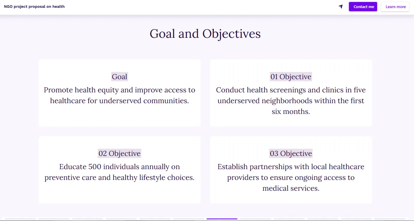
5) Project goals and objectives
This is where you spell out what your project is actually trying to achieve – and how you’ll know you’re on track.
Vague or overly broad goals are one of the fastest ways to lose reviewers who are skimming for clarity and credibility.
Your goal is the big-picture change you’re working toward. The objectives break that down into specific, measurable steps that show how you’re going to get there.
- Start with one clear, overarching goal – This is the long-term change you’re aiming for. Keep it short, outcome-focused, and avoid activity-based language.
- Follow with SMART objectives – That means Specific, Measurable, Achievable, Relevant, and Time-bound. If a reviewer can’t picture what success looks like by reading them, they’re not clear enough.
- Stick to 2–5 objectives – More than that, and it starts to feel bloated. Focus on what you can realistically track and deliver within the project period.
- Keep outputs and outcomes separate – Outputs are what you do (e.g. “Train 30 water management committee members”). Outcomes are what changes (e.g. “Community-managed systems maintained with 90% uptime”).
6) Project description and methodology
This is the heart of your proposal. The project description slide is where you present the plan – what you’re actually going to do, how you’re going to do it, and why this approach makes sense. Your job here is to make it feel real.
Your job here is to make it feel real. Every activity should link directly to one of your objectives, and every part of the methodology should show that you’ve thought it through, from staffing and timelines to community input and local context.
The reader should leave this section thinking that you’ve got a solid plan in place and can pull it off.
- Activities – Break down the core interventions that will help you achieve your objectives. These should be clear, tangible, and well-sequenced. For example: “Construct 15 water points,” “Train 30 local committee members,” or “Deliver hygiene education to 500 households.”
- Implementation methodology – Explain why you’ve chosen this approach. Are you using a particular model or community-led strategy? Did local partners help shape it? Will you be applying lessons learned from previous projects? If there’s anything technical or innovative here, this is where to mention it.
- Timeline – Outline when each major activity will happen. This can be included here or as a separate slide. Either way, show that your plan is paced realistically.
- Roles and responsibilities – Who’s doing what? Detail the project team, partner organizations, contractors, or government actors. Reviewers want to see that the right people are in place to do the work.
- Target beneficiaries – Be specific. Who is this project for, and how will they be selected or involved? Explain how you’ll engage them, and whether you’ve already consulted them in designing the approach.
- Location and context – Briefly describe where the work will take place, and any critical details reviewers should know about the setting – like access constraints, security issues, or relevant local dynamics.
7) Monitoring and evaluation plan
A solid M&E plan explains how you’ll track the project’s progress, measure impact, and adjust if things don’t go as expected.
It should include a mix of output indicators (what you did) and outcome indicators (what actually changed). You’ll also need to explain how you’re collecting data, who’s in charge, and when it’s all happening.
If your donor is results-oriented – and let’s be real, they all are – this section is where you show them you speak their language
- Indicators – Use both output indicators (e.g. number of water points built, number of people trained) and outcome indicators (e.g. percentage reduction in diarrhoeal disease, increase in access to safe water).
- Data collection methods – Describe how you’ll gather your data—baseline surveys, follow-up interviews, field logs, clinic records, etc. If you’re using participatory methods or working in low-data contexts, explain your approach.
- Schedule – Mention how often you’ll collect and review the data – monthly, quarterly, or at key milestones.
- Responsibility – Specify who’s doing the monitoring and evaluation. Is it an M&E officer? Field staff? A partner organization? If there’s an external evaluator involved, say so.
- Reporting and use of data – Let donors know how results will be shared and how they’ll inform future decisions.
- Logical framework (if applicable) – Many international donors will expect a logframe – essentially a matrix that summarizes your goal, outcomes, outputs, and activities, alongside indicators, data sources (means of verification), and key assumptions.
8) Budget
This is where you show how much money you need and exactly what you’ll do with it.
A good budget is a financial reflection of your entire project. If your proposal makes sense but your budget doesn’t, you’re not getting funded.
You need to show that the requested amount is reasonable, justified, and aligned with your objectives and activities.
The budget narrative is your chance to explain the “why” behind the figures – especially for any large or non-obvious items that might raise eyebrows.
- Detailed line items – Break costs down into clear, logical categories: personnel, travel, materials, training, admin, monitoring, etc. Don’t lump everything under vague headers.
- Justifications for key expenses – Use the narrative to explain anything that might seem unclear or unusually high. Why are travel costs what they are? Why is that consultant needed?
- Alignment with activities – Reviewers will scan your budget to see if it matches your project description. If you’re proposing 15 water points, the construction line should reflect that.
- Cost-efficiency – You don’t have to be the cheapest—but you do need to look responsible. Show that you’re using donor money wisely without cutting corners.
- Local contributions – If your organization or the community is contributing in-kind or financially, say so. It strengthens your case and shows buy-in.
- Administrative or indirect costs – If you’re including overhead, make sure it follows donor guidelines. Some funders cap this (e.g. at 10–15%), others expect you to justify every bit.
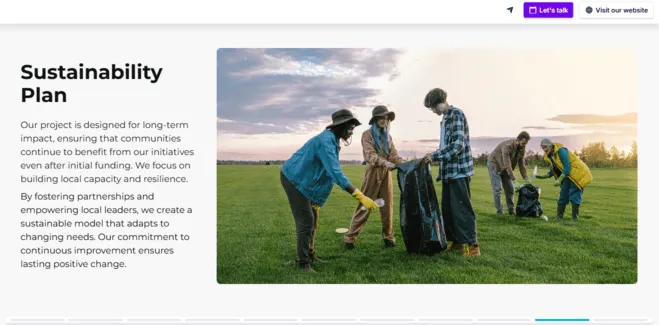
9) Sustainability plan
This is where you answer the question every funder’s thinking: “What happens when our money runs out?”
A strong sustainability plan shows that your impact won’t disappear the moment the project ends.
It explains how the results will be maintained, who will take over, and what systems or resources are in place to keep things going – without relying on indefinite donor support.
This doesn’t mean pretending the project will magically sustain itself. It means being honest, realistic, and strategic about what’s needed to make the impact last.
For example, a sustainability plan for a clean water project might mention setting up a community water committee and small user fees to maintain the wells long-term.
Or an education project might train government teachers to integrate a new curriculum, ensuring it carries on in the public school system.
- Community ownership – Show how you’re involving beneficiaries from the start. If the community helped design the project or will be trained to maintain it, that’s a big plus.
- Local capacity building – Explain how local staff, volunteers, or institutions will gain the skills to carry the work forward.
- Partnerships and handover – Will the local government take over part of the project? Are you coordinating with health clinics, schools, or municipal services to integrate what you’ve built?
- Financial sustainability – Is there a plan for covering future costs? Will there be income-generating components, user fees, local fundraising, or ongoing support from other sources?
- Long-term support (if any) – If your NGO plans to stick around, say so – but explain how that support will look (e.g. periodic monitoring visits, refresher training, etc.).
- Exit strategy – A clear plan for phasing out your involvement shows maturity. No funder wants to see you vanish overnight.
10) Risk analysis and mitigation plan (optional)
If you’re proposing anything even slightly complex – or asking for serious funding – funders expect to see that you’ve thought about what might go wrong.
A clear risk section shows that you’re not naïve, overly optimistic, or working without a backup plan.
It doesn’t need to be a long list of worst-case scenarios – it just needs to be realistic.
A few high-probability, high-impact risks and how you’ll manage them is more useful than an exhaustive catalogue of everything that might happen.
This can be its own section (especially for larger projects) or part of your methodology or implementation narrative.
- The major risks – Pick 3–5 of the most relevant. These might include: security issues, political instability, supply chain disruptions, weather events, or community resistance.
- How likely are they? – If helpful, use a simple “Low / Medium / High” risk level.
- What’s the impact if it happens? – Will it cause delays? Interrupt delivery? Force a total redesign? Say what’s at stake.
- What’s your backup plan? – This is the part funders care about most. How will you avoid the risk, minimize the damage, or adapt?
11) Annexes and supporting documents
This section might live at the end of your proposal, but it’s where reviewers go to double-check that everything you’ve said holds up.
It’s the evidence that backs up your claims, fills in the technical details, or satisfies any specific donor requirements.
Attach only what’s necessary, and label everything clearly. If the funder gives you a checklist or specific annex instructions, follow them to the letter.
(And if you’re using an interactive proposal format, you can embed documents or link to cloud storage instead of adding endless pages.)
- Organizational documents – Registration certificate, mission statement, financial statements, audit reports, board member list, etc.
- Project-related documents – Maps, needs assessments, baseline data, technical schematics, Gantt chart, community consultation summaries.
- M&E tools – Draft survey instruments, your logical framework (logframe), or logic model.
- Letters of support – From community leaders, local government, partners, or stakeholders.
- Staff CVs or bios – Especially for key personnel or technical leads.
- Previous project summaries – To show credibility and track record.
- Any donor-required forms – Some funders ask for special templates, checklists, or budget formats. Don’t skip these – they’re not optional.
12) Call to Action
Whatever you do, don’t end your proposal with “Thank you for your time.” It might sound polite, but what it really does is shut down the conversation.
You’re asking for funding, support, or a partnership – so act like it. Your final section should make it clear what happens next and invite the reviewer to take that step with you.
A good call to action keeps the door open. It shows you’re ready to engage, answer questions, or move things forward – not just drop a deck and hope for the best.
The more direction and ease you give your reader, the better your chances they’ll follow through.
- “Book a call with our team” – Even better if you embed a calendar link so they can do it in one click.
- “Review the supporting documents in the annex”
- “Visit our website for more information about our past work”
- “Contact us directly for further documentation or references” – Offer help before they even have to ask.
NGO project proposal examples that actually win funding
Even if your project is complex, even if it has ten moving parts and a dozen people with different priorities reading it – the best proposals still manage to make everyone get it… and actually care.
They hit that rare mix of clarity, heart, and credibility that funders love.
Below, you’ll find a gallery of NGO proposal examples that do exactly that. They’re smart, human, and designed to work across audiences. And, if you found one you like, you can also use it as a starting point to build your own in minutes.
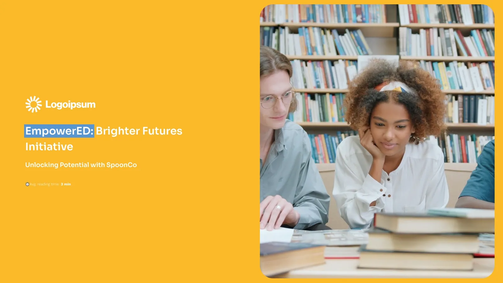
NGO project proposal on education
This NGO project proposal on education gets a lot of things right – starting with the video right on the cover. It’s not loud or over-the-top, but it quietly pulls you in and gives the whole thing some instant energy.
It also opens with a personal note from the CEO, which I really like. It makes the whole proposal feel more human, like there’s someone real behind the work – not just a faceless organization.
But what stands out most for me is the way it’s designed to guide your attention without overwhelming you. Key points are highlighted, and less urgent content stays in the background until you’re ready for it.
As you scroll, new pieces pop into view one at a time, so it’s structured, digestible, and actually enjoyable to read – which, let’s be honest, is not something you can say about most proposals.

Scroll to preview
NGO project proposal on health
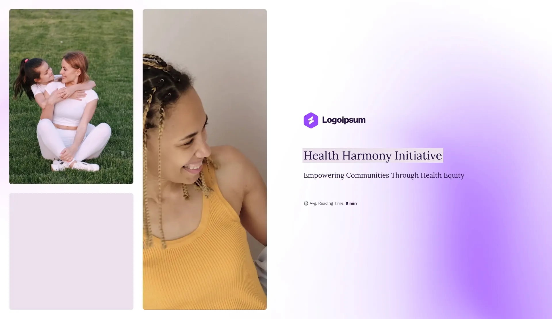
This NGO proposal on health follows a similar structure to the education one – but the cover goes bigger, with multiple video placeholders to pull people in.
My favourite part is hands down the problem slide. It kicks off with a bold statement, then hits you with key metrics that rise up in front of your eyes. It brings urgency without yelling – and makes the lack of access to basic healthcare feel real.
The strategy section is clear (which is a minor miracle in health proposals), and I like how the results are split into outputs and outcomes.
The expandable budget table is a smart touch too. You can easily add explanations for each line item without making the whole thing feel like a spreadsheet.
It’s missing a few slides like the M&E or sustainability plan, but you can drop those in from the gallery in seconds, and the layout will adjust on its own. You’ve got full control over how detailed – or how lightweight – you want to keep it.
Scroll to preview
Project proposal for donor funding
This example of an NGO proposal is a solid pick if you’re pitching to donors and need to show you’ve done your homework on your audience.
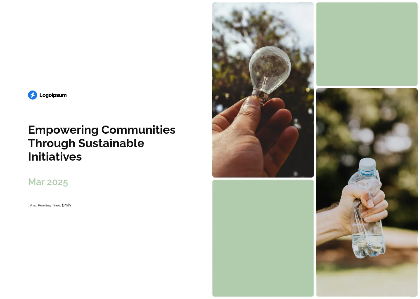
There’s a great data viz slide with three charts that present exactly who you’re trying to reach and how involved they are. It’s super digestible and makes your strategy feel grounded in real insight.
The budget overview keeps things simple – ideal if you’re not dealing with a million line items. It shows how funds are allocated by percentage, which gives donors a quick sense of priorities.
I also like the sponsorship packages slide. It clearly spells out what support at different levels actually covers, which is a nice way to show flexibility and make space for smaller donors who still want to help.
Another strong point of this proposal are the impact stories. Each one has its own tab with a photo and a quote, which you can easily swap out or turn into a video. Or, if you’ve got longer case studies, you can drop in links to those too.
Scroll to preview
Nonprofit project grant proposal
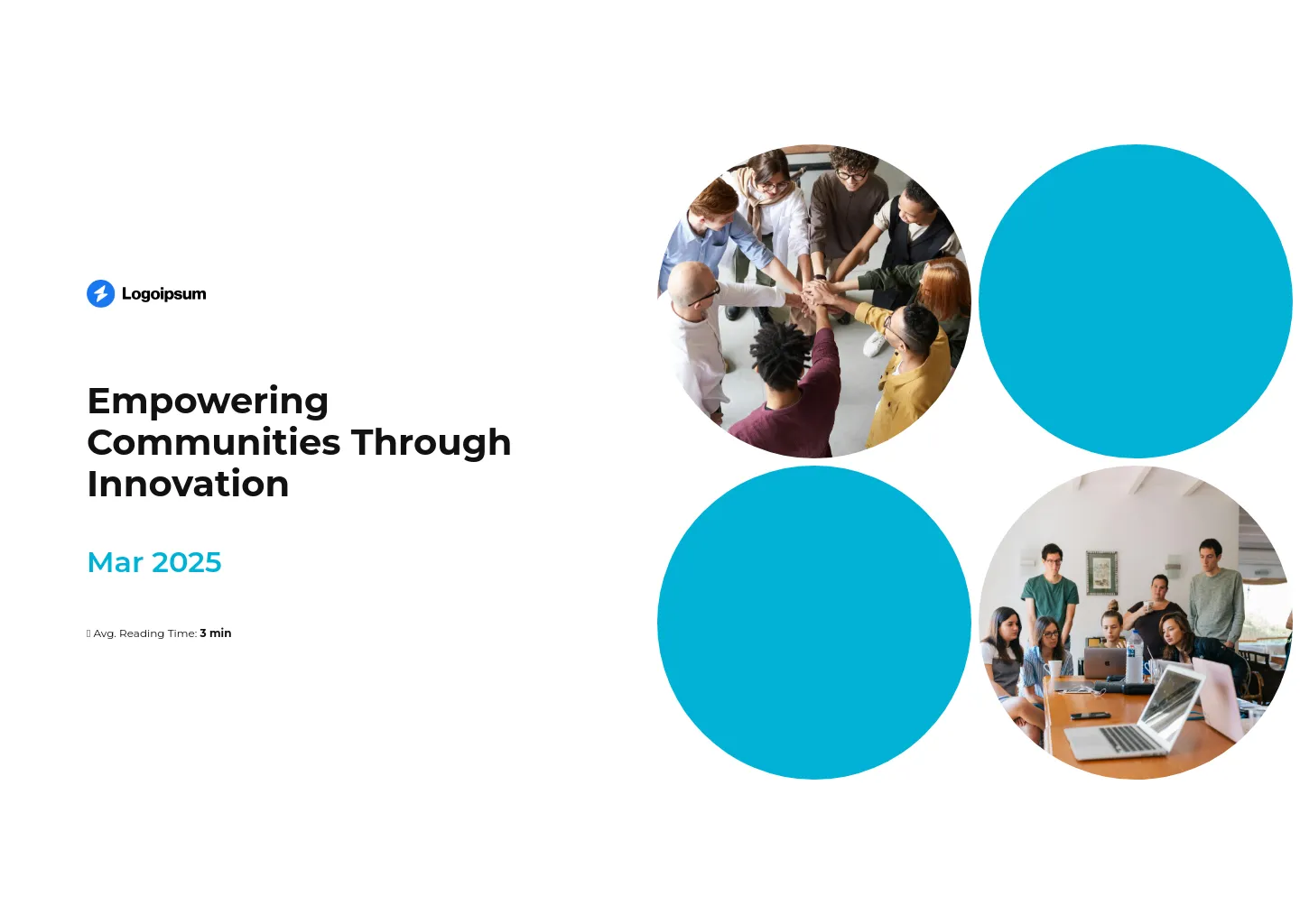
This nonprofit project grant proposal keeps a familiar structure, but adds a few smart features I really appreciate. First off, it actually includes a sustainability plan slide – something a lot of other decks forget but funders definitely look for.
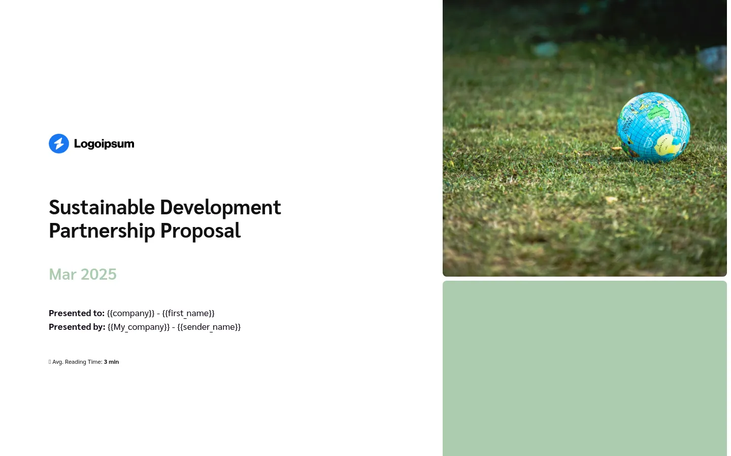
It’s also built for easy personalization, which is a huge win if you’re sending it out to multiple donors. Just drop in tags like {{first_name}} and it’ll feel tailored without you rewriting it ten times.
Another thing I love is that you can password-protect the deck. So if you’re sharing sensitive data or just don’t want it floating around publicly, you’ve got control.
And thanks to the built-in analytics, you’re not pitching into the void – you can see who opened it, how long they spent on each slide, where they dropped off, and whether they clicked through your CTAs.
It gives you the kind of behind-the-scenes intel that’s honestly a game-changer when you’re chasing funding.
Scroll to preview
NGO fundraising sponsorship deck
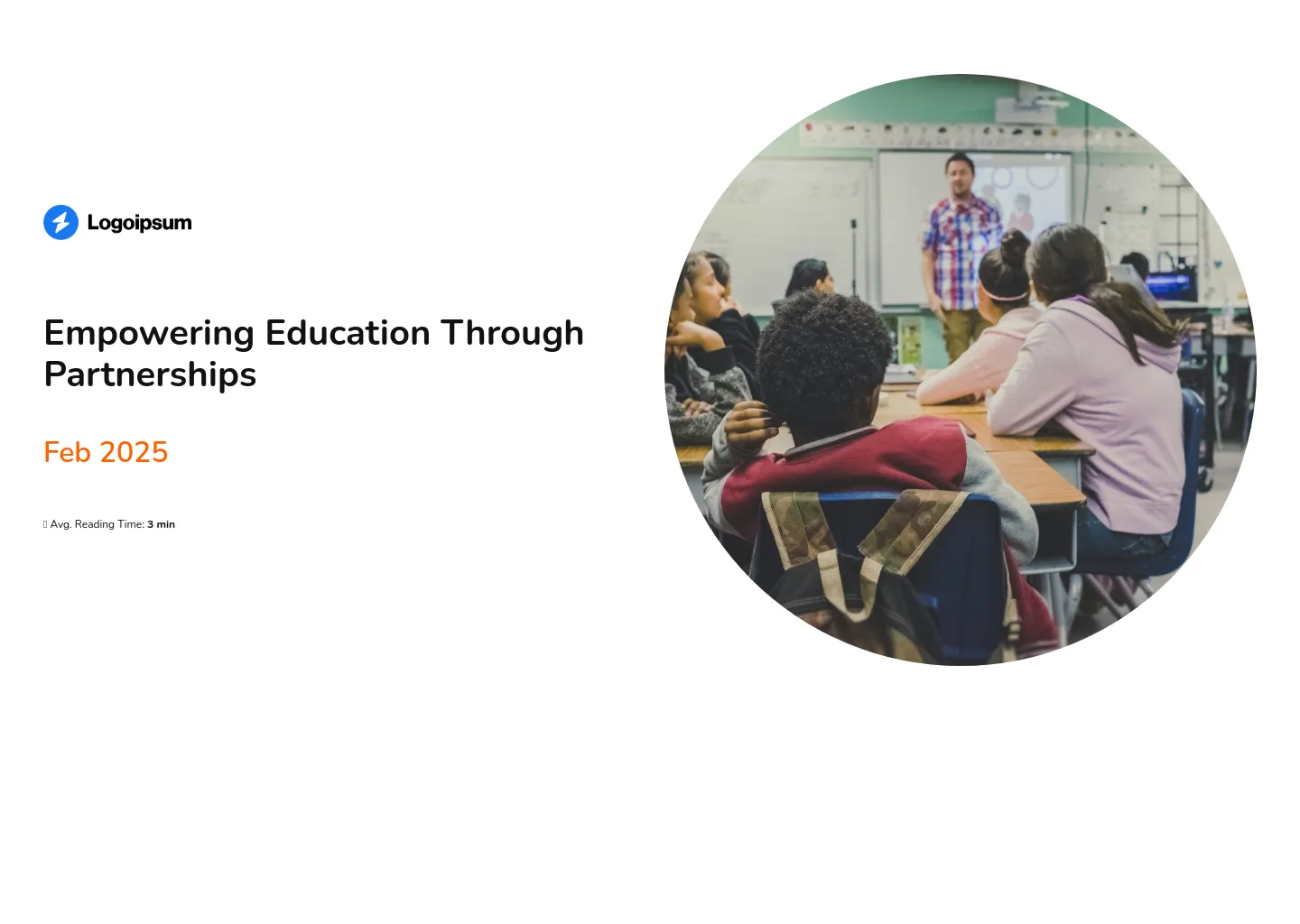
This NGO project proposal example is a bit different – it’s still about partnerships, but the focus here is on fundraising events, not a specific project.
You get a slide that covers all the key event info up top, complete with custom icons. Then the real fun begins: the highlights from past events are shown using scroll-based design.
As you move through the deck, new images and descriptions pop into view, which makes the whole thing feel way more dynamic than dumping everything on the screen at once.
It also looks flawless on any device, which is a must when you’re sending this around to sponsors who might open it on the fly.
And you can collaborate on it in real time with your team – no endless back-and-forths or versioning headaches. Super smooth for big teams juggling a lot at once.
Scroll to preview
Nonprofit project one-pager
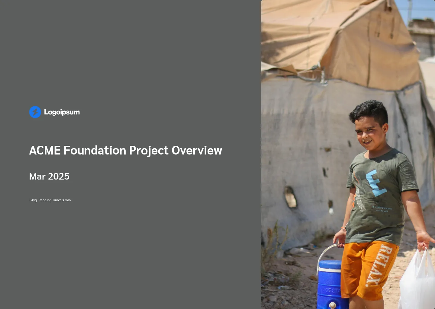
Okay, so don’t let the name fool you – this “one-pager” actually comes with all the slides. But the structure’s light and super flexible, so if you do want to trim it down, you absolutely can.
You can drop in QR codes, link out to extra resources, or add an attachments slide where all the background info can live quietly off to the side.
What I really love is how actionable it is. It ends with an embedded calendar, so if someone’s interested, they can book a meeting on the spot – no extra clicking, no friction.
It’s perfect for early-stage conversations where you’re not pushing the full proposal just yet, but you still want to look sharp and make next steps easy.
Scroll to preview
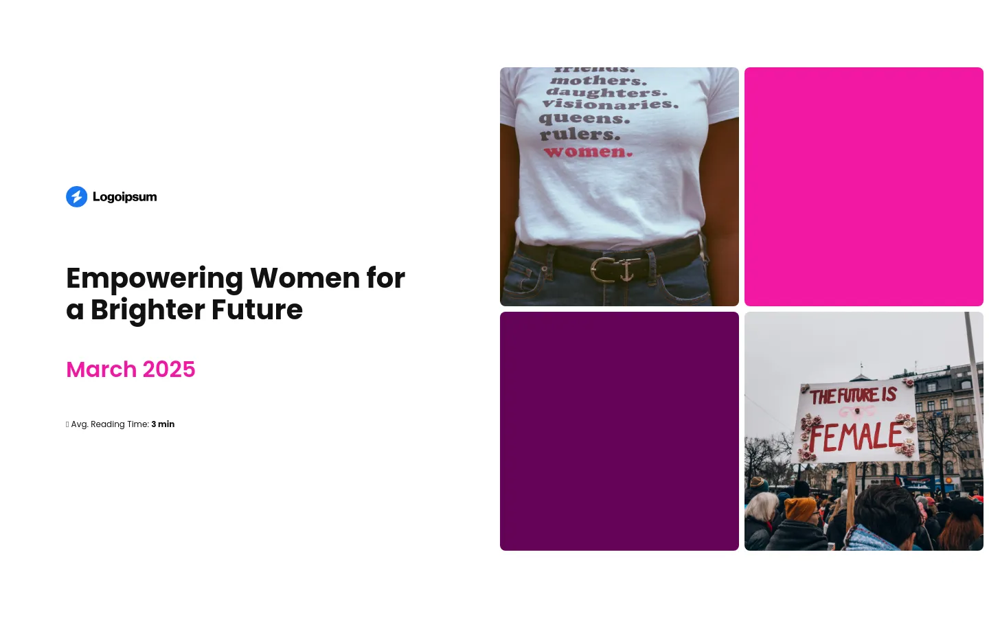
Women empowerment NGO proposal
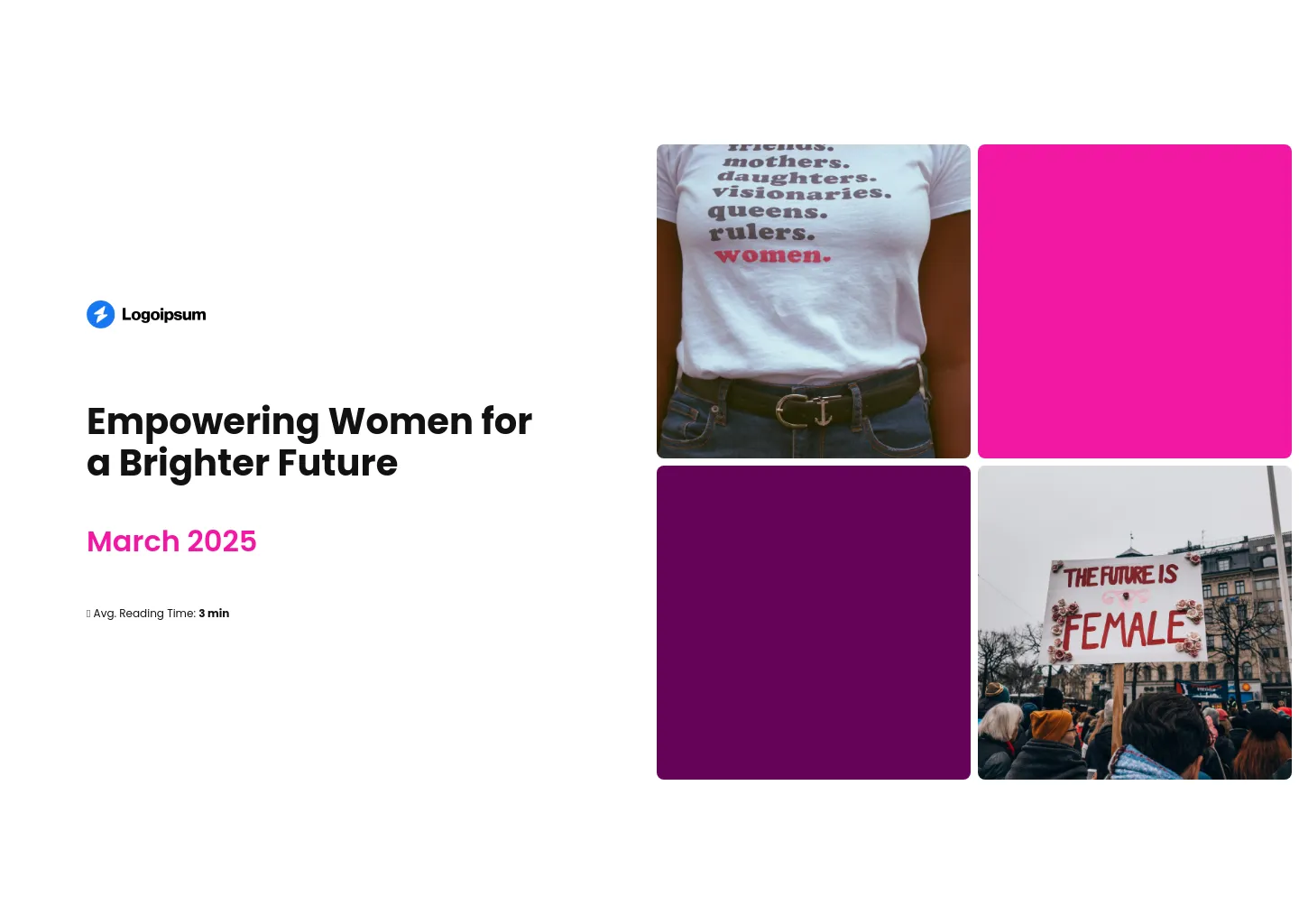
This example of an NGO project proposal isn’t wildly different in structure from some of the others – but I included it because it nails the mission-driven angle.
From the tagline on the cover to the images and the final CTA that reads “Join us in empowerment,” the message is consistent and clear. If you’re speaking to donors who already care about the cause, this one’s going to hit home.
It’s also easy to customize – you can drop in your own content, let the AI assistant help out, or pull text straight from your website or existing docs.
It’s ideal when you want to move fast without losing that personal, purpose-first tone.
Scroll to preview
Use a template to create your NGO project proposal
Writing a project proposal can feel like pulling teeth – especially when the stakes are this high.
You’ve got to convince people to fund your mission, speak to multiple reviewers with different priorities, and present your plan clearly without drowning them in details. And if you miss the mark, that funding might go to someone else.
Interactive NGO project proposal templates are built around the structure that’s worked for other NGOs who’ve secured serious funding. In minutes, you can create something that actually stands out – and makes people want to say yes.
Just grab one.