12 Creative Brochure Design Examples (+Tips & Templates)
Learn how to design a creative brochure that stands out and wins, complete with examples of innovative brochure design and customizable brochure templates.


Learn how to design a creative brochure that stands out and wins, complete with examples of innovative brochure design and customizable brochure templates.
Short answer
Structure your brochure like a story
Let readers explore with tabs and sections
Build movement into your design
Use scrollytelling to guide the journey
Bring your brochure to life with multimedia
Personalize the experience whenever possible
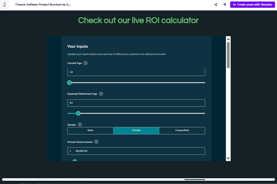
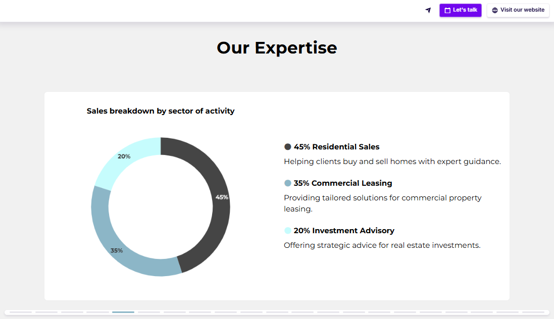
Visualize your data interactively
Design for mobile first
Make it action-ready
Scroll down to read the full guide ⤵
How to segment your brochure content
Use tabs or a side menu to group content into clear categories.
Keep section names simple ("About us," "Our solutions," "Success stories").
Give readers small, satisfying wins at every click - don’t bury key points.
Smart ways to embed multimedia
Add a 30-second intro video where you'd usually write a mission statement.
Embed customer testimonials as short clips instead of plain text quotes.
Let people play with an interactive calculator instead of reading about "estimated ROI."
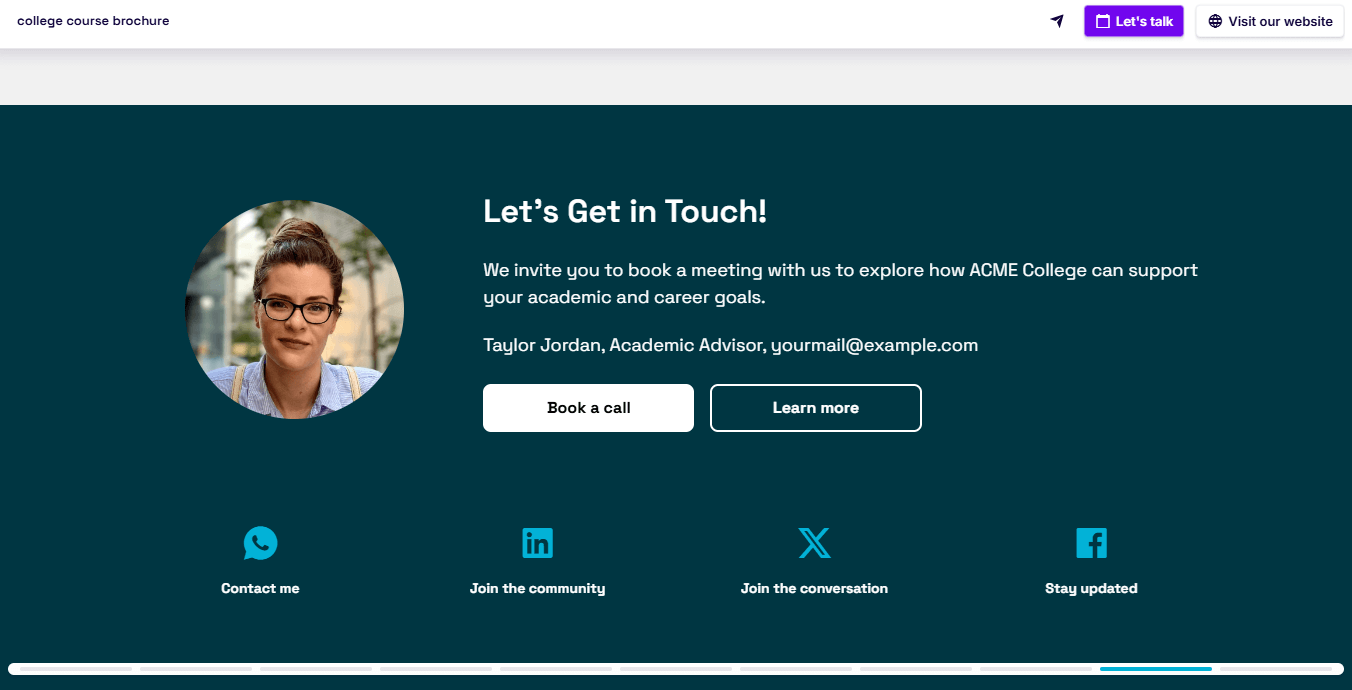
How to personalize your brochure
Include your reader’s name and logo with dynamic variables, not just a generic greeting.
Match their branding automatically by pulling fonts and colors from their website - it shows care without manual design work.
Personalize content paths - offer tailored sections based on industry, needs, or goals.
Stay relevant - feature success stories from companies like theirs, speaking directly to their world.
Examples of CTAs for brochures
Embed a meeting calendar (e.g., Calendly) so prospects can book straight from your deck.
Offer downloads (like whitepapers or product guides) with a click.
Send readers to try a product or browse your portfolio - no clunky typing needed.
Enable payments directly from your brochure when it fits the flow (for example if you’re promoting a ticketed event).
Stop losing opportunities to ineffective presentations.
Your new amazing deck is one click away!