




Best Product Demo Presentation Examples to Show Value
Learn how to make a product demo presentation that stands out and shows your product’s value, and get customizable product demo presentation examples.
Set as Preferred Source
What is the purpose of a product demo presentation?
- Show how the product solves a specific problem: The prospect already knows their pain points – you’re there to prove your product is the fix.
- Highlight must-have features in a real-world flow: Instead of walking through buttons and menus, you show how someone would actually use the product to complete a task or solve a problem.
- Shorten the sales cycle: A clear, targeted demo helps eliminate doubt and gets decision-makers to yes faster.
- Onboard or activate free users: Some demos aren’t for selling – they’re for showing new users how to actually use the thing they signed up for.
- Convince technical stakeholders: Sometimes you’re demoing to someone who’ll never touch the product – but they’ll block the sale if it doesn’t meet security, integration, or performance expectations.
- Make your product feel real: Especially in early-stage sales, a slick demo makes your solution tangible – even if the full product’s still in development.
- Show value to investors or partners: Demo decks aren’t just for prospects. They’re also used to communicate product vision and traction in a pitch setting.
What does a product demo presentation look like?
For years, product demos meant one of three things: a live walkthrough over a screen share, a generic pre-recorded video sent to everyone, or a bloated PDF that felt more like a manual than a pitch.
None of those formats were built for engagement – and they definitely weren’t built for flexibility.
Now, companies are switching to interactive demo decks. These are web-based presentations you can send out, screen-share live, or tailor for different prospects.
You can personalize the content, embed videos, use narrated design that walks the viewer through the product step by step, or even let them try out parts of the product – like an interactive ROI calculator or guided product simulation.
It makes your demo more memorable, more convincing, and way more likely to turn interest into action.
Here’s what an interactive product demo presentation looks like:
Scroll to preview
Product demo presentation examples that close deals
Your product demo is often the very first time someone sees your product in action – so how you present it matters. If the flow is clunky, the interface looks overwhelming, or the story’s unclear, that first impression might be the last.
This is even more important when you’re selling a high-ticket product. The more expensive the solution, the more prospects need to feel confident before they commit.
A strong demo helps you shape the narrative, highlight the value, and show the full range of problems your product can solve – even the ones they didn’t know they had.
Below, I’ve pulled together a few product demo presentation examples that do it right. Take a look, grab inspiration, and if one catches your eye, you can use it as a template to build your own.
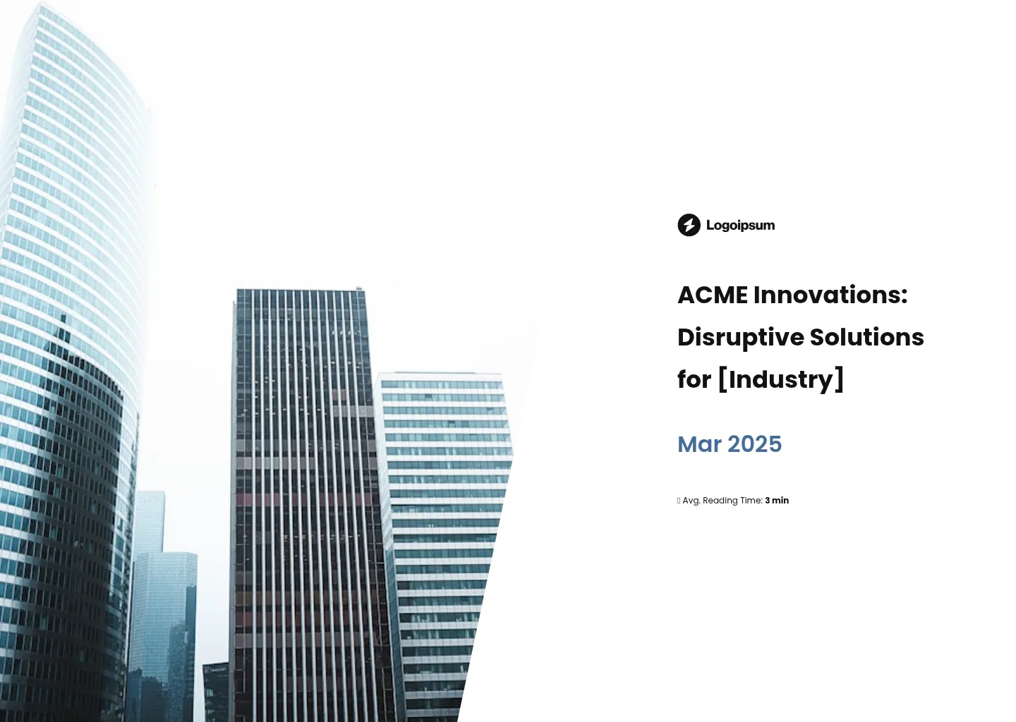
Finance software product demo by GBST
This is hands down one of my favorite product demo presentations, and for good reason.
First off, it’s built for easy personalization – you’ve got a {{company}} tag right on the cover.
If you’re sending demos to multiple clients, you can connect the editor to your CRM and have each one feel tailor-made without lifting a finger.
What I really like, though, is how it walks you through the product using a clean, scroll-based layout.
As you move down the deck, new screenshots appear alongside short, clear descriptions of what you’re looking at. It’s intuitive and easy to follow – no guessing what’s what.
And then comes the best part: once you’ve seen how it works, you can actually test out the calculator directly in the deck. It’s a great format for products that are easy to understand but still need that hands-on moment to really land.
Scroll to preview
SaaS product demo by Yotpo
This software demo presentation from Yotpo is another solid example of a product presentation .
It kicks off with a short embedded video that plays right in the deck, which I love – because let’s be honest, nobody wants to read a wall of text when they can watch it instead. It’s quick, clean, and fits how people actually consume content now.
The walkthrough that follows is just as well thought out. You get clear explanations of key features, each paired with screenshots so you’re never left wondering what you’re looking at.
It doesn’t oversell or overexplain – just gives you what you need, including a few key metrics shown through running numbers that quite literally rise in front of you. Simple, effective, and a nice visual touch.
One more thing I like: there’s a customer quote, but if you want more proof, you can click through to read the full case study. You decide how deep to go, which is exactly how a modern demo should work.

Scroll to preview
Cybersecurity product demo by nSure
This deck’s a bit different – it’s more of a one-pager than a full product demo, which actually makes it perfect for early-stage conversations or outbound efforts where you just need to give someone a quick sense of what the product does.
It’s super lean, with a simple breakdown of how the solution works – just enough to spark interest without going into the weeds.
If someone wants the full picture, there’s a button to book a call right from the deck. You can also embed links to extra resources if you want to offer more detail without crowding the page.
What I really like is how easy it is to make it look like it came straight out of your brand book. You can plug in your colours, fonts, and logo, and everything adjusts automatically so it all feels cohesive.
And if you ever need to update something – say, a feature name changes or pricing shifts – you can just swap it out and the deck will update instantly for everyone who has the link. No resending, no awkward follow-ups.

Scroll to preview
Product demo presentation by WiseStamp
This deck was originally built as a sales proposal – but it’s such a good example of what a personalized product demo can look like that I had to include it here.
What makes it work is how tailored it feels from the very first slide.
It opens with a short note that references a previous conversation, followed by a signature that’s filled in with the recipient’s details – name, job title, company, all of it. No need to imagine how it would look. It’s right there in front of them.
Another smart move is that the benefits are segmented by department using clickable tabs.
So if you’re selling to a team where marketing, HR, and IT all need different things, each person can quickly find what’s most relevant without scrolling through stuff that doesn’t apply to them.
And of course, it’s got built-in analytics. You can see who opened the deck, how long they spent on each slide, what they clicked on, and where they dropped off.
It’s ideal if you want to A/B test different versions or figure out exactly where prospects are getting stuck.

Scroll to preview
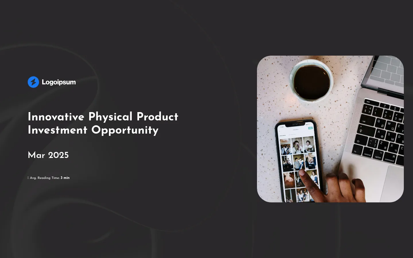
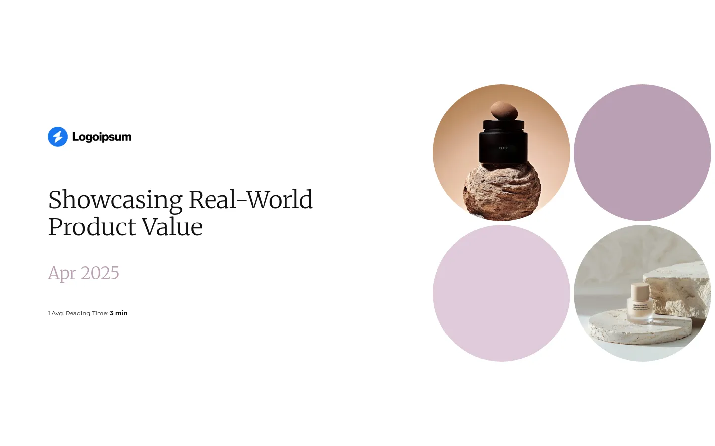
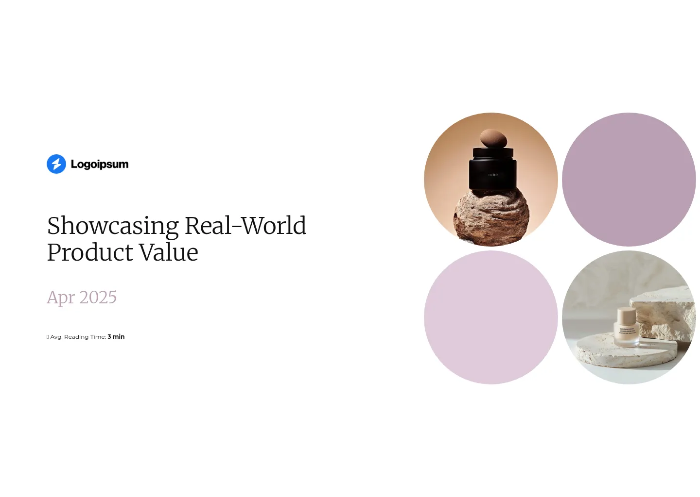
Physical product demo presentation
This one’s a great fit if you’re demoing a physical product – there’s a solid balance of text and visuals, which means you’re not just telling people what your product does, you’re actually showing it.
You can embed high-quality images or short videos to highlight the product from every relevant angle or show it in action, which makes a huge difference when they can’t hold it in their hands.
There’s a team slide in there too – not always essential for this kind of deck, but the good thing is you can easily add or remove slides from the library and everything will adjust to the layout, so you’re not stuck trying to redesign anything.
I also think an FAQ slide could work really well here, especially if you tend to get the same questions during demos.
And the fact that you can collaborate on the deck in real time with your team is super helpful too – especially when multiple people are working on different parts of the pitch.
Bonus points for the multiple smart CTAs, including social media links with custom icons. It makes it really easy for prospects to check you out, follow along, or dive deeper – without needing to ask for a follow-up link.
Scroll to preview
Modern product demo presentation
The final product demo presentation is perfect if you’ve got a more detailed product demo to deliver – especially when there’s a lot of information to take in.
It opens with an executive summary that summarizes the problem and solution right up front, so anyone reading it knows exactly what they’re getting into from the first slide.
I also really like how it uses grayed-out content to guide your attention. You’re not left guessing where to look – each section fades in at just the right time, keeping the flow smooth and focused.
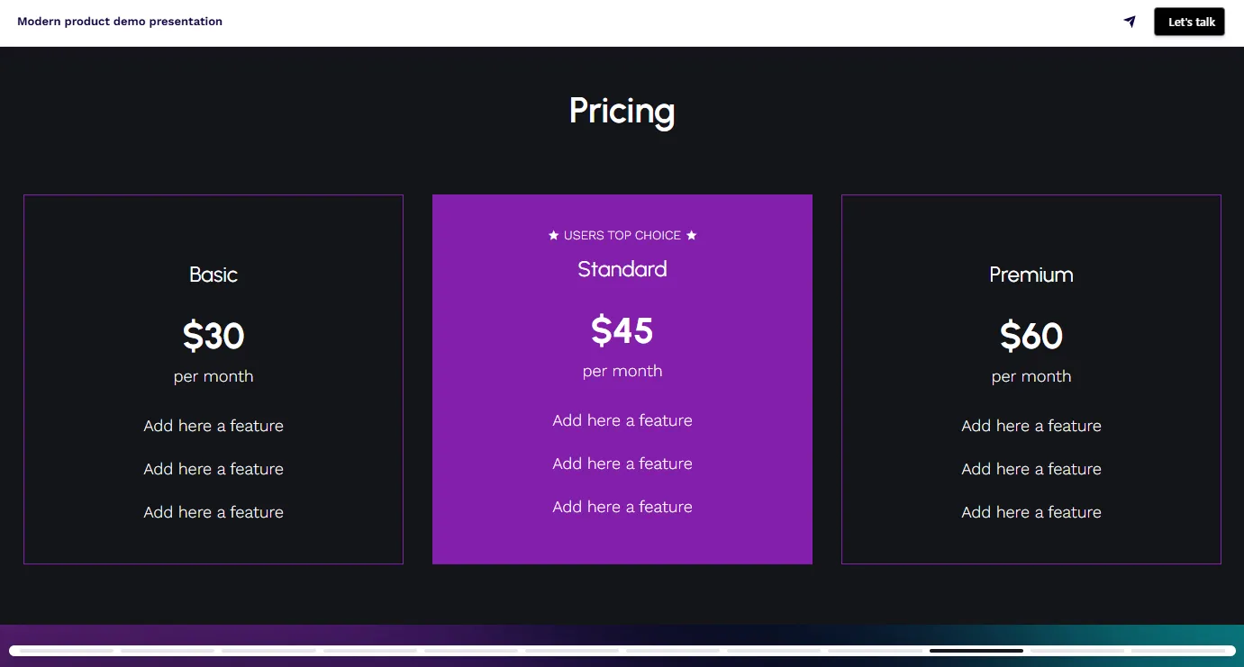
The pricing slide is also spot on. It clearly presents the different packages and what each one includes, but if you’ve got more to say, you can easily tuck in a “read more” button to keep things clean.
And no matter where your prospect opens it – mobile, tablet, or desktop – it looks sharp and holds together. No pinching, zooming, or broken layouts to worry about.
Scroll to preview
What to include in a product demo presentation?
- Cover slide
- Executive summary
- Problem overview
- Product introduction
- Key features and benefits
- Real-life use cases or scenarios
- Customer quotes or testimonials
- Pricing or packages
- Call-to-action (e.g. book a call, start a trial)
How to write a product demo presentation
Let’s be honest: unless you’re selling some ultra-specialized, category-defining tech, there are probably hundreds of other tools that claim to do what yours does. The competition is fierce – and you don’t get a second shot at a first impression.
If your product demo is confusing, dull, or too generic, you’re done. The prospect won’t ask for clarification – they’ll just move on to the next tab. But if you get it right? You become the benchmark.
Let me show you how to create a product demo presentation that’s sharper, clearer, and more convincing than 99% of your competitors.
1) Do your homework on the prospect
Before you build anything, open some tabs and start digging. A solid product demo isn’t just about rattling off features – it’s about showing the right features to the right person. And you can’t do that if you have no idea what they’re struggling with.
Find out what tool they’re currently using (if any), what their main pain points are, who’s involved in the decision, and what kind of language they use to describe their problems.
This will shape everything – from the examples you give to the features you emphasize.
If you’re flying blind, you’re just hoping something lands. With research, you’re guiding them straight to “yes.”
- Their current setup: Are they using a competing product? Doing things manually? Complaining on LinkedIn?
- Pain points: What’s slowing them down? What’s costing them time, money, or sanity?
- Decision-makers: Will this deck be passed around? Do you need to win over IT, finance, or operations too?
- Their goals: Are they looking to scale, save, automate, modernize, or all of the above?
- Their words: Mirror their tone and language to stay on the same page.
2) Cover slide
This slide may only get a glance – but if it’s confusing, vague, or missing key info, that’s the impression you’re starting with. Make it clear what the deck is, who it’s for, and who it’s from.
Use your logo, their name or company if you’re personalizing, and a short subtitle or tagline that hints at the value or solution inside.
If you’re using a live link (and you should), you can also add a subtle animation or hero image to make it feel more polished.
- Keep the title specific: “Demo: [Product Name] for [Client Name]” works better than “Product Overview.”
- Add context with a subtitle: Something like “Optimizing your workflows with [Product]” helps set the scene.
- Include your logo + theirs (if relevant): Adds a personal touch and signals you’ve done your homework.
- Don’t clutter: This slide isn’t where the magic happens. It’s just the front door – keep it clean.
3) Executive summary
This is where you explain what problem your prospect is facing and how your product solves it – without diving into features or technical details just yet.
Keep it short, sharp, and focused on what they care about. This isn’t a background story or a timeline of your company’s success. It’s a “why this matters to you” slide.
Think of it like a teaser for the rest of the demo – enough to spark interest, but not so much that they skip ahead looking for the good stuff.
- Start with the problem: One sentence that shows you understand their pain (bonus points if it sounds like something they’ve said).
- Follow with the solution: A quick, no-nonsense line about how your product solves it.
- Add a result or outcome: Give them a glimpse of what success looks like. Think in terms of time saved, processes automated, or money not wasted.
- Keep it tight: Aim for 2–4 lines, max. You’ll get into the details later – this is about getting them to care.
4) Problem overview
This is your moment to show you get it. That you understand exactly what’s holding them back, where the friction is, and what’s at stake if they don’t fix it.
It should feel familiar to them – as if you’ve been sitting in on their internal meetings.
Don’t go generic here. “Manual processes slow teams down” doesn’t mean anything. Be specific. And if you’ve done your research, this should be easy. Show you’re not just selling something – you’re solving their problem.
- Start with the pain: What’s costing them time, money, or energy right now?
- Use their language: If they call it a “workflow bottleneck,” so do you.
- Back it up with data if you’ve got it: Even one stat or real-world example can go a long way.
- Keep it sharp: This isn’t the origin story of the entire industry. Stick to the problem your product actually solves.
5) Product introduction
The product introduction slide is where you answer the one question your prospect is quietly asking: “What exactly is this thing, and why should I care?”
Avoid walls of text or a laundry list of features – make it a clear, confident intro that connects your product to their world.
Remember, you’re not pitching yet – you’re positioning. What is the product, who is it built for, and what kind of problems does it tackle best? Get that across quickly, and they’ll be ready to see more.
- Use one sentence to explain what it is: For example, “X is a reporting platform built for marketing teams drowning in spreadsheets.”
- Name the audience: Make it clear who the product is made for – so they know they’re in the right place.
- Hint at the value: You don’t need full ROI stats here, but give a sense of the transformation. “From 10 tabs to one dashboard” is better than “centralized reporting.”
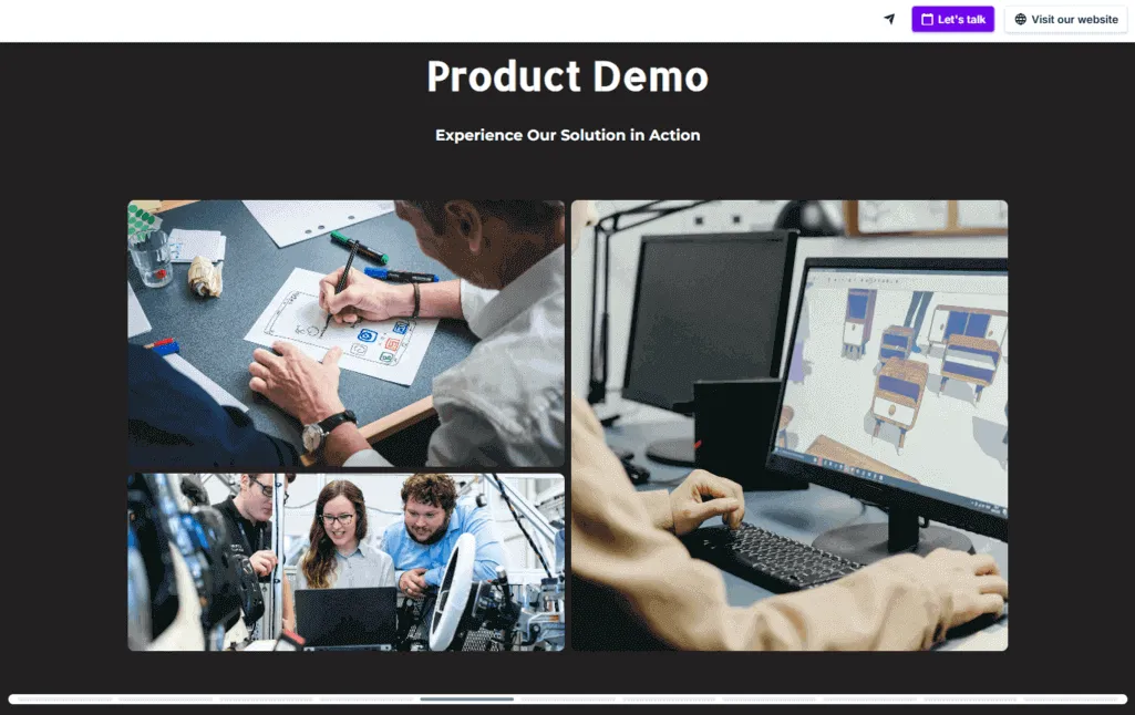
- Add multimedia: A short demo video or looping GIF can go here if it helps make the product feel real from the start – especially if it’s physical or visually impressive.
6) Key features and benefits
This is the meat of your product demo presentation, but don’t mistake it for a checklist.
Your job here isn’t to cover every single button your product has. It’s to highlight the features that matter to them, and show how those features translate into real, useful outcomes.
That said, it’s totally fair game to show off a few extra things they didn’t know they needed – especially if they save time, reduce busywork, or automate something they didn’t even realize could be automated (hello, AI).
The trick is to keep it relevant, not random.
- Tie each feature to a benefit: Don’t just say “automated alerts.” Say “automated alerts so your team never misses a deadline again.” Even better if you can quantify it – “saves 3+ hours a week per user” hits harder.
- Prioritize based on their pain points: If they struggle with manual reporting, lead with your dashboard – not your integrations.
- Show, don’t list: Use visuals, screenshots, or short videos to demonstrate features in context.
- Keep the scope tight: Skip anything that doesn’t apply to this prospect or use case – it’ll only dilute the impact and feel generic. If you still want to cover more ground, you can link out to extra resources or include attachments, and let the prospect decide how deep they want to go.
7) Real-life use cases
This is where your product stops being a list of features and starts feeling like a real solution.
Use cases help people picture themselves using your product in their day-to-day work.
The key is to ground it in reality. Don’t go for some abstract, idealized flow that no one actually follows. Keep it close to how their team operates.
If you’ve done your research, this should feel like a natural extension of their current process – just better.
- Mirror their workflow: Walk through the product as if they were using it – not just “here’s what it does,” but “here’s how you’d use it.”
- Tailor the story to their role: A sales leader wants different things than an ops manager. Choose your lens wisely.
- Keep it simple, not simplistic: Don’t overload the slide with every possible scenario. Focus on 1–2 strong examples that show the value clearly.
- Bonus: Use tabs or sections to let users explore different roles/use cases if the deck will be shared internally. This helps keep everyone engaged without crowding the main flow.
8) Customer quotes or testimonials
You’ve walked them through the product. Now let someone else back you up.
A great testimonial can do what a dozen bullet points can’t – it builds trust. It shows that real people, with real problems, got real results.
Keep it short, specific, and relevant. And don’t bury it. If it’s strong, it deserves to be seen.
Bonus points if you pair the quote with a headshot, company logo, or – if you want to go the extra mile – a link to a full case study for those who want to dig deeper.
- Keep it focused: Choose quotes that highlight a specific benefit or success – not vague “We love it!” praise.
- Make it relatable: Ideally, use a quote from someone with a similar role, company size, or industry.
- Give them a next step: Add a button that says “Read the full case study” or “Watch the full interview.” Let them explore further on their own terms.
- Style matters: Use clean formatting and avoid cramming the quote into a cluttered slide. Let it breathe.
9) Pricing
This is where a lot of demo presentations either get vague or overwhelming. You don’t need to break down every cent – but you do need to give people a clear idea of what they’re signing up for.
No one wants to sit through a full demo just to hear, “Let’s discuss pricing on a call.”
Show the options in a way that’s easy to scan and compare. Help them understand which package fits their needs, and what they’re getting in return.
If it’s more complex, use visuals or “read more” buttons to keep the layout clean while still giving them the detail they need.
- Keep the structure clear: Use columns or a simple table to show what’s included in each package.
- Call out the differences: Don’t make them hunt for what’s “Pro” vs “Basic” – highlight the value upgrades.
- Use plain language: Skip jargon like “Premium onboarding enablement.” Say “Done-for-you setup.”
- Let them explore more if needed: Add expandable sections or links to a full pricing page if your structure’s too detailed for one slide.
- And if you really can’t show pricing yet: Be transparent. Say “Custom pricing based on usage” and offer a CTA to get a quote.
10) Call to Action
Here’s where most decks fall flat. You’ve just walked someone through the entire product, they’re nodding along… and then the deck ends with a polite “Thanks.” That’s not a CTA – that’s a full stop.
Your job here is to tell them exactly what to do next. Don’t leave them guessing. Whether you want them to book a call, start a trial, or share the deck with a colleague – make it easy, obvious, and actionable
- Book a call (with an embedded calendar right there in the deck – don’t make them leave to find a time)
- Start a free trial
- Try the live ROI calculator
- Share this with your team
- Visit our product page
- Download full pricing breakdown
- See customer success stories
Bonus points for giving options. One CTA is good. Two or three tailored ones? Even better. And don’t forget – you can add custom social media icons so people can follow, message, or research you further, depending on where they hang out.
Create your product demo presentation from a template
You’d think creating a product demo would be simple – until you’re 10 slides in, still wondering how to explain your product without boring people, confusing them, or listing out features like a spec sheet.
You spend hours structuring the story, hunting for screenshots, and trying to make it all look halfway decent… and even then, there’s no guarantee it’ll hit the mark.
Interactive product demo presentation templates are built using layouts and flows that actually convert – based on what’s worked for other teams.
They’re ridiculously easy to personalize – you plug in your content, and you’re already showing something better than what 90% of your competitors are sending out.
Just grab one.