This is a preview of your story

Powered by

Storydoc

Airbnb Pitch Deck Made Better (Customizable Template)

Explore our reimagined Airbnb pitch deck: fully editable & ready to use as a template. Learn how to make each slide more effective and ace your next pitch.

Airbnb pitch deck

helped business
professionals at:

Nice Meta RTL Spot Xerox Pepsi

Short answer

What makes the original Airbnb pitch deck so effective?

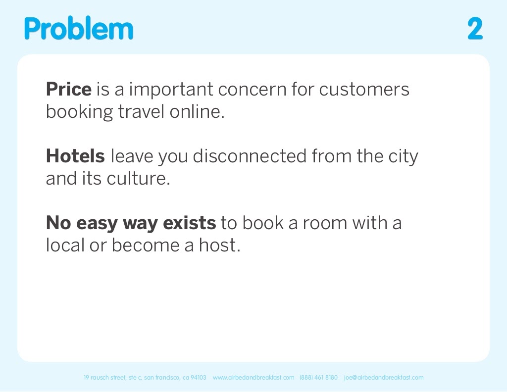
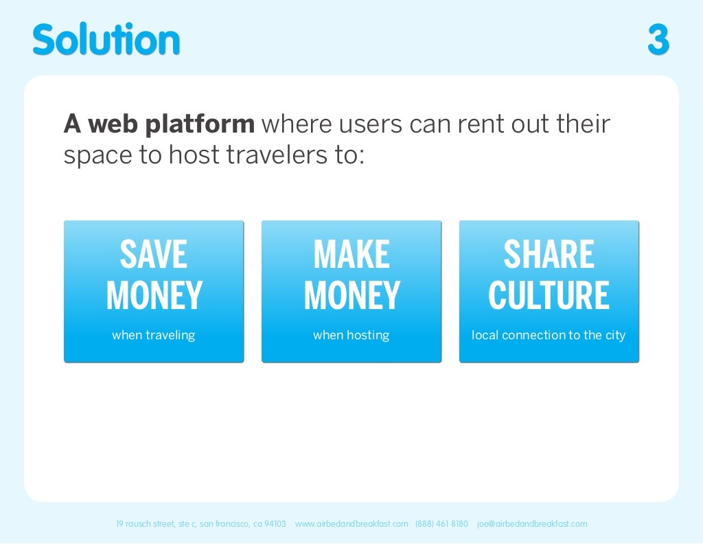
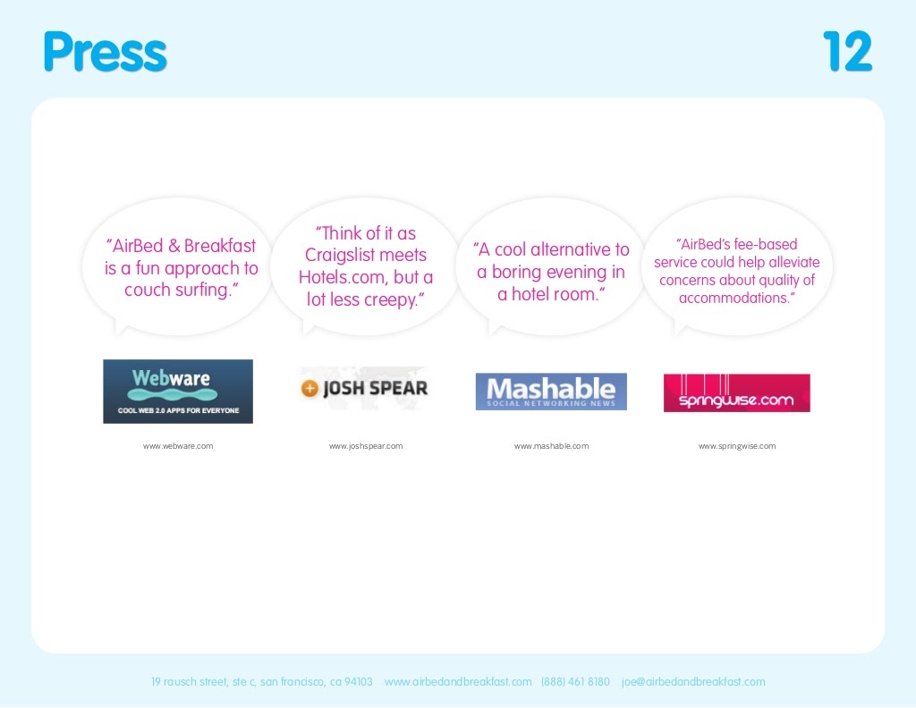
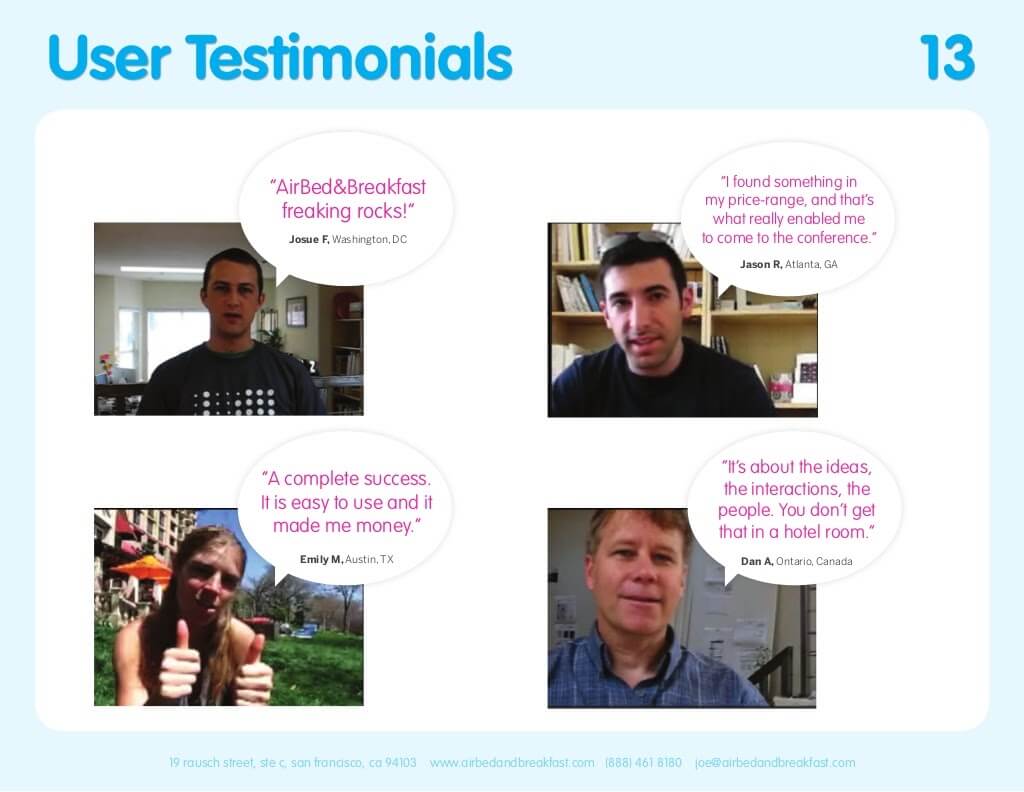
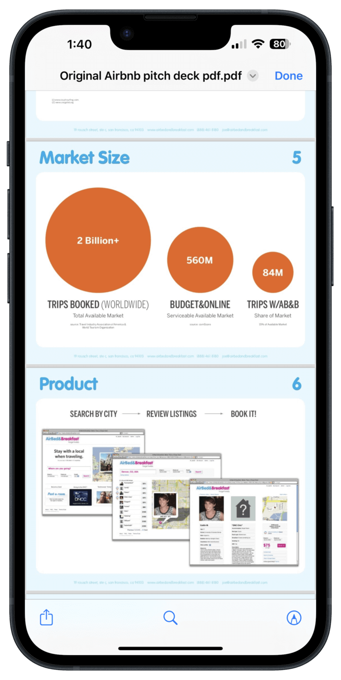
The original Airbnb pitch deck's effectiveness lies in its clear value proposition, compelling storytelling, and concise financial projections. It masterfully balances simplicity with persuasive details, making a strong case to investors while remaining visually appealing and easy to understand.

Airbnb’s storytelling shines, but its presentation style needs a refresh

Everyone loves a good story, and Airbnb's pitch deck is like a masterclass in storytelling for startups. It showed the world how to win over investors with a compelling narrative. But, as times change, so do expectations.

The original Airbnb deck, while groundbreaking, now feels a bit behind the times in terms of design and delivery.

In this blog post, we're going to take a closer look at how we've updated Airbnb's iconic pitch deck to make it more in tune with today's standards.

Let's walk through the transformation of Airbnb's pitch deck, showing you the before and after, and share tips on how you can do the same for your presentation.

Here’s what the original deck looks like (left) compared to its modern version (right):

Static Airbnb pitch deck
Interactive Storydoc remake

Your pitch deck needs to keep the conversation going

Airbnb started with a simple yet revolutionary idea: allowing people to rent out their homes to travelers. This offered a unique and personal travel experience while opening up a new way for hosts to earn extra income.

When they first pitched their idea back in 2009, they did more than share a business plan; they told a compelling story that got them $600,000 in seed funding.

But here's the thing: today, you've got to grab attention fast. Decision-makers are swamped, and your pitch might only get a quick look—think 15 seconds before deciding whether it's worth their time.

Imagine if Airbnb had just emailed their pitch deck and left it at that. It's unlikely they would have seen the same success.

These days, most conversations happen when you’re not there in the room. It's all about making sure your deck continues to speak for you, especially when you're not there to pitch the idea in person.

This is where the magic of a good interactive pitch deck comes in. It grabs people’s attention, yes, but more importantly, it holds onto it, telling your story compellingly enough that it sticks with people long after they’ve finished reading.

Airbnb pitch deck (interactive remake):

Disclaimer: The insights provided here are based on Airbnb's publicly available original pitch deck, which has been remade by the Storydoc team for demonstration purposes only. It does not represent an actual deck used by Airbnb.

How we improved the original Airbnb pitch deck

In this section, I’m peeling back the layers to reveal how we've taken Airbnb's original pitch deck and dialed it up a notch.

From sharpening the narrative to enhancing visual appeal, I’m here to show you the tweaks and twists that can transform a good pitch deck into an unforgettable one, and how you can apply it to your own deck.


1) Cover slide

The original Airbnb pitch deck kicked off with a cover slide that was all about simplicity and getting straight to the point.

Original Airbnb pitch deck cover slide

It had the Airbnb logo and a clear tagline that summed up their whole idea: “Book rooms with locals, rather than hotels”.

This simplicity was its superpower. It grabbed attention by being clear and not overloading viewers with too much from the get-go.

But, most importantly, it invited investors into a story that promised not just a new business, but a new way of experiencing travel.

The Storydoc remake of the Airbnb pitch deck takes this effectiveness to the next level by leveraging modern web capabilities to create a more dynamic and engaging first impression.

Storydoc pitch deck cover slide

Imagine opening the pitch and being greeted not just with words but with a video and images that show exactly what Airbnb is about.

It's like the difference between hearing about a great meal and actually seeing it in front of you — it makes you want to dive in.

Plus, there’s science behind it too — decks with a video on the cover have 32% more people interacting with them as opposed to those with a static cover background.

In addition to the dynamic start, the Storydoc version introduces an "About Us" section right off the bat, giving a quick snapshot of Airbnb's journey from a simple idea to a global community.

Storydoc pitch deck about us slide

This section includes an embedded video directly from Airbnb's YouTube channel, allowing viewers to dive deeper into the company's story with just a click.

The benefits of adding videos aren’t limited to the top part of your presentation. Decks with any video embedded in them enjoy a 37% longer average reading time and a 17% higher call to action click-through rate!

2) Problem slide

For the problem slide, the original Airbnb presentation did a great job of spelling out the main headaches for travelers: steep prices, feeling out of touch with local culture, and the hassle of finding a local spot to stay.

Original Airbnb pitch deck problem slide

It was clear and to the point, setting up nicely for Airbnb's solution to these issues.

In the Storydoc remake, this slide gets a visual boost that really helps drive the message home.

Storydoc pitch deck problem slide

By using grayed-out content, the slide cleverly draws your eyes straight to the key points about travelers' challenges. It's a smart way to make sure you're focusing on what really matters without getting lost in any extra fluff.

And then, there are the icons. Each problem is matched with its own custom icon, making each issue not just something you read about but something you can quickly 'see'.

These icons are neat, simple, and right to the point, acting as a quick visual cue that sticks in your memory.

3) Solution slide

On to the solution slide, where the original Airbnb deck shifted gears to present how they tackle the problems identified earlier.

Original Airbnb pitch deck solution slide

Instead of diving into the nitty-gritty of their platform's features, they zeroed in on the benefits for users: saving money for travelers, earning money for hosts, and fostering cultural connections.

This approach smartly keeps the focus on what users gain, making the value proposition crystal clear.

Our version takes this clarity a step further. By employing custom icons, it makes each benefit instantly recognizable.

Storydoc pitch deck solution slide

Moreover, the use of grayed-out content around these key messages acts like a spotlight, drawing the viewer's attention directly to what matters most.

This design choice simplifies the slide, cutting down on unnecessary distractions and ensuring the focus remains on the benefits Airbnb offers.

80% of people who read the first 3 slides will stick through until the end, so keeping them engaged is crucial.

4) Market validation slide

The original Airbnb market validation slide was a stroke of genius in its simplicity and effectiveness. It showcased solid numbers that proved there was a real, tangible demand for Airbnb's solution.

Original Airbnb pitch deck market validation slide

By presenting data on existing market behaviors, such as the number of listings on competitor sites, Airbnb convincingly argued that people were ready for a new way to travel and host.

It was backed by real-world activity, making their case to investors that much stronger.

Taking this already powerful slide to the next level, we introduced running numbers and an interactive bar chart. This isn't just about showing the data; it's about bringing the data to life.

Storydoc pitch deck market validation slide

The running numbers catch the eye, creating a dynamic experience that draws the viewer in. It's one thing to say a number; it's another to see it count up before your eyes, emphasizing the scale and potential of the market.

The interactive bar chart adds another layer of engagement. Instead of static figures on a page, viewers can interact with the data by hovering over bars to see specific numbers.

This interactivity makes the data more memorable and is a clever way to involve the audience in the story Airbnb is telling.

5) Market size slide

The market size slide in Airbnb's original presentation was a key player in showing just how big the pie was that they were aiming to get a slice of.

Original Airbnb pitch deck market size slide

It laid out the massive potential in the travel market in a way that was easy for investors to understand, highlighting the huge opportunity Airbnb was tapping into.

This slide was all about numbers, but it presented them in a straightforward manner that didn't overwhelm or confuse.

Taking this effective approach up a notch, our remake of the market size slide brings in running numbers while keeping everything looking sharp and clean.

Storydoc pitch deck market size slide

This means that as you're looking at the slide, you see the numbers ticking up, almost like watching a live counter. It's a simple but powerful way to show just how large the market is and how it's growing right before your eyes.

6) Product slide

For the product slide, the original Airbnb deck aimed to showcase how their platform was the solution to the problems they had just outlined. It was all about showing the ease and innovation behind booking a stay or becoming a host.

Original Airbnb pitch deck product slide

This part of the deck was crucial because it moved the conversation from identifying problems to presenting Airbnb's practical solutions.

In the Storydoc version of Airbnb's product slide, the magic of storytelling really comes to life.

Imagine being taken by the hand and led through how Airbnb works, but it's not just a list of steps – it's a story, complete with pictures that make everything pop.

Storydoc pitch deck product slide

Each picture and step unfolds like a chapter in a story, inviting you to picture yourself using the platform. It's like a mini-adventure, from searching for the perfect place to hitting the book button.

Why does this matter? Well, stories stick with us. They're more than just information; they're experiences we can imagine ourselves in. And that's exactly what this product slide does.

By the end, you're not just informed about Airbnb's platform; you're hooked on the idea of being part of this community of hosts and travelers.

7) Business model slide

Diving into Airbnb's original pitch, the business model slide was a key moment, revealing the details of how they planned to bring in cash.

Original Airbnb pitch deck business model slide

They kept it crisp: Airbnb earns by taking a 10% commission from each booking. This piece of the puzzle is vital because it directly addresses what's on every investor's mind: "How will Airbnb make money?"

In the interactive version, the business model slide gets a practical twist with a timeline that shows how Airbnb hit their impressive revenue number.

Storydoc pitch deck business model slide

This approach simplifies the journey to that big revenue figure, making it easy to see just how Airbnb's business model works in action and how those individual fees over millions of stays turn into a substantial sum.

It's a straightforward way to connect the dots from Airbnb's pricing strategy right through to their financial success.

8) Market adoption slide

In the original Airbnb pitch, the market adoption slide was straightforward, outlining their strategies for attracting users and expanding their market presence.

Original Airbnb pitch deck adoption strategy slide

It laid the groundwork by presenting their plans in a clear, no-frills manner, essential for investors to understand how Airbnb intended to capture and grow its user base.

The interactive remake of this slide takes the presentation up a notch by organizing the content into clickable tabs. This interactive feature allows viewers to explore different aspects of Airbnb's market adoption strategies in a more engaging way.

Storydoc pitch deck market adoption slide

According to our research, when compared to traditional, static decks, those with interactive features are scrolled to the bottom 41% more often. Not only that, but they also hold the viewer's attention for 21% longer on average.

This means that by segmenting the market adoption content into tabs, the remake makes the information more accessible while significantly increasing the chances that viewers will absorb all the details.

9) Competition slide

In Airbnb's original pitch, the competition slide was a crucial element, mapping out where Airbnb stood in relation to its competitors.

Original Airbnb pitch deck competition slide

It used a simple matrix to position Airbnb against traditional and emerging players in the travel and accommodation sector.

The remake of this slide enhances competitive analysis by introducing a more dynamic approach. It cleverly uses grayed-out content to spotlight each quadrant of the matrix one by one.

Storydoc pitch deck competition slide

This method guides the viewer's focus through the competitive landscape systematically, ensuring that viewers can fully grasp where Airbnb stands in a crowded market without overwhelming the audience with too much information at once.

10) Competitive advantage slide

In the original Airbnb pitch deck, the competitive advantage slide was straightforward yet effective, listing out the key factors that set Airbnb apart from the competition.

Original Airbnb pitch deck competitive advantage slide

It highlighted Airbnb's unique selling points, such as being the first to market, offering a platform that benefits both hosts and travelers, and creating a community around unique travel experiences.

Building on this solid foundation, our remake of the competitive advantage slide introduces an interactive and focused way to engage with these key points.

Storydoc pitch deck competitive advantage slide

By employing grayed-out content, the remake emphasizes each of Airbnb's competitive advantages one by one, allowing the viewer to concentrate on understanding each point without distractions.

This method effectively draws attention to what makes Airbnb unique in the crowded travel market.

You can further enhance the viewer's experience by including expandable text sections.

This feature allows for a deeper exploration of each competitive advantage without cluttering the slide or bombarding the viewer with too much information all at once.

Viewers can expand these sections at their own pace, diving into the details of how Airbnb differentiates itself in the competitive landscape.

11) Team slide

In the original Airbnb pitch deck, the team slide was pretty standard, showcasing the founders and key team members with brief bios.

It did the job of introducing the brains behind the operation but in a somewhat static way.

Original Airbnb pitch deck team slide

The updated team slide in the Airbnb deck has taken a smart turn by incorporating expandable text sections for each team member.

This clever design choice means you can dive into more details about each person without the slide becoming cluttered with text.

Storydoc pitch deck team slide

12) Press slide

Before its makeover, the Press slide in the Airbnb pitch deck used speech bubbles to showcase quotes, with each bubble linked to banners that named the publications.

While this method effectively highlighted Airbnb's media mentions and built credibility, it did so in a more traditional, static format.

Original Airbnb pitch deck press slide

The deck now features a timeline, making it easy to see Airbnb's journey through the media's eyes. Key words stand out in bold and Airbnb's signature red, thanks to the Storydoc editor's ability to pull branding elements directly from any website in just a few clicks.

Storydoc pitch deck press slide

13) Testimonials slide

At the start, the Testimonials slide in the Airbnb pitch deck took a page from the Press slide's book, using photos of happy customers paired with speech bubbles for their quotes.

This design choice was all about putting real faces to the positive experiences people had with Airbnb, making each testimonial feel more relatable and trustworthy.

Original Airbnb pitch deck testimonials slide

In the updated deck, testimonials have been given their own space, with each quote placed in a separate quadrant. This layout makes it easier to digest each customer's story without mixing messages.

Plus, the option to embed external links to case studies adds an extra layer of credibility and depth.

Storydoc pitch deck testimonials slide

14) Financials slide

In its original form, the Financials slide in the Airbnb pitch deck had a bit of a design hiccup that could lead to some confusion.

The slide aimed to present key financial metrics and projections through a visual format, including bubbles of different sizes to represent various numbers.

However, the design choice didn't quite hit the mark, as the largest bubble wasn't used for the biggest number.

Original Airbnb pitch deck testimonials slide

In the updated version, running numbers bring Airbnb's growth and projections to life. This dynamic element captures attention and makes the financial data more engaging.

If you're looking to present data in a visually appealing way, the deck also offers a variety of data visualization components to choose from.

Storydoc pitch deck financials slide

Bonus features

Beyond the core slides, our team has sprinkled in a handful of enhancements that elevate the original presentation from great to exceptional.

From interactive elements that invite exploration to design upgrades that make every slide pop, we've gone the extra mile to ensure this pitch deck communicates Airbnb's vision in the most compelling way possible.


Responsive design

It's crucial to remember that a good chunk of pitch decks—about one in three—are first opened on mobile devices. This means if your deck isn't built to shine on a smaller screen, you might be waving goodbye to a third of your potential audience right off the bat.

And here's something to chew on: the closer you get to the top of the decision-making chain, the more likely it is that your deck will be viewed on mobile, with almost half of all initial pitches being viewed on the go.

Truth be told, PDFs and traditional slide formats weren't made with the mobile user in mind. They often end up as tiny, cramped text on a phone screen, making them hard to read without a lot of zooming in and out.

This can lead to a frustrating experience where the key points you're trying to make just get lost in the shuffle.

Our new, improved version has embraced responsive design, ensuring that whether your audience is viewing the deck on a mobile phone, tablet, or desktop computer, the layout adjusts seamlessly.

This means no more squinting or zooming, just a smooth, engaging experience that keeps the focus on Airbnb's story, regardless of the device.

Here's the difference it makes:

Static PPT example
Static Airbnb pitch deck
Interactive Storydoc one-pager
Interactive remake

Smart CTA

While the original Airbnb deck was compelling, it left readers at a bit of a dead-end with no clear next step outlined. The new deck changes the game by embedding a calendar directly into the presentation.

Now, after being inspired by Airbnb's vision, readers can immediately take action by booking a meeting right from the deck.

It's a simple yet powerful addition that bridges the gap between interest and action, making it easier for potential partners or investors to connect with Airbnb.

Here's our next step slide:

Storydoc pitch deck next step slide

Analytics panel access

Gaining insights into how the Airbnb pitch was received used to be a bit of a black box, making it challenging to refine and improve the presentation over time.

The new version comes with access to an analytics panel. You're not just sending your deck into the world and hoping for the best; you're getting real-time insights into how your audience interacts with it.

You can see which slides readers linger on, where they drop off, or whether they shared your presentation internally, providing valuable data that can be used to tweak and perfect the deck.

It's a powerful tool that transforms guesswork into informed decision-making, ensuring the pitch resonates as strongly as possible with its audience.

Storydoc analytics panel

Transform your own pitch deck from basic to brilliant

Looking to give your pitch deck a makeover like Airbnb's? You're in the right place!

Explore our wide range of pitch deck templates, each crafted for various scenarios, and find the perfect fit for your story.

Our intuitive editor will guide you through the transformation process, ensuring your deck goes from basic to brilliant in no time.

Or, you could upload your deck and receive advice from our storytelling expert on ways to enhance it.

No templates found
Dominika Krukowska

Hi, I'm Dominika, Content Specialist at Storydoc. As a creative professional with experience in fashion, I'm here to show you how to amplify your brand message through the power of storytelling and eye-catching visuals.

Engaging decks. Made easy

Create your best pitch deck to date.

Stop losing opportunities to ineffective presentations.
Your new amazing deck is one click away!