How to Make a One-Pager That Gets Results (+Templates)

Learn how to create a one-pager that grabs attention and gets results. Find out what to include in a one-pager, get best practices, and grab a template.

How to write a one-pager

helped business
professionals at:

WorkDay IHeart Meta Nice American Cancer Society Xerox

Short answer

What makes an effective one-pager?

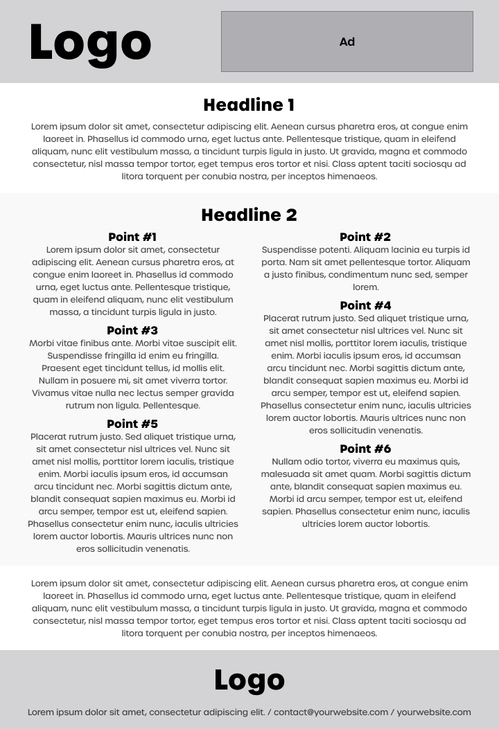
The best one-pagers are personalized, easy to skim, and end with a clear next step. Good one-pager design keeps things clean and readable - use plenty of white space, keep text short, and lean on visuals, videos, or simple data to help tell the story.

Read on to see how it's done step-by-step ⤵

What does a one-pager look like?

Traditionally, a one-pager was a tightly packed PDF loaded with text and barely any breathing room. The idea was to squeeze as much information as possible into a single A4 page.

But these days, that format just doesn’t cut it. People aren’t printing things out - they’re scanning on their phones, jumping between tabs, and losing interest fast. Static one-pagers make it harder to hold attention and even harder to drive action.

Modern one-pagers are built for how people actually consume content now.

They’re interactive, lightweight, and built around storytelling - using video, visuals, and simple navigation to communicate value quickly and make it easy for people to take the next step.


Here’s what a modern interactive one-pager looks like:

Here’s what a legacy one-pager looks like (yikes!):

legacy static pdf one-pager

How to write a winning one-pager step-by-step

Just because a one-pager is a short document doesn’t mean it will be easy or quick to produce.

On the contrary, boiling down your entire business vision into a single-page document requires careful thought, planning, and effort.

A poorly executed one-pager will turn off potential customers before you’ve had a chance to dive deeper into your unique value proposition.

Let’s walk you through the process step-by-step so you’ll avoid common mistakes.

I’ll show you what a successful one-pager should contain and how each section should look.

NOTE: If you’re looking for inspiration rather than a practical guide, go check out out one-pager examples.

What to include in a one-pager?

  1. Cover slide

  2. Personal note

  3. Who we are

  4. Problem

  5. Solution

  6. How it works

  7. Benefits

  8. Next steps

1) Cover slide

Your cover slide is the gateway into your content. If it’s not immediately clear and valuable, there’s a good chance your reader will move on.

A cover slide works a lot like the “above the fold” section of a sales landing page. This is where people decide whether to keep reading or not - so it needs to earn their attention fast.

Your cover slide is also your first impression by which the rest of your one-pager will be judged. Thankfully, there are things you can do to hook readers, make a strong positive first impression, and enhance the overall reading experience.

How to create an effective one-pager cover slide

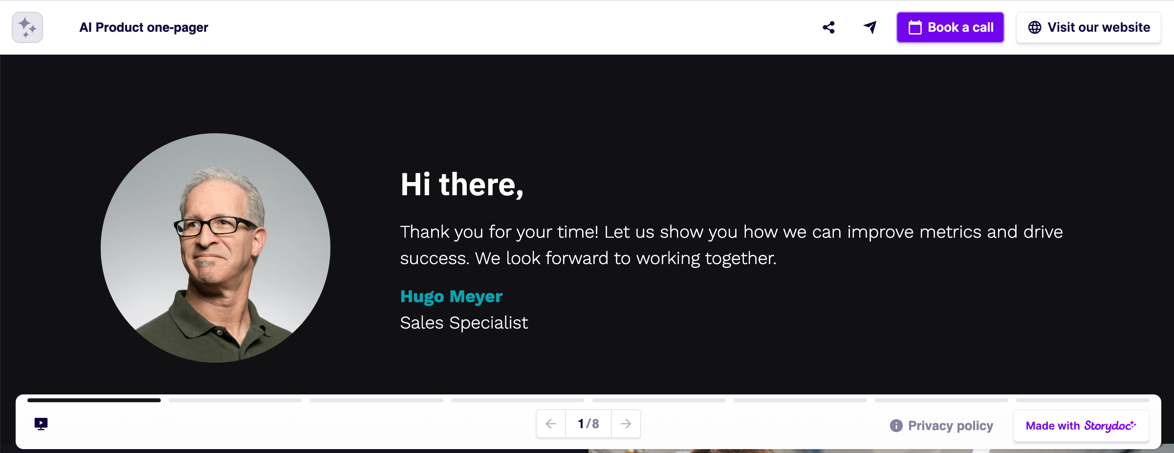
I) Use a cover video

We’ve all heard the saying “a picture is worth a thousand words” more times than we can count. And yes, it’s a cliché - but it’s also backed by science.

So how many words is a video worth?

According to Dr. James McQuivey’s research, roughly 1.8 million. And that was back in 2008 - before the most popular video-streaming services took off and video became the go-to format for everything from learning to buying. It’s probably double that now, if not more.

We also ran our own study, focused specifically on sales and marketing presentations. After analyzing over 100,000 user sessions, we found that adding a video to the cover slide increases interaction by 32%.

It’s one of the simplest ways to show off your product or service without overwhelming your reader with facts and text. Just hit play and let the video do the work.


II) Deliver a refined Unique Value Proposition

Your UVP (Unique Value Proposition) is your one-liner. It’s the clearest, simplest way to say what you do, who it’s for, and why they should care.

Use your cover title and subtitle to deliver it. This is prime real estate - don’t waste it trying to be clever. Just be clear.

If you don’t have a UVP yet, this is your sign to sit down and write one. It makes everything else - your messaging, your structure, your value - fall into place.


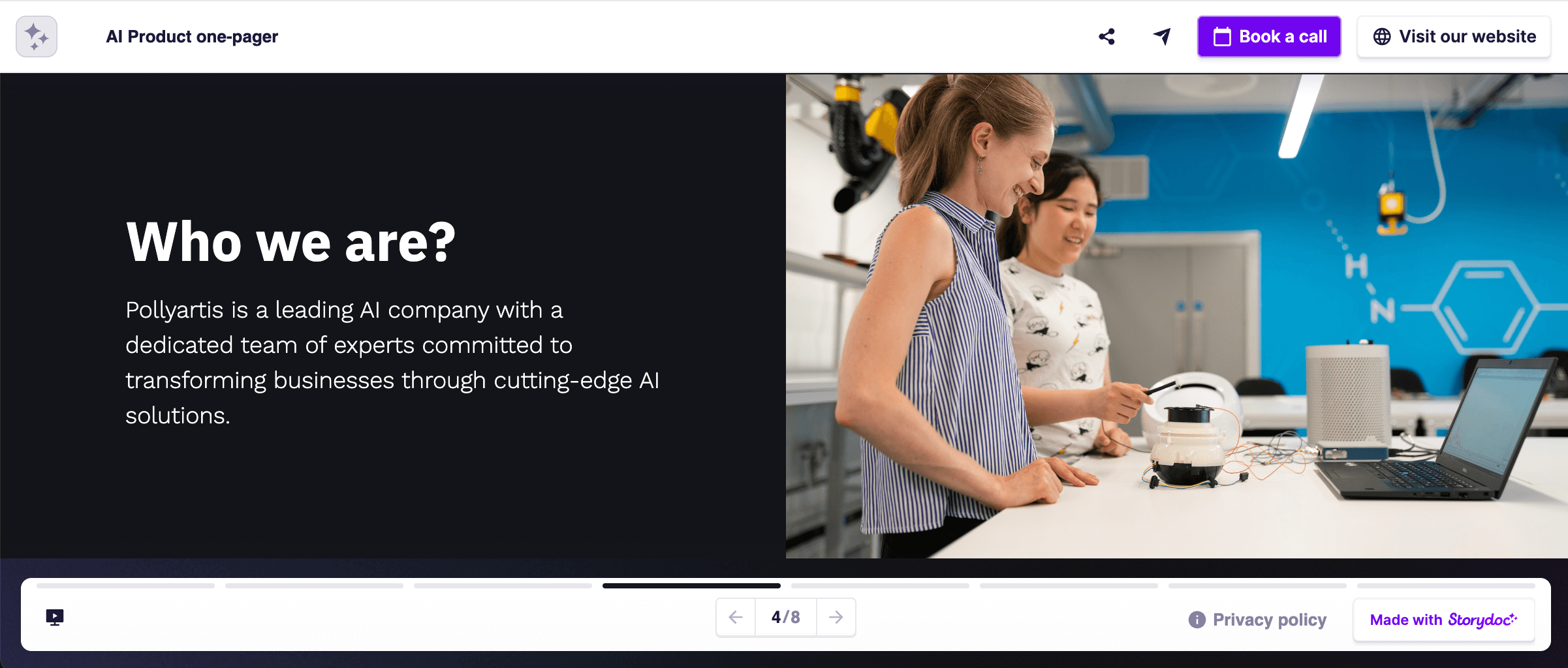
III) Personalize for person, company, and need

One of the biggest drivers of engagement is simple: personalization.

We all like to feel seen. So when your one-pager mentions someone’s name, company, or specific goal, they’re instantly more likely to pay attention.

It doesn’t have to be complicated or time-consuming. If you’re using Storydoc, you can personalize your one-pagers at scale in seconds - just drop in dynamic tags and hit send. It feels personal on their end, even if it took you 10 seconds.


IV) Set the reader’s expectations

There’s a reason more and more articles now include reading times.

When people know upfront how little time something will take, they’re much more likely to stick with it. It’s the not knowing that makes them hesitate.

That’s why adding a quick note like “Average reading time: 2 minutes” at the top of your one-pager can make a real difference. It removes the mental barrier and can increase completion rates by up to 25%.

one pager cover slide

2) Personal note

The personal note is your opportunity to humanize your one-pager. By personally addressing the person by name, you make your one-pager feel warmer and not part of yet another mass outreach.

The personal note also acts as an informal introduction to the document. Use this space to provide a warm, personal context - like referencing a recent chat, a shared challenge, or how you understand their current situation - so they feel seen, not sold to.

Keep the tone conversational and empathetic. It’s about creating emotional engagement and trust right from the start.

If done right, a short note like this can significantly boost the chances they’ll actually read your one-pager - and stay engaged while they do.

one pager personal note introduction slide

3) Who we are

The who we are slide is crucial for establishing a measure of trust.

If someone’s going to seriously consider what you’re offering, they’ll want to know who they’re dealing with. A quick overview of who you are helps them feel more at ease and more willing to keep reading.

The reader will want to know basic things like where you’re headquartered, what you specialize in, what your values are, and what sets you apart.

Keep it short and engaging. Provide enough information to get your readers interested, but leave a little room for curiosity. That space opens the door to future conversations.

one pager who we are slide

4) Problem

In this section, your goal is to address a real pain point your audience is struggling with - something they recognize instantly. This sets you up to position your offer as the solution.

Start by tapping into the emotional side of the problem. Show your readers that you truly understand what they’re going through - speak to their frustrations, fears, or goals in language they’d use themselves.

Then back it up with one or two strong data points. People often make decisions emotionally, but they use numbers to justify them.

TIP: Framing the cost of not taking action is often more effective than highlighting what they’ll gain by making the change (e.g. “Every day you lose $X in missed revenue”). That’s because people are more motivated by loss aversion than by the promise of gain.

one pager problem slide

5) Solution

If your description of the problem hits the mark, practically and emotionally, and you’ve built a solution tailored to the problem, it’s time to argue that your solution is the best fit.

Keep the description high-level and easy to grasp in a few moments: for instance, use a simple headline or statement of your solution’s core approach, and perhaps a supporting visual (like a screenshot, brief demo clip, or before-and-after graphic) to make it concrete.

Focus on the outcomes you can bring. Use data visualization elements to present ROI or significant uplift in KPIs for past clients.

Avoid talking about features, and avoid heavy technical language or industry jargon. People unfamiliar with your solution won’t bother to make sense of any of it.

one pager solution slide

6) How it works

This section should give your reader a clear picture of what it’s like to work with you - from first contact to delivery.

Walk them through the key steps they can expect: onboarding, timelines, implementation, and what’s needed from their side.

Then outline what they’ll get in return - specific deliverables, access, or outcomes. The goal here is to manage expectations and reduce uncertainty.

NOTE: This part will cover dramatically different things for different types of one-pagers. A product one-pager does not offer the same deliverables or experiences as a marketing services one-pager, or an event one-pager.


For example, a product one-pager might focus on setup and usage, while a services one-pager will likely outline your process and scope. An event one-pager could explain registration, preparation, or what’s included on the day.

one pager how it works slide

7) Benefits

The benefits section answers the most important question your reader will have - “What’s in it for me?”. Benefits should embody your reader’s goals, needs, or wants.

Make the benefits as concrete and tangible as you possibly can.

Don’t make your readers work hard to understand what they stand to gain. Make it something you know they prize, and use their own language to describe it.

Aim for 3-5 core benefits, ranked by what this reader cares about most. This not only appeals to logic (hard results) but also to emotion – you’re painting a picture of a better future for them.

Ensure the layout is scannable (bullet points or icons per benefit) so these rewards leap off the page, making the decision to engage feel like a no-brainer.

How to present benefits persuasively

Change takes time and effort. Change is scary.

Because of the risk involved in change, many people would rather take no action at all, even if the current situation leaves them deeply unsatisfied.


I) Be specific and concrete when describing your benefits

Give specific numbers, timelines, and deliverables. Being concrete removes uncertainty but also shows that you are committed and accountable.

For example, “We offer 24/7 service and maintenance. You can take comfort in knowing that our highly trained and experienced group of experts is always ready to assist you with any technical issues. For the first 3 years, we will cover any cost of repair not caused by misuse of the product.”


II) Make “no change” scarier than change

In order to make the argument for change, your reader must come to the conclusion that NOT making a change presents a greater risk than making it.

Give prospects a clear overview of the losses they’re going to incur by not making the switch.

Quantify the approximate opportunity cost of taking no action to make them arrive at the conclusion that change is necessary.

one pager benefits slide

8) Next steps

If you did your work well, then your one-pager has managed to create motivation for change in your readers. That was the hard part.

But now your readers are primed to take action, and the only thing that’s missing is a button to nudge them in the right direction.

Tell them what they should do now if they want to proceed.

Your next steps should be a small act of commitment on their part, nothing too demanding. Deals hardly get closed directly after reading a one-pager, the point is getting a conversation started.

How to nail your one-pager next steps


I) Don’t conclude, and don’t say “thank you”

Ending your one-pager or presentation with a “thank you”, or a “conclusion” slide will kill your efforts to maintain a relationship with your reader. It creates a hard stop right when they're most primed for action.

If you don’t end your one-pager with a clear and easily accessible call-to-action, all the effort you’ve put in so far will be lost.


II) Don’t be shy - put up call-to-action for all to see

Getting your reader to take action is the whole point of your one-pager, right? So don’t be subtle about it.

Make your call to action clear, direct, and easy to find. Whether it’s booking a call, signing up, or downloading something - your reader should know exactly what to do next.


III) Don’t be pushy - ask for a small concession

Aim for a small but meaningful concession on the part of your reader. This is what Neil Rackham, the author of Spin Selling, calls the advance.

The principle is that as long as you get a commitment from your reader for further interaction, you’re still in the game, and in a better position to provide them with more value and ultimately make a deal.

Next steps you can use

  • Schedule a meeting

  • Schedule a demo with your sales team

  • Sign up for a free trial of your product or service

  • Get a sample of a product or good

  • Read a white paper

  • Read a case study

  • Join a webinar

  • Read an article on your blog

  • Sign up for an email crash course

  • RSVP for a local event

  • See a virtual tour of a location or property

one pager next steps slide

Create your one-pager from a template

Figuring out what to include in your one-pager is tricky enough. Add to that the pressure of structuring it all in a way that flows and converts, and it quickly becomes more time-consuming than it needs to be.

To make things easier, I’ve put together a gallery of interactive one-pager templates that already follow the best practices we’ve covered here, so all you need to focus on is your content.

These templates were built based on what we’ve seen work time and again for our clients, and they can do the same for you.

Just grab one.

No templates found

One-pager tips that give you the edge

If the slide-by-slide breakdown gave you the structure but you’re still after that extra why-it-works insight - this part’s for you.

These best practices go a bit deeper and cover the small details that can make a big difference in how your one-pager is received.

Think of this as your cheat sheet for standing out, building trust faster, and getting more people to actually take action.

1) Keep a narrow focus

As the name suggests, a one-pager should be short and concise.

It can be tempting to pack all the value you provide into your one-pager, but that defeats the purpose of a one-pager.

Focus on what matters most to your audience. Leave the rest out. Your one-pager should contain a comprehensive value proposition. Nothing more, nothing less.

This is especially true for companies offering a wide spectrum of products or services. You’ll never fit them all in a single one-pager.

Instead, create separate one-pagers for each category of products or services that you offer. Increase engagement, reduce confusion, and save your readers’ time by only presenting the offer that’s relevant to their needs.

2) Be stingy with text and data

Nothing kills engagement faster than walls of text or dense tables.

If your reader has to work to understand what you're saying, they’ll likely bounce before they get to the good stuff.

Instead, focus on clarity over quantity. Use short, punchy sentences and highlight only the most relevant data - enough to build trust and curiosity, not overwhelm.

Let visuals, short videos, or interactive charts do the heavy lifting. They help explain complex ideas in seconds and make your one-pager far more engaging to skim, scroll, and remember.

one-pager infographics

3) Tell a compelling story

Structure your one-pager like a mini story, not a list of disconnected facts.

The classic arc works for a reason: context → problem → solution → benefits → next steps. Each part sets up the next so the reader always knows where they are and why it matters.


The best one-pagers answer two questions from the start:

  1. Why should I care?

  2. Why should I work with you?


Make every sentence, visual, graph, or video pull its weight. Think of them as bricks building a clear, persuasive path toward your value.

When your reader can follow along without effort, they’re far more likely to keep going - and take action at the end.

4) Use a brain-friendly structure

Your one-pager should be easy to read, easy to follow, and easy to act on.

Cognitive science backs this up: when we break down information into small, related chunks, it’s easier for people to process and remember. Short paragraphs, bullets, and section breaks all help reduce mental load.

Interactive formats let you take this further with progressive disclosure - revealing extra info only when someone wants it (like expanding a “read more” section or clicking to view specs).

That way, your one-pager stays clean and focused, while detail-hungry readers can dig deeper without feeling overwhelmed.

interactive one-pager design

5) Guide toward one clear action

Avoid decision fatigue.

If your one-pager presents too many options or asks for multiple actions, readers are more likely to do… nothing.

Instead, guide them toward one clear next step and make it easy to take. When people know what matters and what to do next, they’re far more likely to stick around - and convert.

You can include multiple CTAs, just make sure it’s obvious which one is primary - any others should feel clearly optional, not competing for attention.

6) Make your one-pager mobile-friendly

The main purpose of creating a one-pager is to save your busy prospects time, so it’s also important to ensure they can view it on the go.

We all read our news, emails, and content on our mobile, so why not your one-pager?

Especially knowing that almost 50% of one-pagers are opened on mobile devices.

By making one-pagers that are unavailable or hard to read on mobile you’re practically losing every other person you send your one-pager to. It’s scary to think about, isn’t it?

And if you’ve ever had to pinch and zoom your way through a static PDF - practically cursing at the screen - you know exactly how frustrating that is.

Don’t put your prospects through the same pain. Make sure your one-pager works beautifully on any screen.

mobile friendly one-pager

7) Personalize at scale

As your prospects will get swamped with dozens of similar-looking one-pagers, you need a powerful tactic to stand out in a sea of competitors.

People can smell generic messages from a mile away. That’s why personalization has been a leading part of email outreach tactics for a while now.

And now you can use the same practice you use in email in your one-pagers using dynamic variables. If you’re using Storydoc, that is.

This simple fix will get 68% more people to read your one-pager, increase the average reading time by 41%, and cause your one-pager to be shared internally 2.3x more often.

sales deck personalization

8) Analyze one-pager performance

Creating your one-pager is not a one-off job. You can always do better. And this is where one-pager analytics comes in.

If you use Storydoc’s analytics panel, you can easily get deep insights into your one-pager performance:

  • How many people viewed your one-pager
  • How many times it was shared internally
  • How much time people spent reading it
  • Which slides they interact with the most
  • Where they stopped reading
  • What readers clicked on
  • Where in the world your one-pager was opened

With this kind of data, you’re not left guessing what’s working - you’ll know.

You can make informed tweaks, improve over time, or even A/B test different versions until you land on what gets the best results.

how to track a pitch deck

The easiest way to make an effective one-pager

You can build a one-pager using a standard website builder - but chances are, you’ll spend way too much time wrestling with tools that weren’t made for the job.

Website builders are great for, well, websites. But when it comes to creating sharp, persuasive sales and marketing one-pagers, they often come with too many options, too much setup, and not enough guidance.

A dedicated one-pager builder, on the other hand, won’t complicate things but rather do all the heavy lifting for you. It will apply best practices by default so you can focus on your message.

Storydoc was built specifically for one-pagers like the ones we’ve walked through here. It makes it easy to create something beautiful, engaging, and effective - without needing design or tech skills.

Try Storydoc free for 14 days. Make as many one-pagers as you like - whatever you build during your trial is yours to keep forever.

Dominika Krukowska

Hi, I'm Dominika, Content Specialist at Storydoc. As a creative professional with experience in fashion, I'm here to show you how to amplify your brand message through the power of storytelling and eye-catching visuals.

Engaging decks. Made easy

Make your best one-pager to date.

Stop losing opportunities to ineffective one-pagers.
Your new amazing deck is one click away!