This is a preview of your story

Powered by

Storydoc

How to Make Effective Impactful Presentations (Tips & Tools)

Learn how to make a good presentation great - step-by-step with examples. Learn the principles, guidelines & qualities needed to prepare captivating slides.

Dominika Krukowska

12 minute read

How to make good presentations
Trusted by top companies:
client logo: meta
client logo: RTL
client logo: Yotpo
client logo: NetApp
client logo: healthy.io
client logo: deliverlight

Short answer

Short answer: How to make a good presentation

  1. Start with a surprising statement, a bold promise, or a mystery

  2. Provide context with a bit of background information

  3. Structure your presentation within a story framework

  4. Make every word count, and use as few as possible

  5. Use visuals only to support your presentation text

  6. Use interactive design to make your audience active participants

  7. End by telling your audience what they can do with what they’ve learned

Boring presentations are instantly forgotten. How’s yours?

Lifeless presentations can spell doom for your message, leaving your audience disengaged and your goals unreached.

The price of a mediocre presentation is steep; missed opportunities, unimpressed prospects, and a bad rep.

In a world where everyone has grown to expect a good story, a boring presentation will be instantly forgotten. Like a drop in the ocean.

But not all is lost.

This post will teach you how presentation pros create compelling narratives and leverage the latest tech tools to command attention, drive a powerful message, and get shared like gossip.

Let’s get started!

How to prepare a presentation?

The successful presenter understands the value of small details and thorough preparation like the seasoned chef knows the importance of quality ingredients and careful technique for serving a 5 star dish

But where do you start?

Step-by-step guide for preparing a presentation:


1. Define your objective

Every presentation needs a clear goal. Are you looking to persuade, educate, or motivate? Perhaps you aim to showcase a product, or share insights about a recent project.

Defining your objective early on will guide your content creation process, helping you to focus your message and structure your presentation effectively. Think of your objective as the North Star guiding your presentation journey.


2. Analyze your audience

Next up, who are you talking to? Your audience should shape your presentation as much as your objective does. Understanding their needs, interests, and background will enable you to tailor your message to resonate with them.

Are they experts in your field, or are they novices looking for an introduction? What questions might they have? The more you know about your audience, the more compelling your presentation will be.


3. Research your topic

Once you've defined your objective and analyzed your audience, it's time to delve deep into your topic. Comprehensive research lays the groundwork for a robust, credible presentation.

Don't just scratch the surface – explore different perspectives, recent developments, and key statistics. This will not only enhance your understanding but also equip you with a wealth of information to answer any questions your audience might have.


4. Choose the right delivery format

Finally, consider the best format to deliver your message.

The right format can make all the difference in how your message is received, so choose wisely!

PowerPoint presentations are classic and easy to work with. But PowerPoint and Google slides are not so versatile in terms of their content experience. They're static, packed with information, and all look alike.

Our own presentation maker offers interactive, personalized, and multimedia content experience.

Data from our research of over 100K presentation sessions shows that audiences engage with Storydoc presentations 103% better than PowerPoint.

Static PDF or PPT
Interactive Storydoc

How to create an effective presentation?

There’s part art and part science in creating high-engagement high-impact presentations.

An effective presentation is the painstaking result of well-organized content, visuals that support and elevate your message, simplifying complex information, and personalizing wherever possible.

I wrote this post to teach you how to do all these, and a few things more.

Ready to learn? Let's dive in!

How to organize your presentation content?

Crafting a compelling presentation is like writing a page-turner.

You need to captivate your audience, maintain their interest, and guide them effortlessly through your narrative.

But how do you transform a heap of information into a well-structured presentation you can’t stop reading? There’s a structure you can follow.

3-step process for organizing a magnetic presentation:


1. Prioritize content

Your presentation should immediately capture interest and demonstrate relevance before moving on to establish understanding.

A) Build interest:

Begin with a strong hook that grabs your audience's attention. This could be an intriguing statistic, a powerful image, or an engaging question. It should stir curiosity and make your audience eager to hear more.

B) Establish relevance:

Once you have their attention it's time to establish why your presentation matters to your audience.

Address your audience's main concerns. Make sure your content directly speaks to these pain points, and address them in order of importance.


2. Build anticipation

A great presentation is like getting a new car – it builds anticipation, takes you on a thrilling ride, and ends with you wanting to share the experience with all your friends.

Start with a compelling problem your audience relates to and follow up with a promise of an amazing way they can solve it. This problem-solution dynamic creates a suspense that keeps your audience glued to your presentation.


3. Use a story framework

Finally, use a story framework to give your presentation structure and flow.

Begin with a big idea that underpins your presentation. Then delve into the problem, showcasing why it needs attention. Present your solution, painting a vision of a better future for your audience.

Weave in concrete examples of how your solution changes lives.

Tell the story of WHO you helped, WHAT the situation was before and after your solution, WHERE and WHEN it happened, WHY it worked and HOW it made them feel.

If you’re writing a business presentation you should follow this with an execution plan that outlines how the solution will be implemented.

Finally, close with clear next steps, guiding your audience on what they should do after the presentation to bring meaningful change into their lives.

Our recommended story framework:

How to write a presentation storyline that creates interest

How to design your presentation?

A good presentation is more than just making it look pretty; it's about communicating your message effectively and creating a lasting impression.

Good presentation design grabs attention, and leads it to where it’s needed most. It takes your hand and leads you through the easiest and most pleasant path to understanding.

Good presentation design supports your message rather than steals the spotlight. Good design is narrated design.


What is narrated design (Scrollytelling)?

Scrollytelling, where "scroll" meets "storytelling", is an interactive content experience that guides readers through a narrative journey with a simple scroll. It connects text, images, videos, and animations into integrated “scenes” where content is both shown and narrated.

Scrollytelling breaks complex content into digestible chunks and gives the reader control over pace. It has been scientifically shown to enhance engagement, understandability and memorability.

Scrollytelling came up as a central thing when Itai Amoza, our Founder and CEO was building the foundations for Storydoc.

He partnered with one of the world’s leading visualization scientists, prof. Steven Franconeri, to help him bring to Storydoc the means to reduce the complexity, friction, and information overload so characteristic of business presentations.

Scrollytelling is part of the solutions that came up, which led to specialized storytelling slides like our narrator slide (in the example below).

An example of Storydoc scrollytelling:

Narrator slide example

How to design presentation visuals to support your story

Presentation visuals can be unsung heroes or sloppy distractions.

Visuals can bring your message to life, make complex concepts easy to understand, and engage your audience in ways that words alone cannot. Or… they can sit there looking all pretty and distract you from what’s really going on.

4 elements of great presentation visuals:

  1. Support your message: Your visuals should support your text, highlight your main message, and align with your objective. They should reinforce your points and help your audience understand your message.

  2. Represent your audience: The best visuals are relatable. They should resonate with your target audience and reflect their world of associations. Use images and graphics that your audience can identify with – this can enhance their engagement and make your presentation more memorable. Equally important is using clean images - an effective way to do this is by using tools that allow you to remove your image backgrounds. By eliminating distractions and focusing on your subject, you create images that are more impactful and, therefore, can potentially increase audience engagement.

  3. Introduce your product, outcomes, and clients: Wherever possible, use visuals to demonstrate your product, illustrate outcomes, and represent your clients. This can remove doubt and misunderstanding by letting your audience see (and make obvious) what words sometimes struggle to describe.

  4. Follow your branding guidelines: Your presentation is an extension of your brand, so your visuals should conform to your branding guidelines. Consistent use of colors, fonts, and styles not only enhances brand recognition but also creates a cohesive, professional look.


Here’s an example of a well-designed presentation:

How to communicate complex information?

Did you ever have to read a presentation where you felt like you're lost in a maze of jargon, data, and complex concepts?

Are you giving others this same experience?

Communicating complex information is a common challenge in presentations. But there are ways you can simplify your presentation and reengage your audience.

Here’s how you can get complex information across:


1. Use interactive content

Interactive content is your best friend when it comes to simplifying complex information and getting deeply engaged with your content.

It gets the readers more involved in your presentation by letting them play an active part; like choosing the content route they wish to take and controlling the pace.

It keeps your presentation textually lean - giving readers the choice to expand more details on demand (in tabs, live graphs, sliders, accordions, and calculators).

Beyond that, live graphs can illustrate trends, animations can demonstrate processes, and videos can bring concepts to life.

Calculators, questionnaires, and chatbots provide personalized and specific answers to readers as part of your presentation, without them having to get in touch with you or your team.

Elavating your presentations from static to interactive has been tied to increasing the number of people who read your presentation in full by 41%!

Making interactive used to be hard, but now you can just use Storydoc. Go make your first interactive presentation. It’s easy as pie.


2. Show don’t tell

A picture is worth a thousand words. Because no one will read a presentation with a thousand words, do everyone a favor and use images.

Images can be super effective at communicating complex information and save you a lot of needless text.

In fact, visual representation of data and concepts can often convey what words cannot. Use diagrams, infographics, and images to illustrate your points and simplify the complex.

The goal is to create a visual narrative that complements your verbal one.


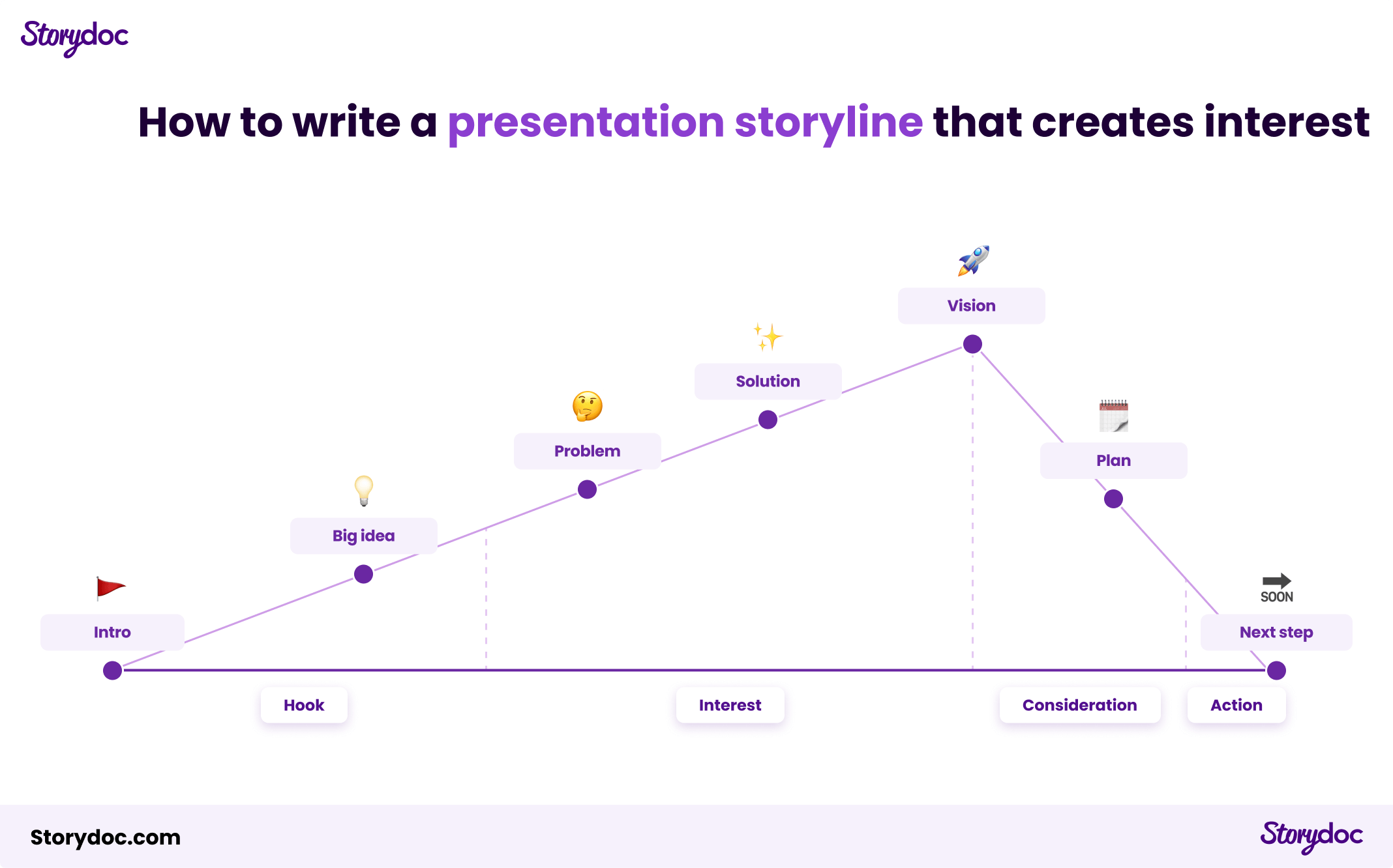
3. Narrate your content

Storytelling is another powerful tool for communicating complex concepts.

Whether it's through text to speech AI, video bubbles, or a scrollytelling narrator slide, narrating your content can help guide your audience through the complexity.

By giving your information a narrative structure, you can make it more digestible, engaging, and memorable.

According to Sales Hacker’s data, people remember up to 10% of numbers and 25% of images they see. When you center your presentation around a story, this rises to 60-70%.


4. Use examples and allegories

Examples and allegories help unravel the complexity of ideas.

They scaffold your message with concepts we already know and understand, and can easily imagine in our mind. This makes them less new and intimidating and more familiar.

Critically, the real secret lies in selecting examples that are not just familiar but also deeply relevant—those are the ones that will truly ring with your listeners.

If you tailor the allegory to your audience's world, it is guaranteed to lead to an “aha” moment.


5. Open a line of communication

Finally, invite dialogue. This could be through a chatbot or an option to book a meeting for further discussion. This not only helps clarify any confusion but also encourages engagement and deepens understanding.

For example, finishing your presentation with an interactive calendar to book a meeting instead of a generic “Thank you” slide has proven to boost conversion rate by 27%!

Thank you slide
Generic 'Thank you' slide
Next steps slide
Next steps/CTA slide

How to personalize your presentation?

Imagine attending a party where the host doesn't remember your name or anything about you. Not a great experience, right? The same holds true for presentations.

In a sea of generic content, personalization can be a lifeline that connects you to your audience on a deeper level. It’s also the single most important predictor of success, getting 68% more people to read your presentation in full.

But how do you add that personal touch?


1. Address reader by name

Just as you wouldn't start a conversation without a greeting, don't start your presentation without acknowledging your audience.

Using your audience's name can make your presentation feel like a personal conversation rather than a generic monologue. It's a simple yet powerful way to engage your audience from the get-go.


2. Use their company logo

Including your audience's company logo in your presentation can make them feel seen and valued. It shows that you've taken the time to tailor your presentation to them, enhancing its relevance and appeal.

Plus, it's a subtle way to reinforce that your message is specifically designed to address their needs and challenges.


3. Add a personal message (video or text)

A personal message can go a long way in building a connection with your audience.

It could be a video message from you, expressing your enthusiasm for the opportunity to present to them, or a text message highlighting why the presentation matters to them.

This personal touch can make your audience feel special and more invested in your presentation.


4. Personalize your Call-to-Action

Finally, cap off your presentation with a call to action that speaks directly to your audience.

Swap out the generic 'Contact us' with something that gets to the heart of their needs, something like, 'Let's roll up our sleeves and tackle your [specific issue] at [their company].'

By tailoring your call to action, you show your audience you've truly got their back, that you're not just here to talk, but to make a real, positive impact on their world.

Here’s an example of a personalized slide:

how to make a good personalized presentation slide

How to measure the effectiveness of your presentation

Imagine if you could peek into your audience's mind, understand what resonated, what fell flat, and what drove them to action?

Presentation analytics is essential in order to guide you on how to fine-tune it for maximum impact.

But how do you get your hands on presentation analytics?

Any presentation you create with Storydoc comes with an out-of-the-box analytics suite, ready to track and provide insights.

We give you 100% visibility into how people engage with your presentations and send you real-time engagement alerts.

Here’s a video explaining how you can track performance with our analytics panel:

Storydoc analytics pa

4 critical presentation engagement metrics to keep track of

1. Reading time

Storydoc gives you the precise time prospects spend reading your presentation so you can quickly figure out what's hitting the target and what's not.

Are they soaking up every word or just quickly skimming through? This can help you shape your content to hit the bullseye.

NOTE: Keep in mind that reading time alone might not show you a full picture. A better way is to use a smart engagement score that brings together different metrics like time spent and depth of reading. You can get this kind of total score in Storydoc.

2. Reading completion

Another basic metric we track is how many people read your content from start to finish.

This metric is a strong sign of the prospect’s interest and your content quality. It shows you if they're finding the information relevant, but also worth sticking with till the end.


3. Next step conversion rate

This one tracks how many people take the next step after they check out your presentation. This could be filling out a form, setting up a meeting, or downloading more files.

For business presentations, measuring this can show how well your presentation is pushing people further down the sales funnel.

At the top of your analytics dashboard, you can find a tab that shows you how many people clicked on your CTA divided by presentation, date, and location. If you scroll down to the list of readers, next to each person you can also see whether they clicked on the CTA or not.

Here's what it looks like:

Analytics panel - CTA

4. Number of shares

This metric is particularly important for B2B sales teams. As more people are getting involved in buying decisions, this measure helps you see if and when your content is being passed around inside your prospect’s company.

On the analytics dashboard, under each presentation version, you can find detailed information on how many people read it. So, the higher the number, the more your presentation has been shared internally.

We'll notify you when your presentation has been shared, and who opened it, so you can time your follow-up perfectly to your buyer’s readiness to advance further.

Here's where you can find this information:

Analytics panel - internal shares

Best tool for making an effective presentation

In the realm of presentation tools, classics like Google Slides and PowerPoint offer simplicity and ease, while Canva and Pitch add a dash of design flair and collaboration.

If you're seeking to elevate your presentations to new heights you’ll need to do better than simple PowerPoints or flashy Canvas. Next-gen AI presentation tools like Storydoc are your game-changer.

They break free from the static concept of slides and offer the creation of interactive, immersive content experiences that sweep us along like a good story.

Storydoc - AI presentatio

Grab a template - create your best presentation to date

Ever wished for a secret recipe to whip up a killer presentation? We've got something even better! Our interactive presentation templates are your shortcut to success.

Say goodbye to hours of formatting and hello to captivating, interactive presentations, all with a few clicks.

Grab a template and turn presentation woes into wows!

No templates found
Dominika Krukowska

Hi, I'm Dominika, Content Specialist at Storydoc. As a creative professional with experience in fashion, I'm here to show you how to amplify your brand message through the power of storytelling and eye-catching visuals.

Grab a presentation template

Create your best presentation to date

Try Storydoc interactive presentation maker for 14 days free (keep any presentation you make forever!)