This is a preview of your story

Powered by

Storydoc

Why Making a PowerPoint Presentation Attractive Won't Help

Learn how to make a presentation attractive but also engaging and converting, and why PowerPoint can only make a beautiful presentation that will never engage.

Dominika Krukowska

9 minute read

Make a PowerPoint presentation attractive
Trusted by top companies:
client logo: meta
client logo: RTL
client logo: Yotpo
client logo: NetApp
client logo: healthy.io
client logo: deliverlight

Short answer

What makes a presentation attractive?

A presentation is attractive based on its first impression which includes its looks but also the experience it promises.

Just like an attractive person is beautiful, but also has charm - an attractive presentation has a balanced design, beautiful visuals, and elegant fonts, but also inviting animations, moving words, and authenticity.

A pretty presentation is not necessarily attractive

When setting out to create a presentation, you want it to be engaging, informative, and yes, attractive. But have you ever paused to consider what 'attractive' truly means in this context?

We all understand that a beautiful presentation is aesthetically pleasing but is it necessarily attractive?

Attractiveness in a presentation goes beyond beauty. It's beauty coupled with charm.

Charm is the emotional attractiveness that makes an audience want to engage with content. It’s the images and words that resonate with them. It's the narrative that turns your facts and figures into a story they can identify with.

It's the difference between a presentation that looks real-pretty but no one likes reading, and one that they wouldn’t stop reading if you asked.

And here's my point: PowerPoint, for all its capabilities, lets you make beautiful slides that no one likes reading.

That’s why, in this post, we're going to dive into alternatives to PowerPoint that let you make the attractive presentations your audience deserves.

Let's get started!

Why beautiful PowerPoint presentation design is still bad design

Aesthetically pleasing PowerPoint slides might seem attractive, but they lack the essential ingredient of modern presentations - engagement.

PowerPoint fails to provide the experience we’ve become accustomed to expecting from even the simplest webpage.

With its static nature, with mostly text and a bit of visuals to communicate information. It’s like talking to your audience through a veil without having your body language give depth of meaning to your words.

Worse yet, PowerPoint’s 16:9 slide format was meant for the slide projectors we had 30 years ago. Nowadays this format feels like having a conversation where you can only speak in 5-word sentences.

What if I wanna say more than I can fit on a standard slide? What if I wanna say something with a video, or show on a long timeline?

Moreover, what if my audience wants to read my presentation on their mobile when they’re on the go? Doing this is unbearable with PowerPoint (if you’re not walking around with a mini-slide projector in your pocket).

Even if your audience is made of fanatics that won’t rest until they read your presentation, the endless pinching in and out on mobile devices will discourage even the most zealous person from reading your presentation after a few seconds.

PowerPoint is a relic from a bygone era, trying to deliver an experience it wasn't designed for.

Just take a look at these 2 presentations. Which one would you rather read?

Static PDF example
Static PDF or PPT
Interactive Storydoc example
Interactive Storydoc

How to make a presentation attractive but also useful?

Creating an attractive presentation is more than just about aesthetics. It's about crafting an engaging, interactive experience that not only looks good but also immediately builds interest and effectively communicates your message.

Here's how you can do it:


1. Use narrated design - scrollytelling

Scrollytelling is where "scroll" meets "storytelling". It's an interactive content experience that guides your readers through a narrative journey with a simple scroll.

Scrollytelling connects text, images, videos, and animations into integrated “scenes” where content is both shown and narrated. It breaks complex content into digestible chunks and gives your readers control over the pace.

This enhances your presentation’s engagement, understandability, and memorability.

Here’s an example of Storydoc scrollytelling:

Narrator slide example

2. Design for interactivity

Interactive features can make your deck more engaging and memorable. This could include sliders, tabs to click through, or live data calculators.

These elements invite your audience to participate, making them active learners rather than passive listeners.

How to use interactive Storydoc features

3. Add multimedia elements

Videos, images, and audio clips can make your presentation more dynamic and engaging. They can help explain complex concepts, provide real-world examples, or simply break up text-heavy slides.


4. Keep your design cohesive

Consistency is key in design. All through your presentation, stick to a single color scheme, font style, and layout.

This not only makes your presentation look professional but also helps your audience follow along and understand your message better.


5. Design your presentation for mobile and desktop

Our data exposes that 1 out of 3 people will read your presentation on mobile. Make sure your presentation looks good and functions well on different devices.

What looks good on a desktop might not work on a mobile device. Testing ensures that your audience has a positive experience, no matter how they access your presentation.


6. End with a CTA

Your first slide is just as important as your last slide. Your first impression should impress first, but your last impression should leave a lasting impression.

End your presentation by connecting your main message with something your readers can do to make their lives even a tiny bit better. Use a call-to-action (CTA) to prompt your audience to take a specific action.

This could be signing up for a newsletter, downloading a resource, or scheduling a meeting. A clear, compelling CTA slide can help you achieve your presentation goals.

Here’s an example of a presentation with an embedded calendar:

Interactive Storydoc deck with embedded calendar

How to make boring presentations exciting?

Turning a dull presentation into an exciting one isn't as hard as it might seem. Here's how you can inject some life into your presentations:


1. Open with a powerful visual and powerful message

Make your first slide embody your main message. Use a video or animation that hints at what’s inside the presentation.

Think - a smiling family on a turquoise beach, for a presentation about tourist destinations, or an in-action preview of your product if your presentation is showcasing a new device or software.

Pair this with a strong title that promises how whatever you offer can impact the reader's life for the better. Think - “A vacation your kids will never forget”.


2. Tell them what to expect

Start by setting the stage for your audience. Include an introduction slide that gives a brief overview of what your presentation is about and why it's relevant. Add an agenda to provide a roadmap of what you'll cover.

Also, consider sharing the average reading time to help your audience plan their time. This simple fix can get 25% more people to start reading!

Here’s the difference it can make:

Static cover slide

Before

Interactive cover slide

After

In addition, Storydoc templates come with a slide bar that highlights the slide you're currently viewing and shows your progress through the presentation, providing a visual guide for your audience.

This feature can further enhance the audience's understanding of the presentation's structure and flow, helping them anticipate what's coming next and manage their attention and engagement effectively.

Here’s an example of a presentation that uses this feature:

3. Visualize your data

Data is crucial, but it can be dry and hard to understand. Make your numbers come alive by visualizing them. Use charts, graphs, or infographics to make complex data easy to digest and engaging.

Use live charts and graphs that let the reader interact with them and expose more information as they like.

Here’s an example of how data visualization can transform your deck:

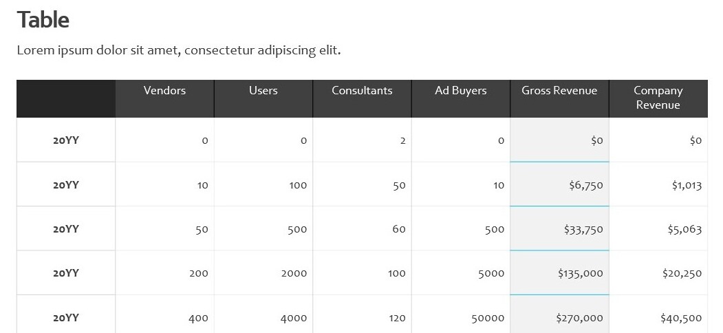
Static table

Before

Slide with data visualization

After

4. Create a storytelling narrative

Stories are powerful tools in presentations. They transform your audience from passive listeners to active participants, making them feel like they're part of the narrative.

This is crucial because when your audience feels engaged and in control, they're more likely to remember your message.

But don't just take our word for it. Data from Sales Hacker shows that prospects remember only up to 10% of numbers and around 25% of images they see.

However, when your message is woven into a story, memory retention skyrockets to 60-70%!

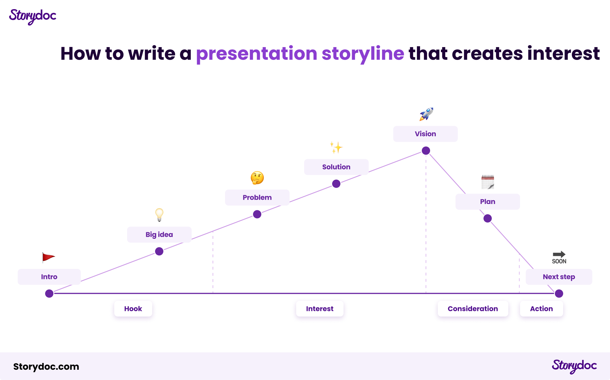
Here’s our recommended presentation storyline:

How to write a presentation storyline that creates interest

5. Optimize for engagement with interactive elements

Interactive elements add an extra layer of engagement that keeps your audience hooked.

Think of elements like tabs that reveal different product benefits, live data calculators, or sliders showcasing case studies and customer testimonials.

These interactive features invite your audience to engage with your content actively, rather than just passively reading it.

And the results speak for themselves. Decks with interactive components were scrolled to the bottom 41% more often and were read 21% longer.

Here’s how interactive elements can enhance your presentation:

Static pitch deck

Before

Interactive pitch deck

After

How to keep your team from breaking your decks?

If you're making presentations as a team effort you may be asking “How can I collaborate on presentations while keeping them attractive?”

It's a delicate balance between allowing creative input and maintaining design consistency. So, how can you achieve this balance?

Here are some strategies:


1) Use a “walled garden” presentation editor

The first step is to choose an intuitive editor that's user-friendly and safeguards the design. It should be a walled garden, designed to allow creators to collaborate on creating content with limited design leeway.

A walled garden editor limits the design decisions you can make to options that maintain a beautiful design always.

This lets your team focus on enhancing the contents of your presentation, without worrying about accidentally altering the layout or design elements and breaking the presentation.

The only walled garden presentation maker we know is Storydoc. Maybe you’d like to give it a try.


2) Assign limited editing access

Collaboration doesn't mean everyone needs full access to edit the design. In fact, too many cooks can spoil the broth. By assigning limited editing access, team members can contribute to the content without being able to alter the design.

This ensures that your presentation remains visually consistent, regardless of how many people are working on it.


3) Create a library of high-quality visuals

Visuals are the lifeblood of an engaging presentation. They breathe life into complex ideas, making them easier to understand and more enjoyable to consume.

That's where a shared library comes in handy.

You can create a collection of high-quality images, videos, and graphics that your team can dip into whenever they need to add a visual punch to your presentation.

This way, your content always looks its best, and your message comes across loud and clear.


4) Maintain your brand guidelines in a brand book

Consistency in colors and branding is key to creating an attractive presentation. It makes your presentation look professional and reinforces your brand identity.

If you want a recognizable brand you should standardize any content you make with one single source of truth - your brand book.

Based on your brand book, you can apply your brand colors, fonts, and design language to any presentation your team creates in the Storydoc design settings.

This eliminates the risk of inconsistent branding and helps maintain the visual appeal of your presentation.

Here's what our editor looks like:

Storydoc presentation maker

Beautiful interactive presentation examples to inspire you

Looking for some inspiration to kickstart your next presentation? You're in the right place!

In this section, we'll walk you through some stunning examples of presentations from various industries and use cases. These aren't just pretty to look at - they're crafted to engage, inform, and impress.

So, whether you're presenting a business proposal, sharing research findings, or launching a new product, there's something here to spark your creativity. Let's dive in:

SNC DeserTech - Long-form report

This presentation provides an insightful overview of Israel's DeserTech ecosystem, showcasing over 300 startups focused on combating desertification.

It covers innovative solutions in agriculture, energy, water, and infrastructure, highlighting Israel's pioneering role in sustainable desert living and reversing desertification.

Cannasoft - Investment pitch deck

This presentation introduces Cannasoft, a cutting-edge CRM platform specifically designed for the medical cannabis industry.

It outlines the platform's unique features tailored to navigate the complexities of the cannabis market, emphasizing its role in optimizing business operations.

nSure - Interactive cyber one-pager

This one-pager presents nSure's AI-driven fraud protection solution for digital gift card transactions.

It details how nSure.ai's innovative technology distinguishes legitimate purchases from fraudulent ones, significantly boosting transaction approval rates.

Orbiit - Visually narrated sales deck

Orbiit's presentation showcases its innovative virtual networking platform, designed to activate and engage communities.

It highlights features like custom audience segmentation, automated member matching, and insightful community analytics, emphasizing Orbiit's effectiveness in fostering meaningful professional connections and knowledge sharing.

Matics - Digital product brochure

This one-pager presents Matics, a revolutionary system that digitizes manufacturing floors.

It highlights Matics' ability to quickly turn any facility into a smart, agile factory, enhancing productivity and decision-making through real-time data and collaboration tools.

Annual report

This annual report template is expertly designed to present a year's achievements and data in a clear, engaging format.

It includes structured chapters for organized content flow, dynamic data visualization elements for impactful statistics display, and various interactive components to enhance reader engagement.

Startup pitch deck

This startup pitch deck template is tailored for capturing the attention of venture capitalists.

It features interactive elements that bring your business idea to life, advanced data visualization tools to clearly present metrics and projections, and smart CTAs to engage and prompt action from potential investors.

Tech deck

TechTech's deck brings to life their groundbreaking solutions for business efficiency.

With a compelling timeline, an engaging case study, and visual tool integrations, it spotlights optimized workflows, insightful analytics, and enhanced collaboration, all weaving together a story of significant efficiency gains and elevated customer satisfaction.

Sales one-pager

This sales one-pager template features tiered slides for clear information hierarchy, ample white space for a clean, focused design, and an embedded calendar for easy scheduling.

Sales pitch deck

This sales pitch deck template is a dynamic tool for personalized presentations.

It features embedded videos and tiered slides for structured storytelling, along with step-by-step explanations for a smooth, logical flow. Ideal for creating impactful, customized pitches that resonate with each unique audience.

Product pitch deck

Taacme's pitch deck skillfully introduces their IT solutions, featuring a narrator slide for key features, strategically grayed-out content to focus attention, and a smart CTA.

This presentation effectively highlights how their software enhances performance, streamlines integration, and adapts to growing business needs, all while driving significant cost savings and customer satisfaction.

Marketing project proposal

InnovateX's marketing project proposal is a dynamic, engaging presentation tailored for impactful pitches. It features dynamic variables for personalization, expandable slides to neatly contain extensive text, and detailed pricing packages.

The proposal effectively communicates a comprehensive marketing strategy, leveraging personalized elements and interactive content to captivate potential clients.

If you want to see more samples, check out our post containing 52 perfect presentation examples to set you apart.


Create your most beautiful presentation to date from a template

To create an attractive presentation, you need a mix of engaging content, compelling visuals, and a logical flow that carries your audience along. At first, it can be challenging to get it right, which is why we have something to make your life easier.

Interactive presentation templates are the way to go. They offer a ready-made structure that's designed to be engaging, visually appealing, and easy to customize. With a template, you can focus on your content, knowing that the design is already taken care of.

Pick one from our library and create your most beautiful presentation yet.

No templates found
Dominika Krukowska

Hi, I'm Dominika, Content Specialist at Storydoc. As a creative professional with experience in fashion, I'm here to show you how to amplify your brand message through the power of storytelling and eye-catching visuals.

Grab a presentation template

Create your best presentation to date

Try Storydoc interactive presentation maker for 14 days free (keep any presentation you make forever!)