Uber Pitch Deck Made Better (Customizable as Template)

Explore our enhanced Uber pitch deck template, based on the original that raised $200K. Gain insights and tips for creating your successful pitch deck.

Uber pitch deck

helped business
professionals at:

Nice Meta RTL Spot Xerox Pepsi

Short answer

What makes the original Uber pitch deck so effective?

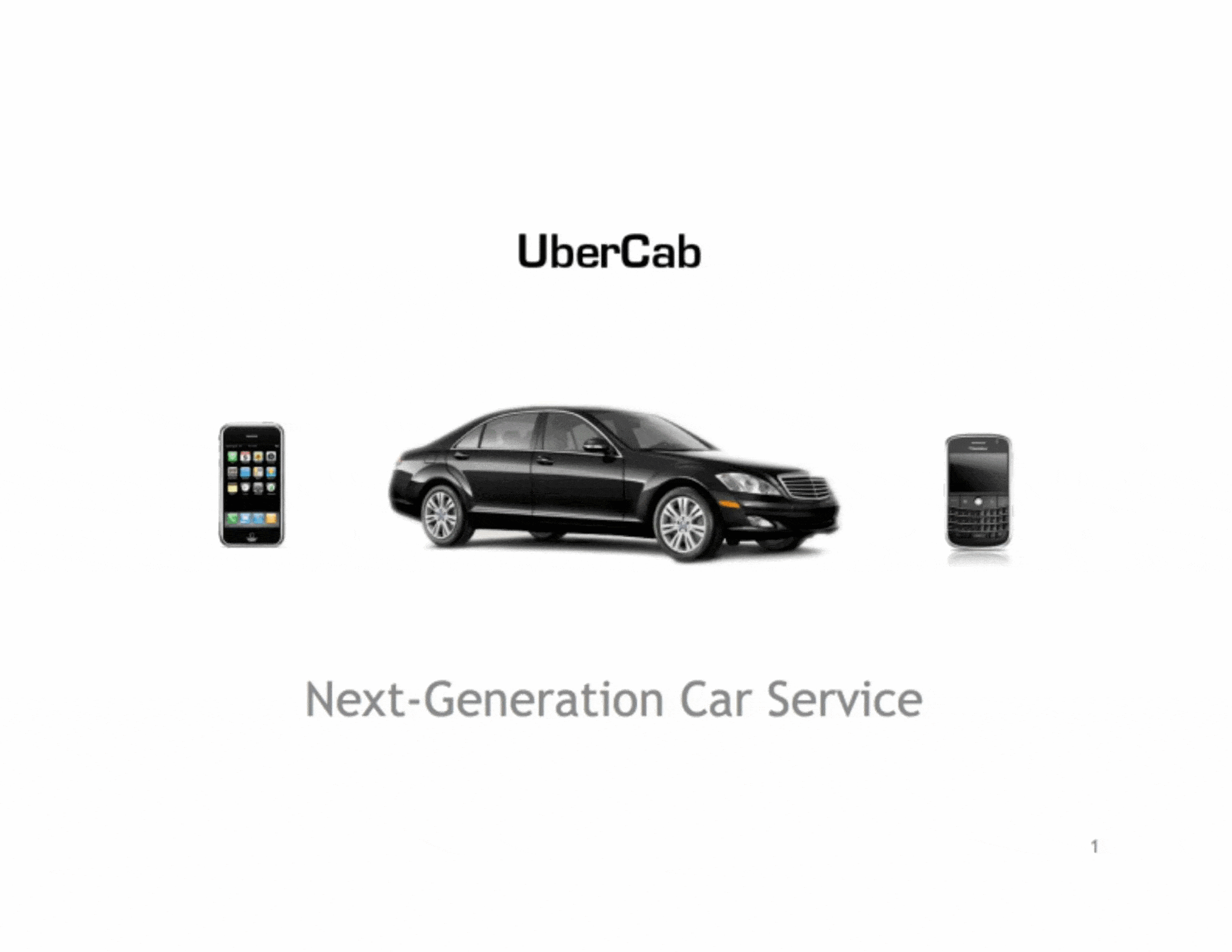
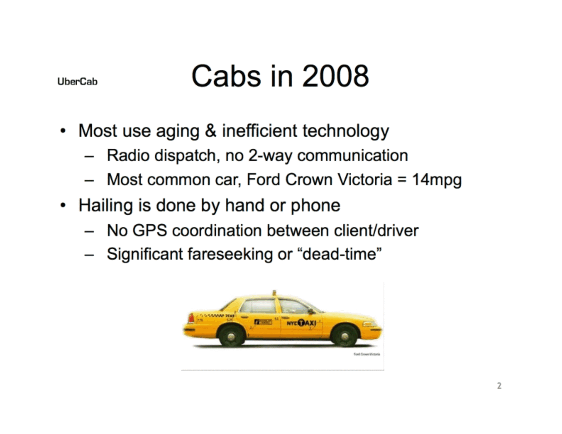
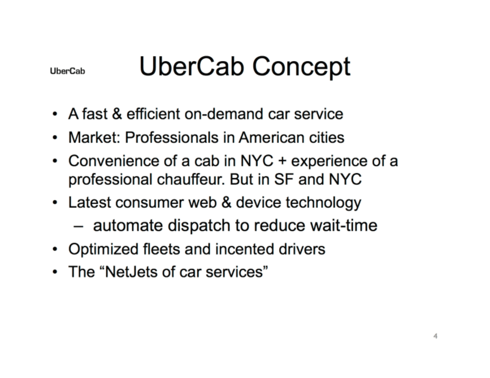
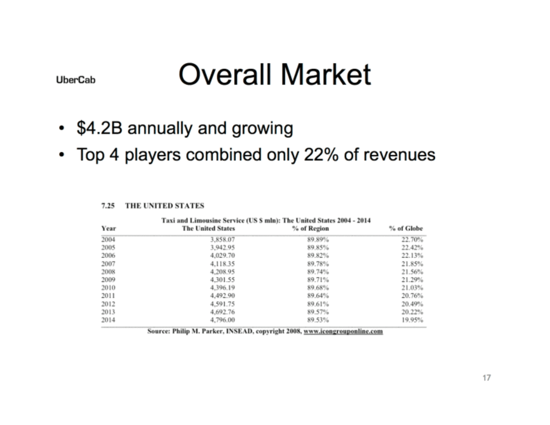
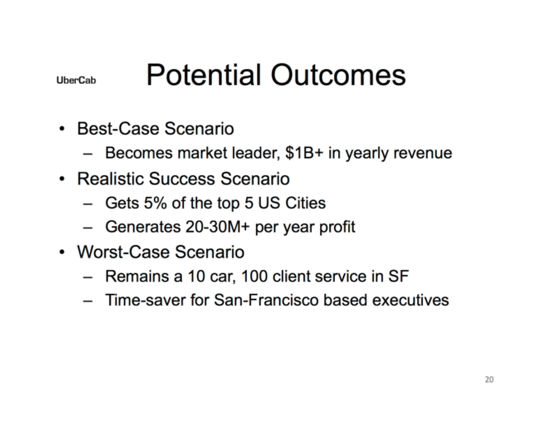
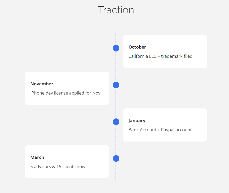
The original Uber pitch deck's effectiveness lies in its clear value proposition, concise market analysis, and compelling vision for revolutionizing transportation.

Its straightforward approach and strong storytelling captivate investors, showcasing Uber's potential for disruptive innovation.

Uber’s pitch deck shares a great idea, but it’s ready for a style update

The original Uber pitch deck is a masterclass in sharing a big vision. It's the kind of story that grabs attention and doesn't let go, showing us all how a simple idea can change the world.

But, while the first pitch deck of Uber was groundbreaking at its time, it now feels a touch dated in its look and feel.

In this blog post, we're going to give Uber's iconic pitch deck a modern makeover, turning it into an interactive journey that's more in line with how today's audiences consume content.

Join me as I walk through the transformation of Uber's pitch deck, showing you the before and after, and sharing tips on how you can spruce up your own slides.

Here’s a sneak peek at the original deck (left) and its updated version (right):

Static Uber pitch deck
Interactive Storydoc

You need to elevate your pitch to ignite investors’ interest

Imagine a world where catching a ride was as simple as pressing a button on your phone. That was Uber's game-changing idea back in 2008.

With a clear vision and a compelling pitch, they turned a simple concept into a global revolution in urban mobility, kicking off with $200,000 in seed funding.

These days, snagging someone's attention is just the start. The real challenge? Keeping it.

Picture this: an investor glances at your pitch deck. You've got 15 seconds to make an impression. If Uber had just sent out their deck and hoped for the best, we might not be hailing rides with our smartphones today.

Think of your pitch deck as your story's best friend. It's there to do the talking when you can't.

But it's got to be more than just words on a screen. Crafting an interactive pitch deck is about weaving a narrative that resonates, ensuring your vision sticks with people long after they've moved on from your slides.

Uber pitch deck (interactive remake):

Disclaimer: The insights provided are inspired by Uber's publicly available initial pitch deck. It has been recreated for illustrative purposes by the Storydoc team and does not reflect the exact deck Uber used for their fundraising efforts.

How we improved the original Uber pitch deck

Let's take a closer look at how we've given Uber's original pitch deck a major upgrade.

We've improved the storyline and ramped up the visuals to bring you a step-by-step breakdown of the changes that can take a decent pitch to the next level.

I'm here to walk you through these improvements, showing you how to apply them to your deck to make it stand out and stick with your audience.


1) Cover slide

When Uber first hit the scene with its pitch deck, it went by "UberCab," and its cover slide was pretty straightforward.

Picture this: a sleek Mercedes and a Blackberry phone right there on the front page. It was clear from the get-go that Uber wasn't your average taxi service; it was something new, something modern.

Original Uber pitch deck cover slide

Fast forward to today, and we've given that cover slide a bit of a facelift with Storydoc's touch. First off, we've updated Uber's name to reflect its current brand, keeping it crisp and simple.

But here's where it gets really exciting: we swapped out those static images for a dynamic video. Why? Because videos have this unique power to draw people in.

Interactive Uber pitch deck cover slide

In fact, decks with a video right on the cover slide see a whopping 32% more engagement.

Imagine starting your pitch with a video that captures the essence of Uber, showing the bustling streets or happy customers. It sets the stage for everything that's to follow.

And we didn't stop there. We added a little note about the average reading time for the whole deck.

It turns out, just by letting folks know up front how much time they'll need, you can reduce the chance of them bouncing off by 24%. It's like giving them a heads-up, "Hey, stick around, it's worth it," and it works.

2) Problem slide

Originally, Uber's pitch deck tackled the taxi industry's issues across two separate slides, which risked diluting the audience's focus.

The slides laid out the inefficiencies and frustrations with traditional taxi services, but the split could potentially weaken the impact of the message.

Original Uber pitch deck problem slide

In our revamped version, we've streamlined these insights into a single, more powerful slide.

By employing design strategies like grayed-out content transitions, narrated storytelling, or a quadrant layout, you can make the transition between points smoother and more engaging.

This not only keeps the narrative tight but also ensures that the audience's attention is captured and held from start to finish.

Improved Uber pitch deck problem slide

Moreover, the original slides included a graph meant to illustrate the high cost of NYC medallions, but let's be honest, it was pretty hard to decipher.

Recognizing the importance of data in storytelling, we offer an extensive library of interactive data visualization tools you can use instead.

This way, viewers can interact with the data themselves, exploring the specifics at their own pace. This makes the information clearer, adds an engaging, hands-on element to the presentation, and sets the stage for Uber’s solution to shine.

3) Solution slide

When Uber first laid out its solution, it was spread across several slides, packed with walls of text. It was thorough, sure, but it risked losing the audience in the details.

Imagine trying to catch a glimpse of the city skyline through a thick fog—that's how it felt navigating through the original solution slides.

Original Uber pitch deck solution slide

So, we took a step back and thought, "How can we clear the fog?"

First up, we set the stage with a "Why invest in Uber?" slide. Picture this as the moment the sun starts to peek through, highlighting the key metrics that make Uber shine.

Why invest in Uber slide

Then, we tackled the solution itself, condensing the essence into 2 crisp slides:

  1. On the first slide, we mapped out Uber's world using quadrants, each representing a different service. For those who love to explore, you can add expandable text sections that let you dive deeper into each area without cluttering the slides.

  2. The second slide is where the journey begins. Using scroll-based design, you can explore Uber's main features and benefits one by one at your own pace. There are also image and video placeholders to present the solution in action.

By repackaging Uber's solution into this streamlined, engaging format, we’ve made it easier for the audience to grasp and remember Uber’s offerings.

And, more importantly, giving readers something to play around with means that your deck will get scrolled to the bottom 41% more often and read 21% longer.

Improved Uber pitch deck solution slide

4) Market size slide

Uber's original market size slide, packed with numbers and a simple pie chart, was informative but a bit dry. It was like reading a dense report when you really wanted a clear, engaging story.

Original Uber pitch deck market size slide

So, we switched things up with an interactive data visualization component that fills with real-time data. This interactive approach transforms the slide from a static snapshot into a lively exploration.

It's about making the audience active participants, turning what could be a forgettable list of numbers into a memorable, hands-on experience.

Now, understanding Uber's market size and segments is not just easier but also a lot more fun.

Improved Uber pitch deck market size slide

5) Traction slide

In the original pitch, Uber spread its story thin across several slides, touching on future hopes and what they'd achieved so far.

Fast forward to today, and we've got a whole saga of success to share. So, we thought, why not make it easier and more engaging for everyone?

Original Uber pitch deck traction slide

We packed Uber's milestones into one timeline slide. It's like a road trip through Uber's history, where every stop is a major win or a breakthrough moment.

This visual journey makes it easy to see just how far Uber has come, turning a list of dates into a compelling story of growth and innovation.

Improved Uber pitch deck traction slide

For the success part, we went with running numbers. Picture this: numbers that climb right before your eyes, showcasing Uber's annual revenue, year-on-year user growth, and customer satisfaction rate.

It's not just numbers on a slide; it's a live show of Uber's growth, making the scale of their achievements instantly clear and far more impactful.

By focusing on a timeline and interactive numbers, we've made Uber's progress and success not just easier to grasp but impossible to ignore.

It's a fresh, lively way to highlight just how big a deal Uber is, turning dry data into a dynamic narrative that captures the essence of their journey.

Improved Uber pitch deck proven success slide

6) Next steps slide

The original Uber pitch deck, while groundbreaking, left out several key slides that could have painted a fuller picture of the company's vision and strategy.

Important elements like the business model, the team behind the magic, how they planned to use their investments, and crucially, clear next steps were missing.

Recognizing these gaps, we saw an opportunity to not just fill them in but to do so in a way that significantly boosts engagement and action.

We capped our deck off with a smart call to action (CTA) that's more than just a polite "thank you."

We embedded a calendar directly into the deck, allowing investors to book a meeting with Uber's team right there and then. This direct approach transforms passive interest into active engagement.

Improved Uber pitch deck next steps slide

Our analysis of various pitch decks revealed a striking insight: decks with a singular, clear next step, like booking a demo or signing up, boasted a conversion rate 27% higher than those ending with a generic thank you.

It's a testament to the power of a well-placed CTA, turning viewers into participants and potential leads into concrete actions.


And that’s it!

If you’d like more insights on how to create a fundable pitch deck, we’ve put together several guides for you:

Give your own pitch deck a makeover

Looking to transform your pitch into something as impressive as Uber's? You've come to the right place!

Take a look at our wide selection of pitch deck templates, each designed for different needs, to find the perfect one that tells your story just right.

Our easy-to-follow editor will guide you through turning your pitch from good to great, effortlessly.

Or, if you'd rather, upload your deck and get tailored advice from our storytelling expert on how to polish it up.

No templates found
Dominika Krukowska

Hi, I'm Dominika, Content Specialist at Storydoc. As a creative professional with experience in fashion, I'm here to show you how to amplify your brand message through the power of storytelling and eye-catching visuals.

Engaging decks. Made easy

Create your best pitch deck to date.

Stop losing opportunities to ineffective presentations.
Your new amazing deck is one click away!