Everything you need to know about pitch-perfect infographics, from the concept stage to execution and design. Plus, examples of the best-ever infographics to get you inspired.
Topics:
As the name suggests, an infographic is a graphic, visual representation of information. Infographics can be based on different types of information: numerical data, geography, timelines, processes, and more. The common denominator of every infographic is that its visual aspect is more important than the verbal one.
Infographics have been a constant trend in business communications over the last 15+ years but they can be successfully used in many other areas, from education to politics to urbanization to healthcare.
Alright, alright… You probably didn’t come here only to see a working definition of an infographic. More likely, you’re in the process of creating infographics yourself and want to make sure you don’t set a foot wrong. Good! You’re in the right place.
If you’re in for a shortcut, visit our gallery of the best infographic templates for instant download: The Best Infographic Templates in 2023
You’ll get fill-in-the-blank layouts you can use to create a professional infographic in minutes. All use cases and different infographic types are covered.
But—
Let’s face it. Infographics are usually not standalone, rather, part of a longer narrative, be that a marketing presentation, a report, or an article. If you’re seeking infographics to enhance your message, why not make the whole piece of content exciting for readers?
That’s what our presentation maker is for. It lets you create a stunning, scroll-based presentation packed full of interactive infographics, charts, and other data visualization items.
Here’s an example of what it can do (and yes, you can try it for free):
Static presentation with infographics
Presentation with infographics transformed in Storydoc
Need an infographic as part of a longer business document? Pick a perfect template for your needs from one of our carefully curated template lists:
The best infographics present data or information in an easier-to-digest way than plain text would. A good infographic is one that uses visuals to make its content easier to grasp, not just better looking.
Think about it this way… If you have a set of data, facts, or a certain state of knowledge and think to yourself “if I could present this and that visually, it would really click with the reader,” you’re probably on your way to at least a great concept of an infographic.
If you’re sitting there and thinking “man, I’d love to add a fancy infographic here,” you’re about to waste a lot of time and resources only to get your readers confused.
Of course, there’s no universal formula for a successful infographic, but there’s one handy acronym to help you identify one. Interestingly, it’s called S-U-C-C-E-S-S or “misspelled,” as S-U-C-C-E-S.
Of course, the effectiveness of this checklist depends on how critical you are. So I suggest a few questions to help you validate if an idea meets the criteria:
And no, it’s not that your infographic has to tick all these boxes to be worth doing. But it’s good to have the list in mind as a sanity check.
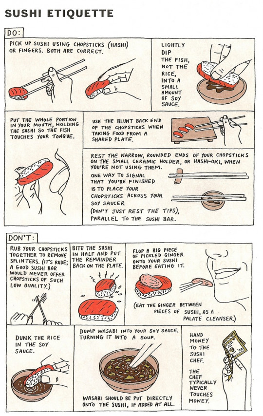
Okay, time for the fun part: examples of infographics I find particularly brilliant. Let’s see how many of the “S-U-C-C-E-S-S” criteria they meet!
Full version here.
A very straightforward idea for an infographic debunking the most common (via Google search volume) myths and misconceptions. I was genuinely surprised to learn about 75% of the stuff there and I consider my knowledge quite well-rounded! You can choose to scroll through the whole page or pick tabs with the most common myths by category (so bonus points for a little interactivity going on!).
Now, is it…
4 out of 7! Doesn’t seem too great, but the sheer value of unexpectedness is what made this one an instant hit.
Full, interactive version here.
One of the Internet’s all-time classics, an infographic comparing the daily routines of famous creative people.
Full version here.
A brilliant way letting you experience (at least to some degree), just how far away the Earth is from Mars.
Full version here.
A heartbreaking interactive detailing the timeline of drone strikes over Pakistan, the casualties, and the key events along the way. One of those infographics that you don’t really want to share in a “fun” compilation but on the other hand, feel the piece wouldn’t be right without it.
Full version (not too different from what you see above) here.
Just to prove that not every infographic needs fancy animations and hundreds of lines of code to work well. This hand-drawn one does just as good a job of being informative. And yes, it’s a *proper* infographic too, presenting knowledge in a visual way.
Wait, what? THAT is an infographic too?
But think about it. It presents geographical information in a simplified way, making navigation easier. Instead of showing exact locations, it highlights relative positions of the stations and lines, and how the stations are interconnected. Actually, the London Tube map might have been one of the first infographics to go “viral” globally: the same design principles have been adopted across many cities including New York and Tokyo!
While I don’t think it makes sense to measure it against the “S-U-C-C-E-S-S” formula, it’s worth having in mind when contemplating the concept of the infographic itself.
Infographics are so fascinating and beautiful, browsing through them can get addictive (trust me, I spent more time on this piece than you’d imagine, just going through hundreds of amazing infographics).
If you want to dig deeper into the fascinating world of infographics, check out some of these resources:
Hope this piece will help you up your infographic game. Happy creating!
Try Storydoc for free for 14 days (keep anything you make for ever!)