Aesthetic presentation templates that engage and convert
Get aesthetic presentation templates that help you captivate audiences and close deals. Stand out from competitors and tailor content with AI
Company presentation
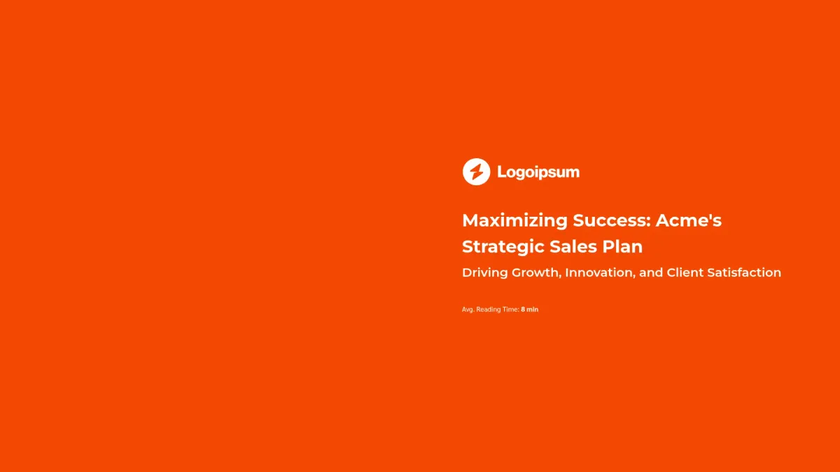
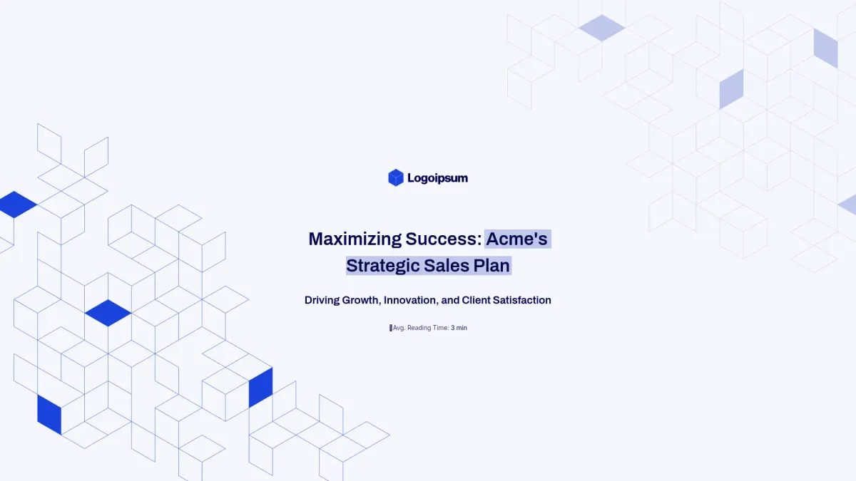
Sales pitch deck
General presentation
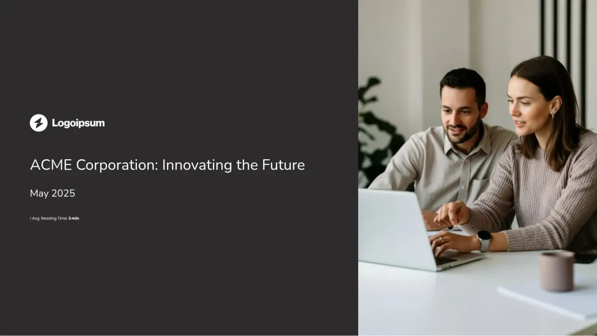
Corporate profile presentation
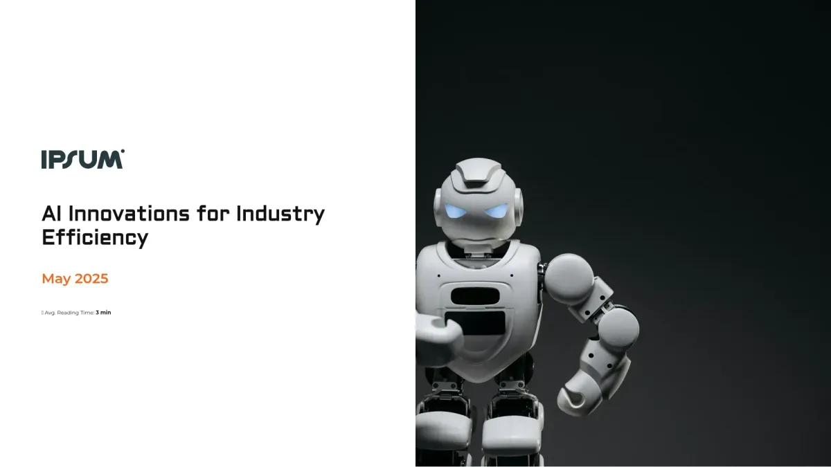
AI company presentation
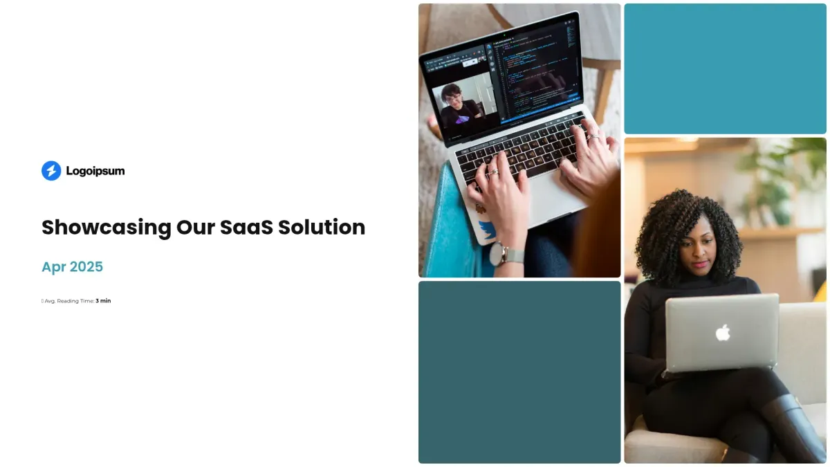
SaaS product demo presentation
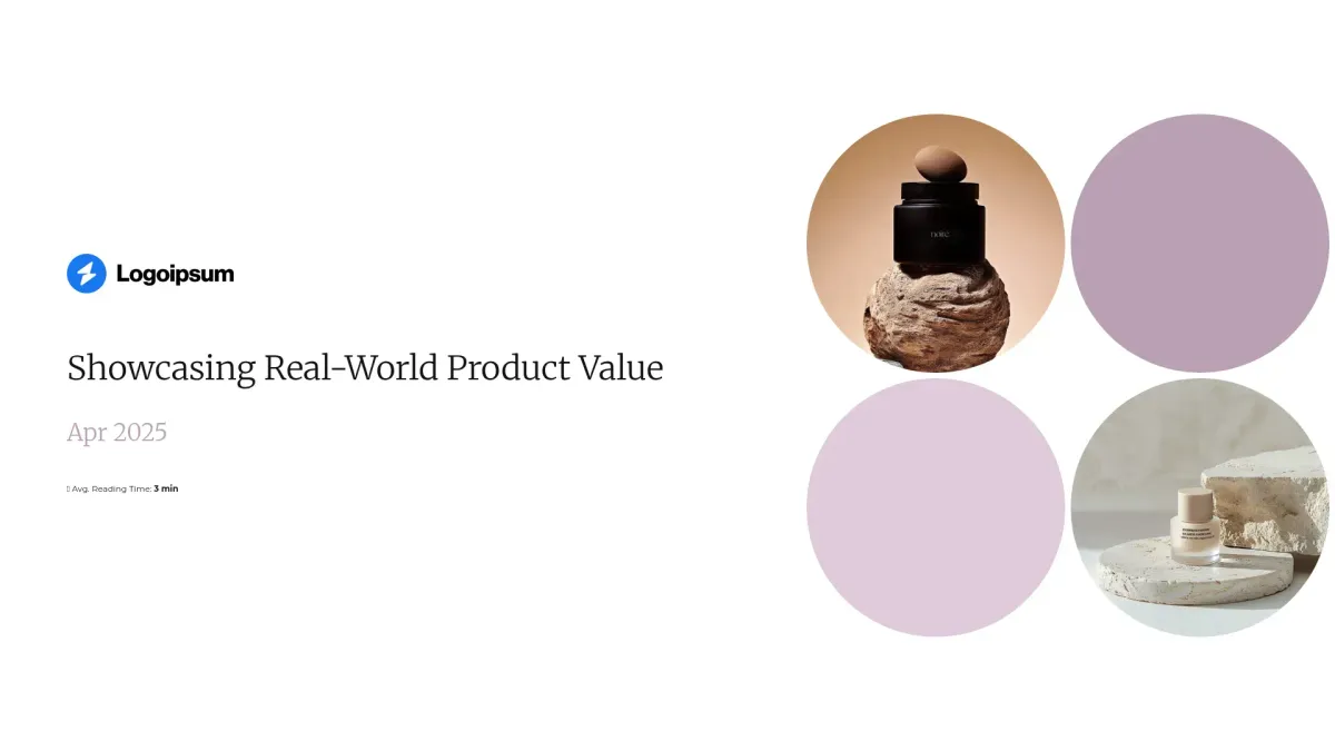
Physical product demo presentation

Medical device product demo deck
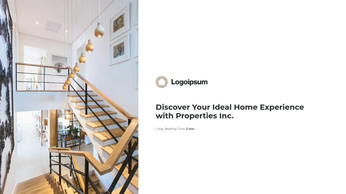
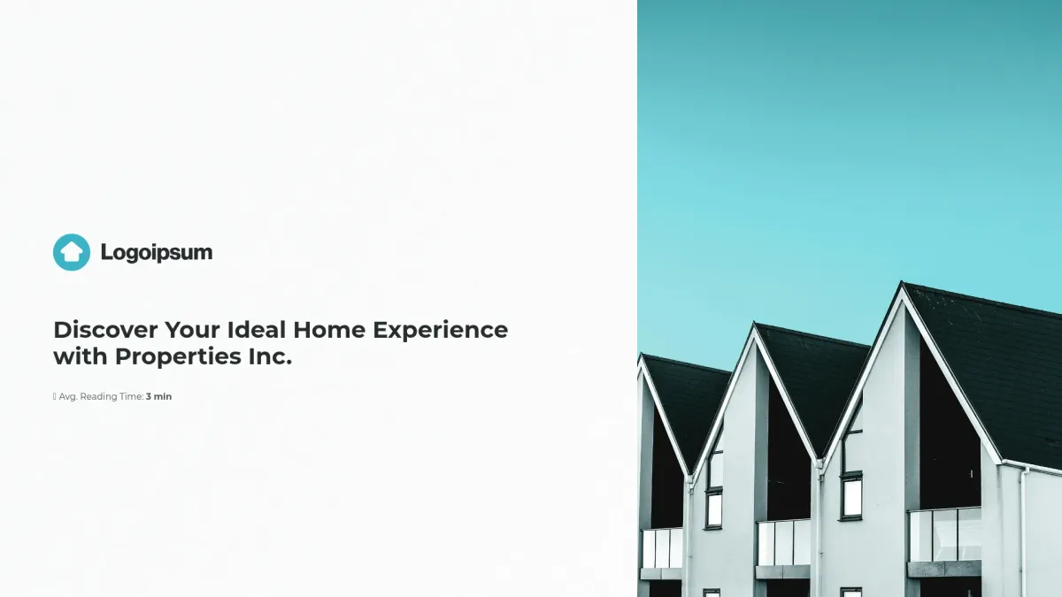
Real estate seller presentation
Enterprise B2B product demo deck
Software demo presentation
Product sales demo presentation
Physical product pitch deck
Agency services pitch deck
Product sales pitch deck

FAQ
What is a aesthetic presentation?
What is a aesthetic presentation?
A aesthetic presentation is a refined document category used to visually impress audiences during business pitches and company briefs. You use this template for presenting strategies and data. Industries like marketing, finance, and tech frequently adopt this format. Elevate your messaging and secure success immediately.
What is the goal of aesthetic presentation templates?
What is the goal of aesthetic presentation templates?
The goal of aesthetic presentation templates is to empower you with visually dynamic tools that capture attention, convey your message clearly, and drive engagement throughout every presentation step consistently effective.
What do aesthetic presentation templates include?
What do aesthetic presentation templates include?
A aesthetic presentation template typically includes the following slides to structure your message efficiently:
- Cover slide – brand intro clearly
- Overview slide – concise key benefits
- Content slide – detailed message delivery
- Data slide – smart insight visualization
- Conclusion slide – summarize main outcomes
These slides ensure your story is communicated powerfully and always impress.
How to tailor your template with AI?
How to tailor your template with AI?
Leverage Storydoc’s AI engine to automatically adapt your aesthetic presentation template with content from your website, PDFs, or text. The engine customizes visuals, colors, tone, and layout based on source materials. You can also refine specific slides instantly with AI design and writing tools efficiently.
What makes Storydoc better than static content like PPT, PDF, Doc, plain HTML, or print?
What makes Storydoc better than static content like PPT, PDF, Doc, plain HTML, or print?
With your same-old PowerPoint aesthetic presentation design, you’ll never stand out, let alone engage. Decision-makers have seen beautiful PPTs and PDFs a thousand times, yet they remain static and uninspiring.
Storydoc’s interactive design brings content to life with animation, annotation, and narration. Mobile navigation is seamless, and built-in analytics and dynamic personalization ensure superior performance.
Why use a Storydoc template instead of paying a design agency?
Why use a Storydoc template instead of paying a design agency?
Experience faster creation, lower costs, and better control with Storydoc templates. They deliver 2x more engaging content than agency proposals and empower you to update content instantly, ensuring your presentation remains current and impactful. Boost your success with Storydoc today.
Start working on your aesthetic presentation with our AI presentation maker

Make aesthetic presentation that gets the job done
Stop losing opportunities to ineffective documents.
Try Storydoc now.